EBAY VIEW ITEM
Transforming eBay's most highly trafficked page.
PROJECT: 01/15
BRAND: EBAy
DATE: 2022
PLATFORMS: IOS/ANDROID/WEB
ROLE: DIRECTION/DESIGN
TEAMS: CORE PRODUCT
STATUS: LIVE-PHASED LAUNCH
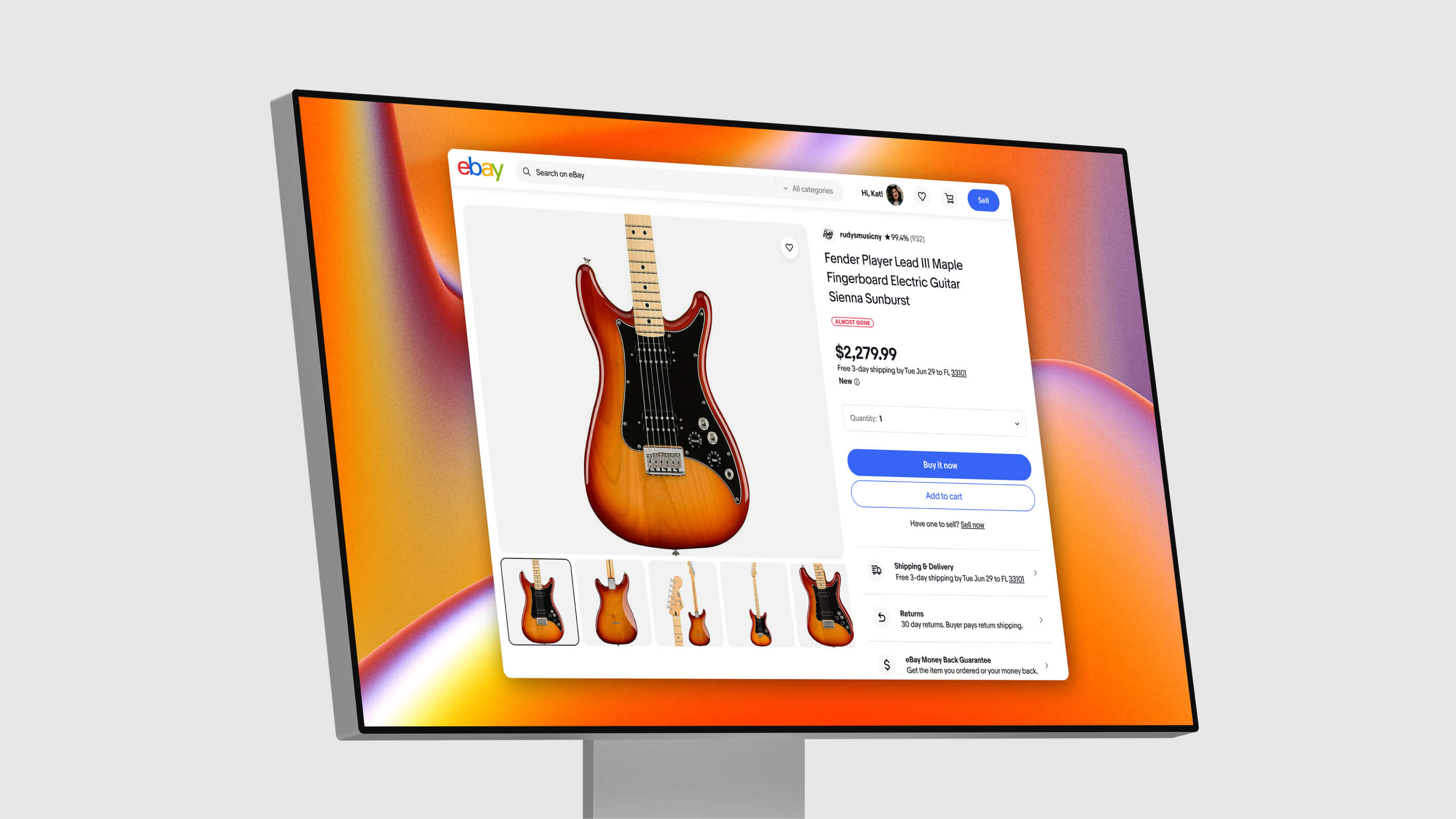
The View Item page is eBay's most highly trafficked page with hundreds of millions of views per day. Years of optimizations made the page extremely dated and complex. I led a redesign to develop a modern and scalable framework that can support products being sold as well as sellers and their brand.
The problem was that it was very difficult for users to find the information they needed in order to make an informed purchase decision due to a visually cluttered and poorly designed page. This resulted in buyers not trusting sellers, their listings, or eBay. The new page was designed to better organize content and ensure the page can flex for categories like home goods, sneakers, and more. We designed and coded prototypes simoultaneously to stress-test ideas and validate ideas with users. While previous attempts to redesign this page had failed, our team succeeded due to cross-functional collaboration, rapid prototyping, a cross-platform execution, and a willingness to innovate and enforce change.
UX FRAMEWORK
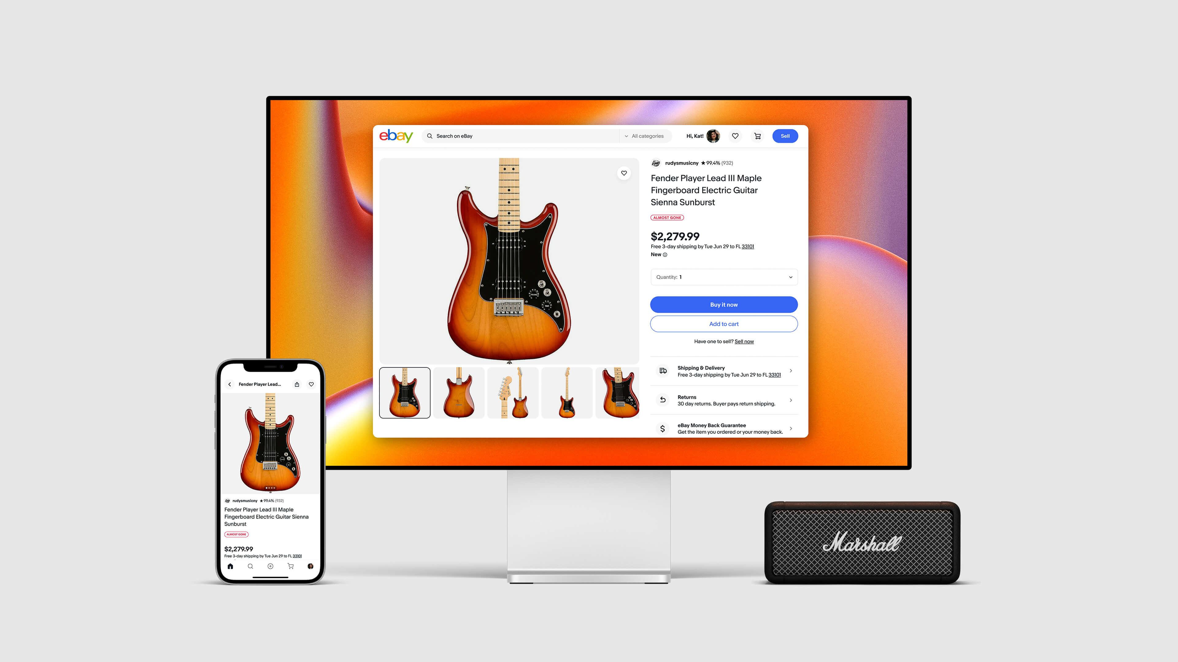
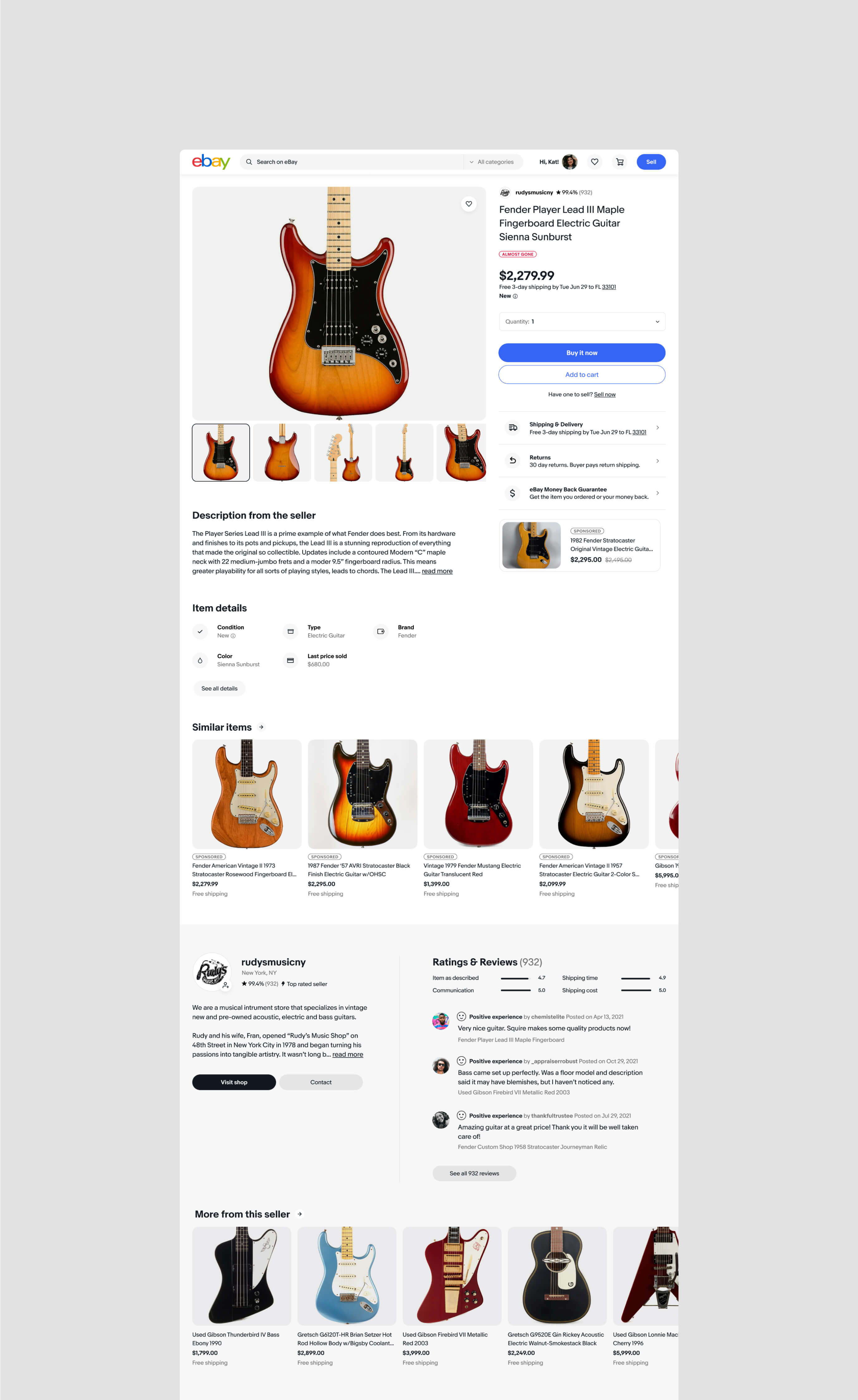
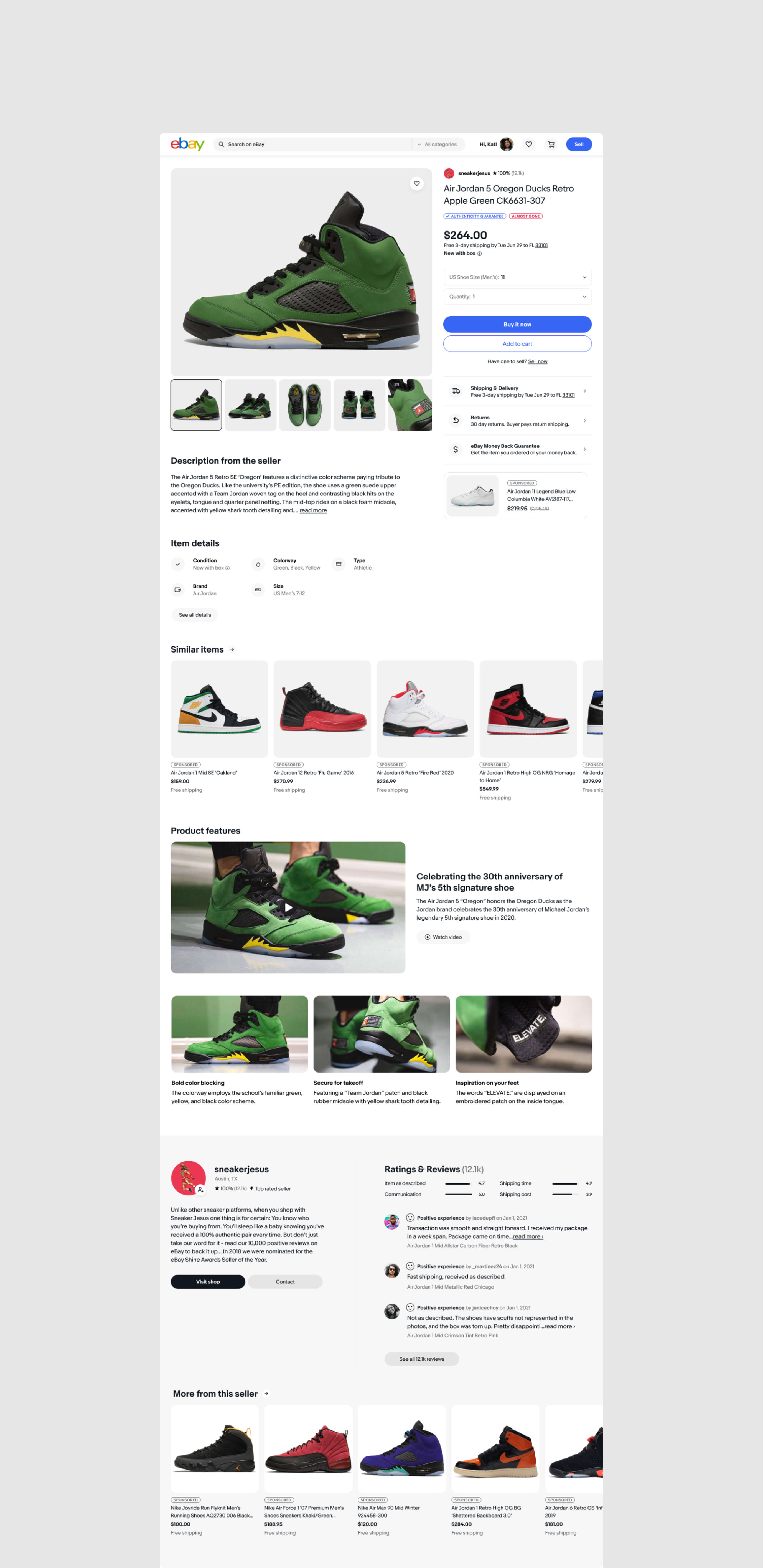
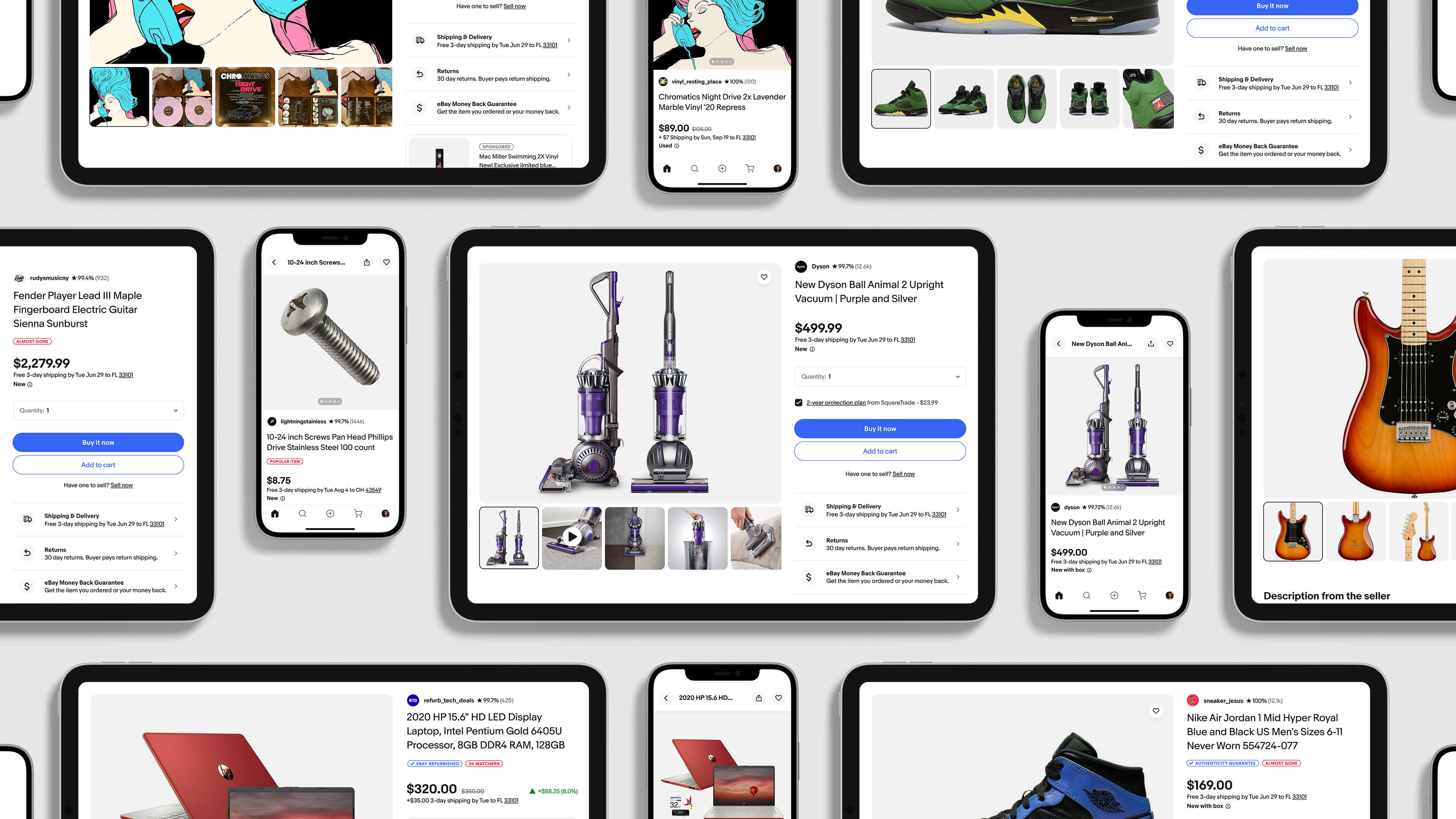
The new framework is organized and scales consistently across displays—small to large.
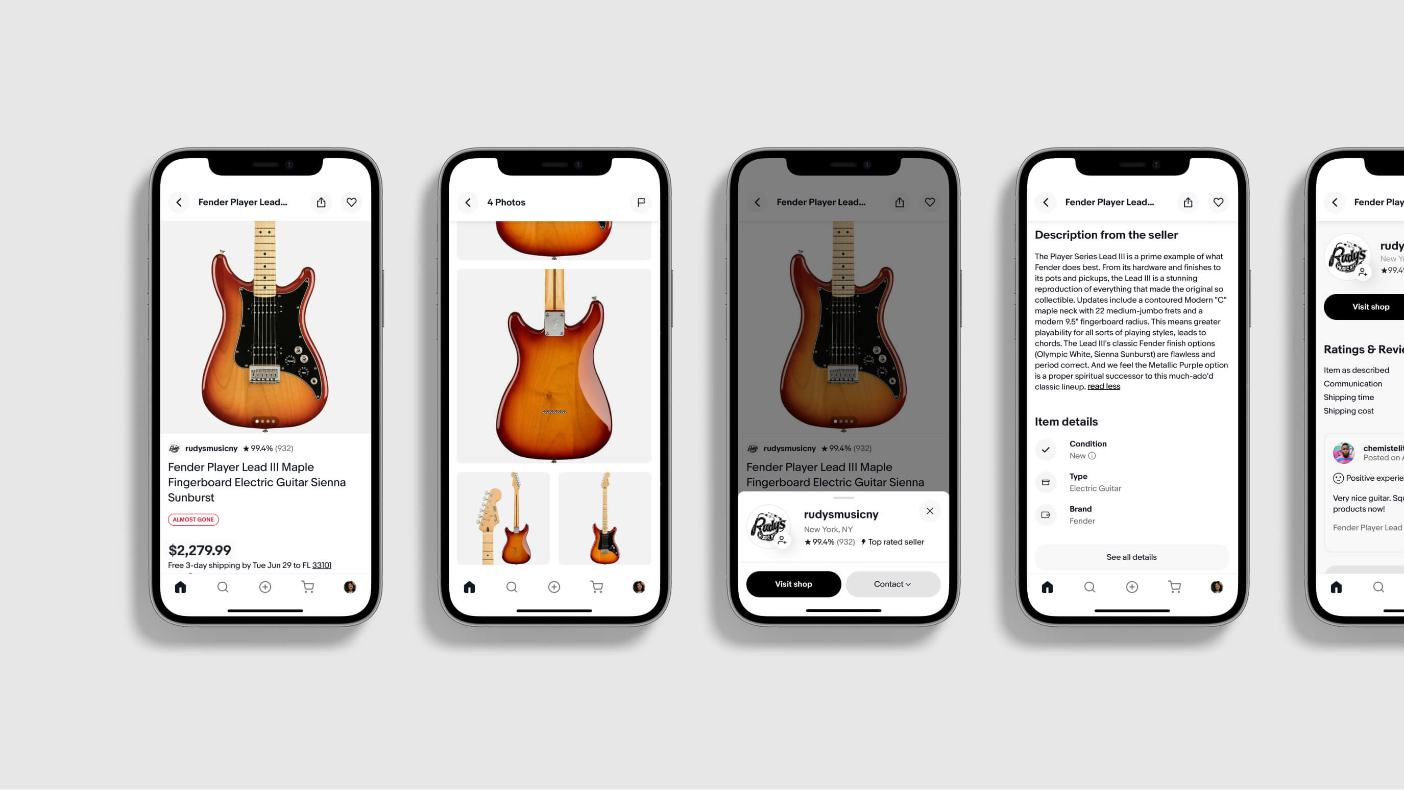
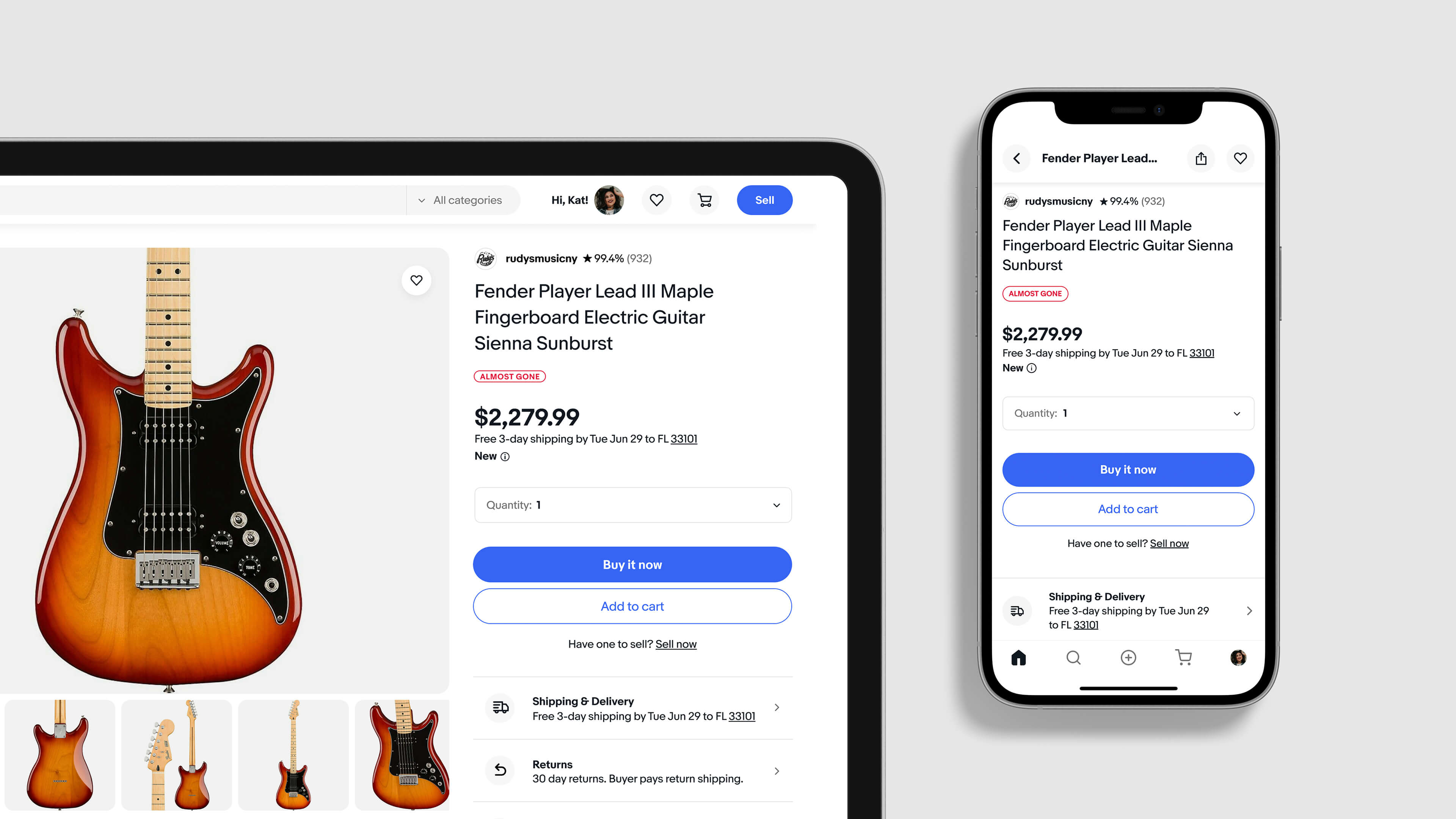
Buyers can easily find the information they're looking for due to an organization of content that reflects the hiearchy of importance to them. Product photos stand out alongside pricing and purchase options, with seller information accessible throughout the page. All to make purchasing easier thus building greater trust with users.
MEDIA GALLERY
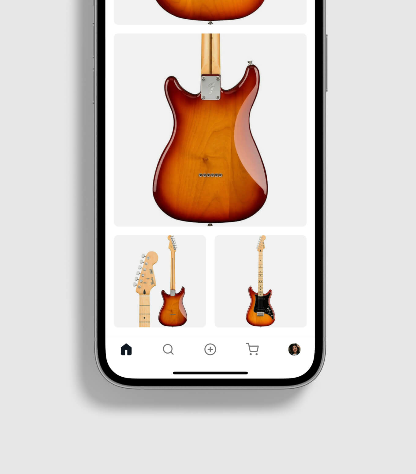
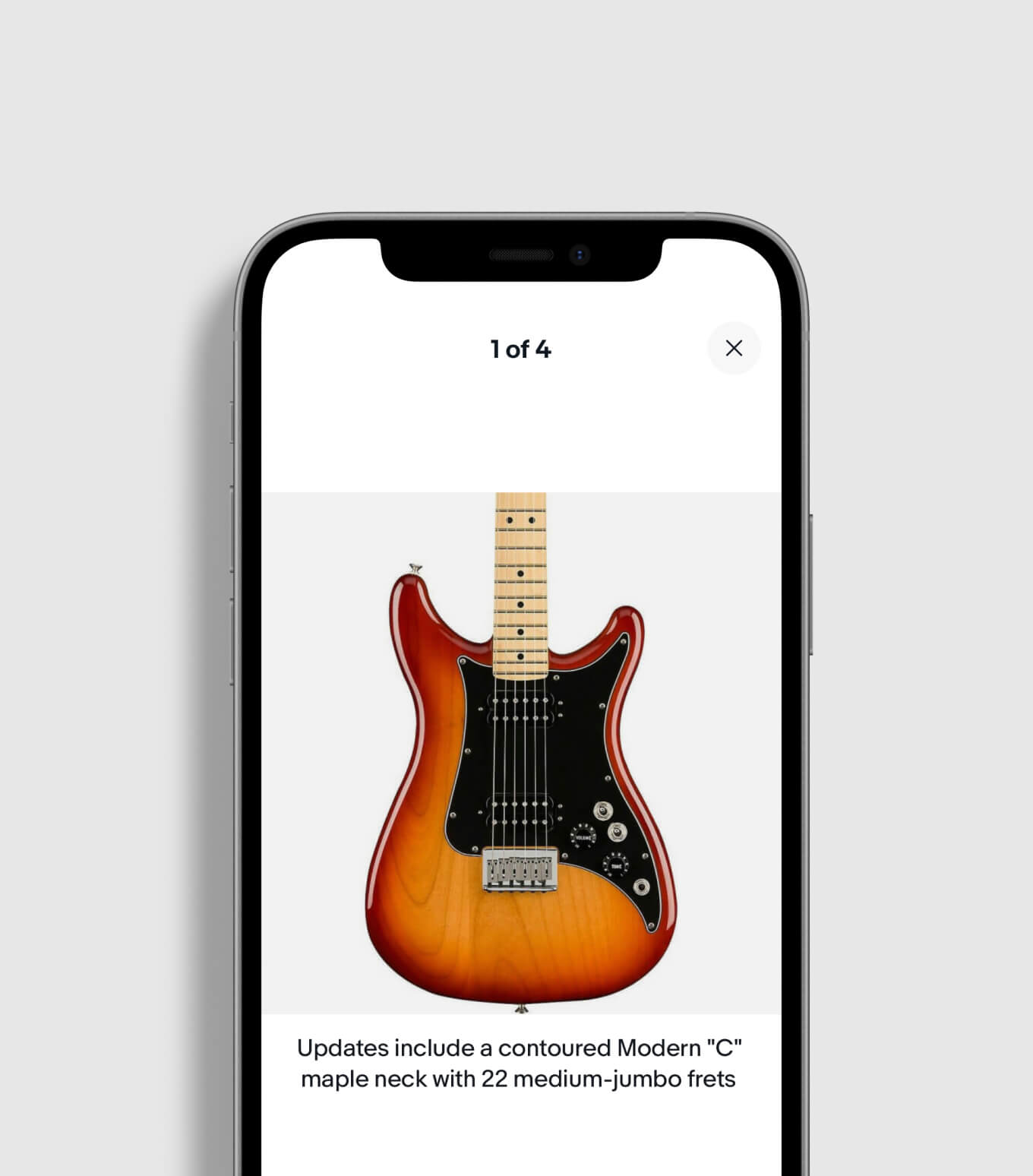
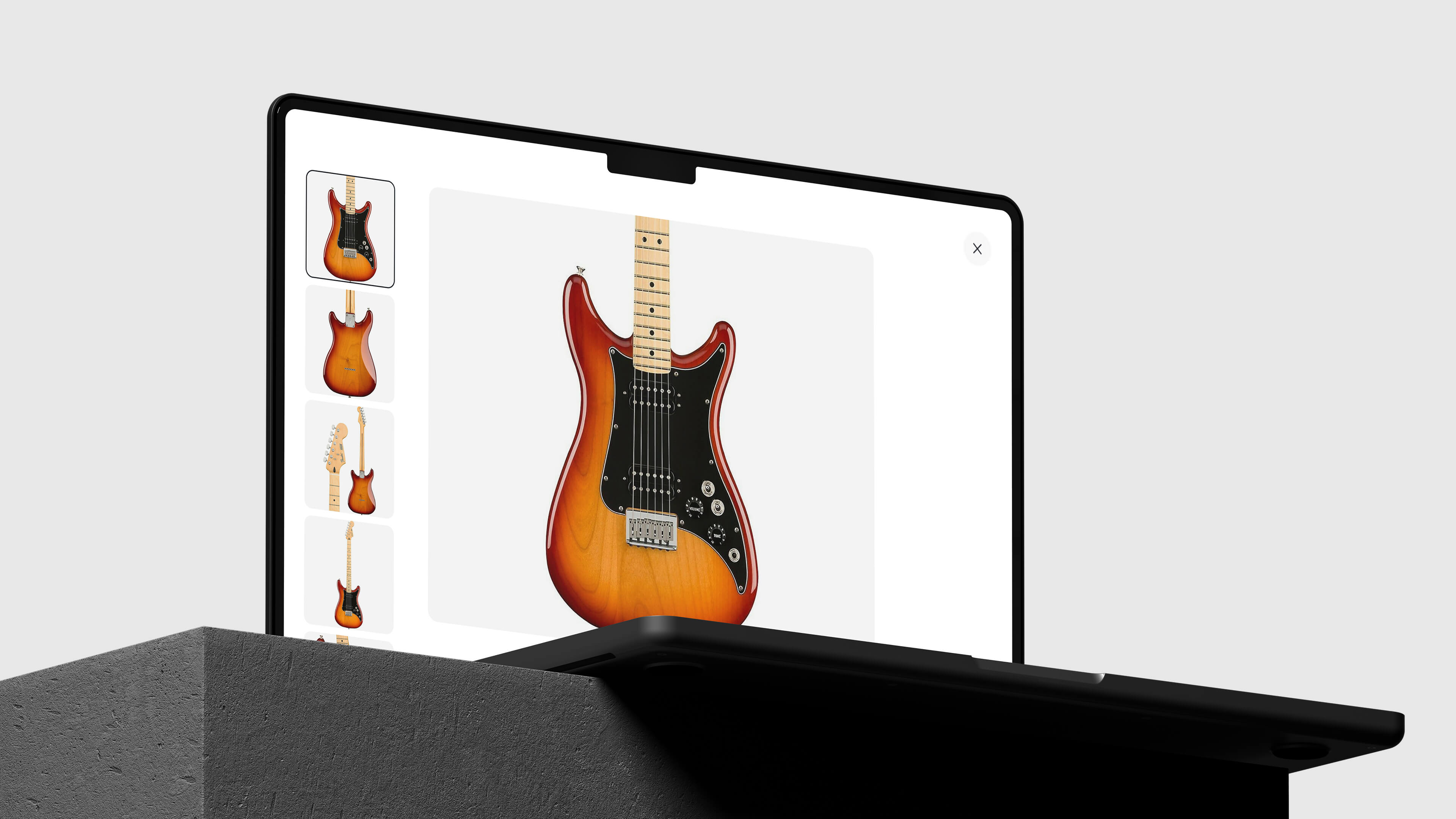
Large image modules draw attention and visually highlight product details.
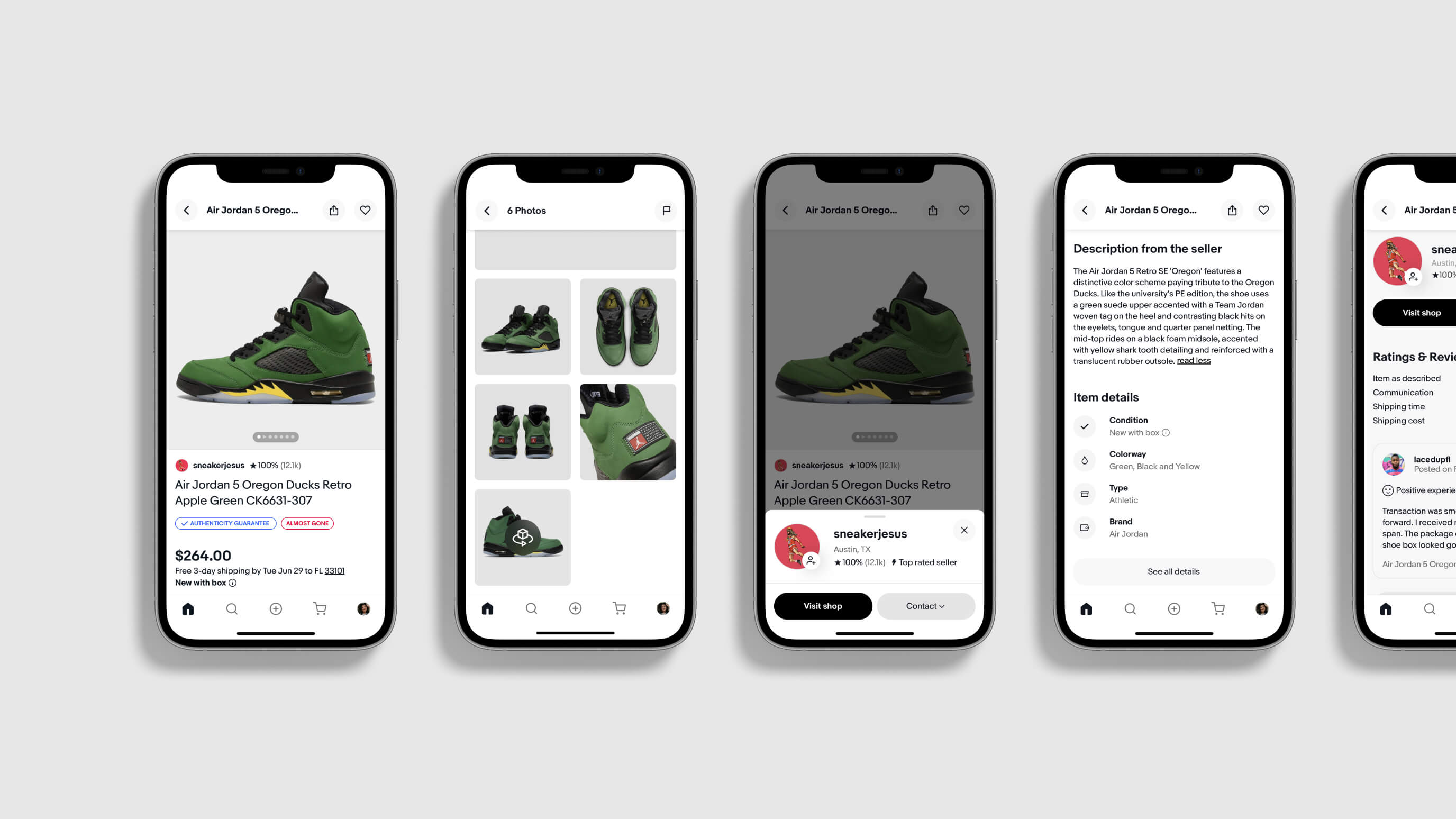
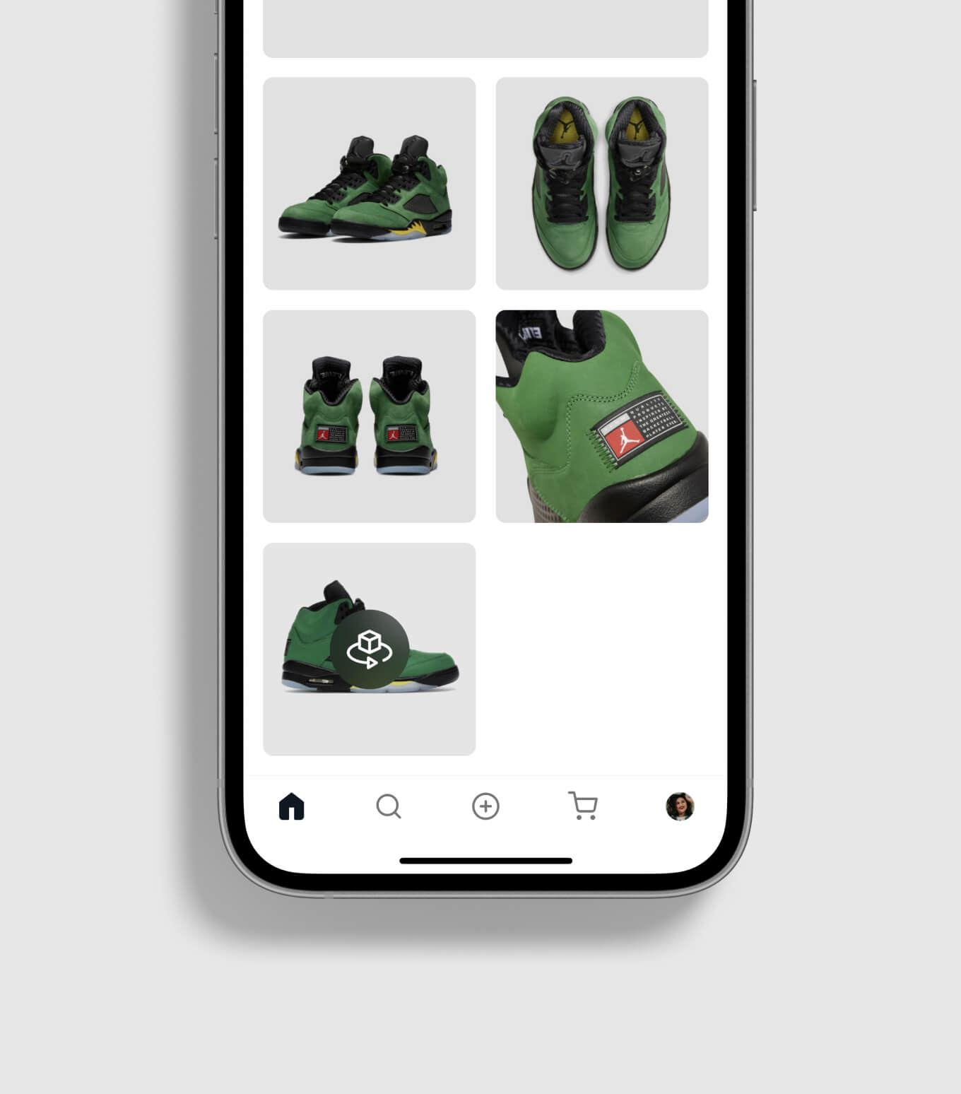
Photos greatly inform much of the purchase decision making of buyers. We made the image modules larger, and buyers can enter the gallery to examine images and read captions that capture specific details about an item and its condition.
BUY BOX
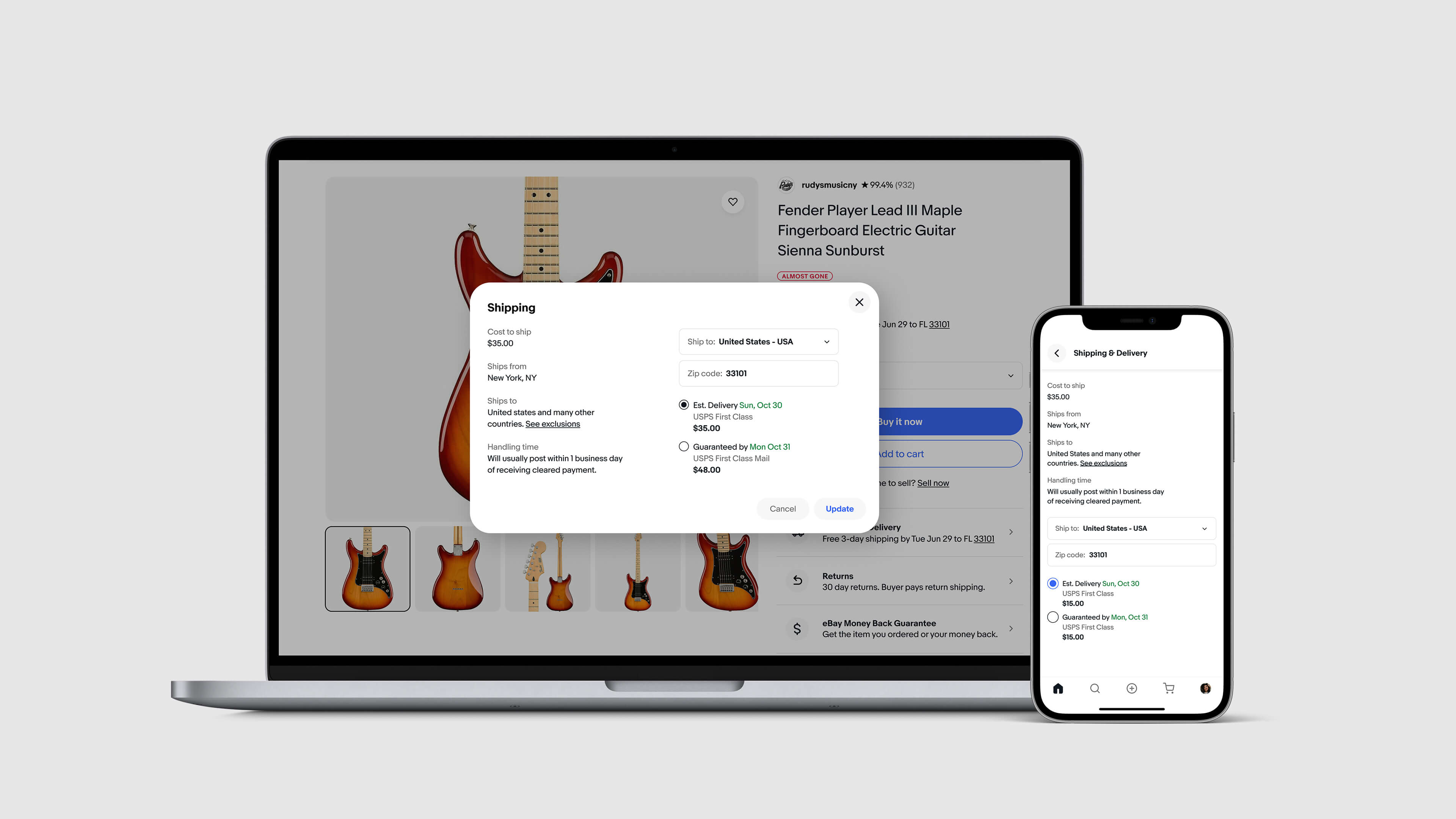
Item info like price, reviews, and purchase options are grouped closely together.
eBay's "Buy-Box", the area and modules that containt these highly important elements, now scale to accomodate a multitude of SKUs and options without breaking the layout of the page. An assigned area for key confidence drivers like eBay's Money Back Guarantee and return policies leverage modality so that buyers can learn more without traveling off the page.
SELLER INFO
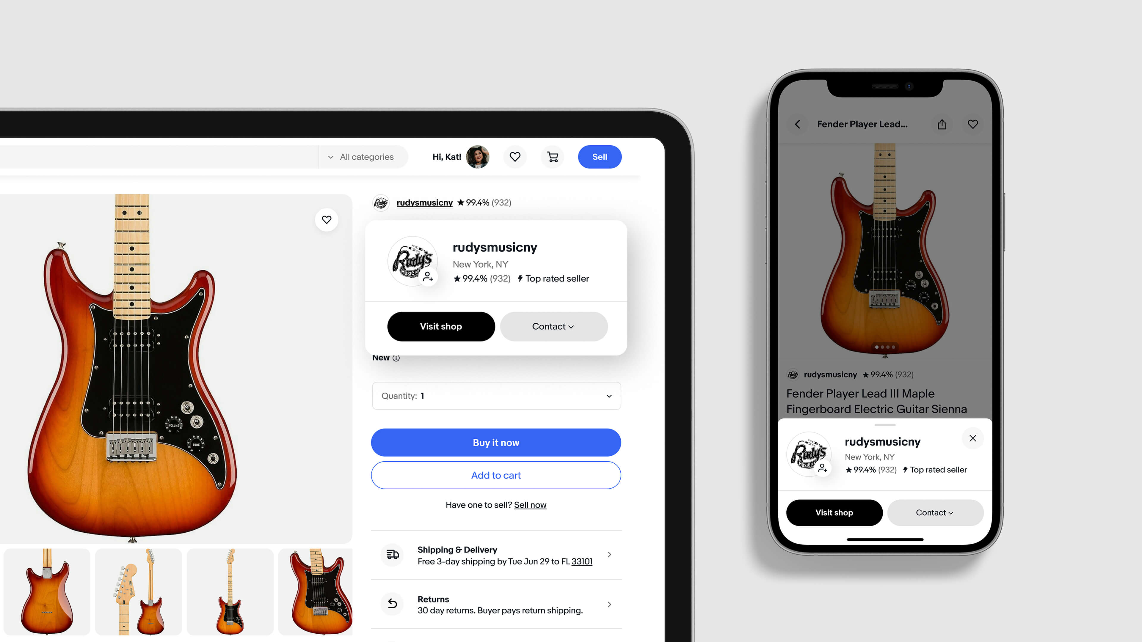
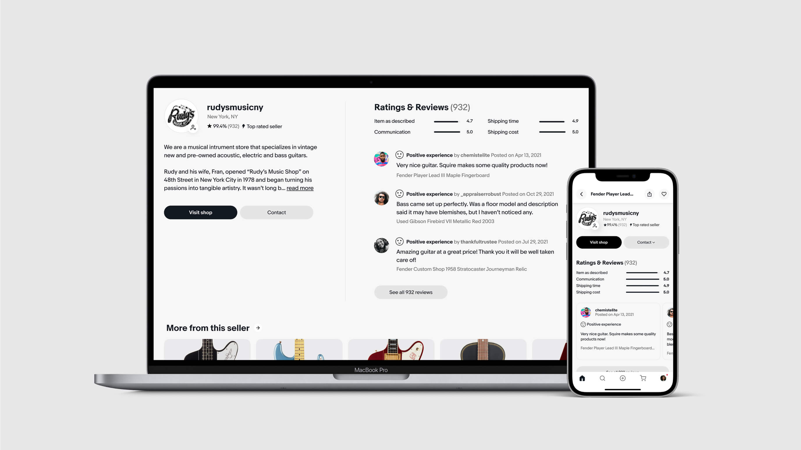
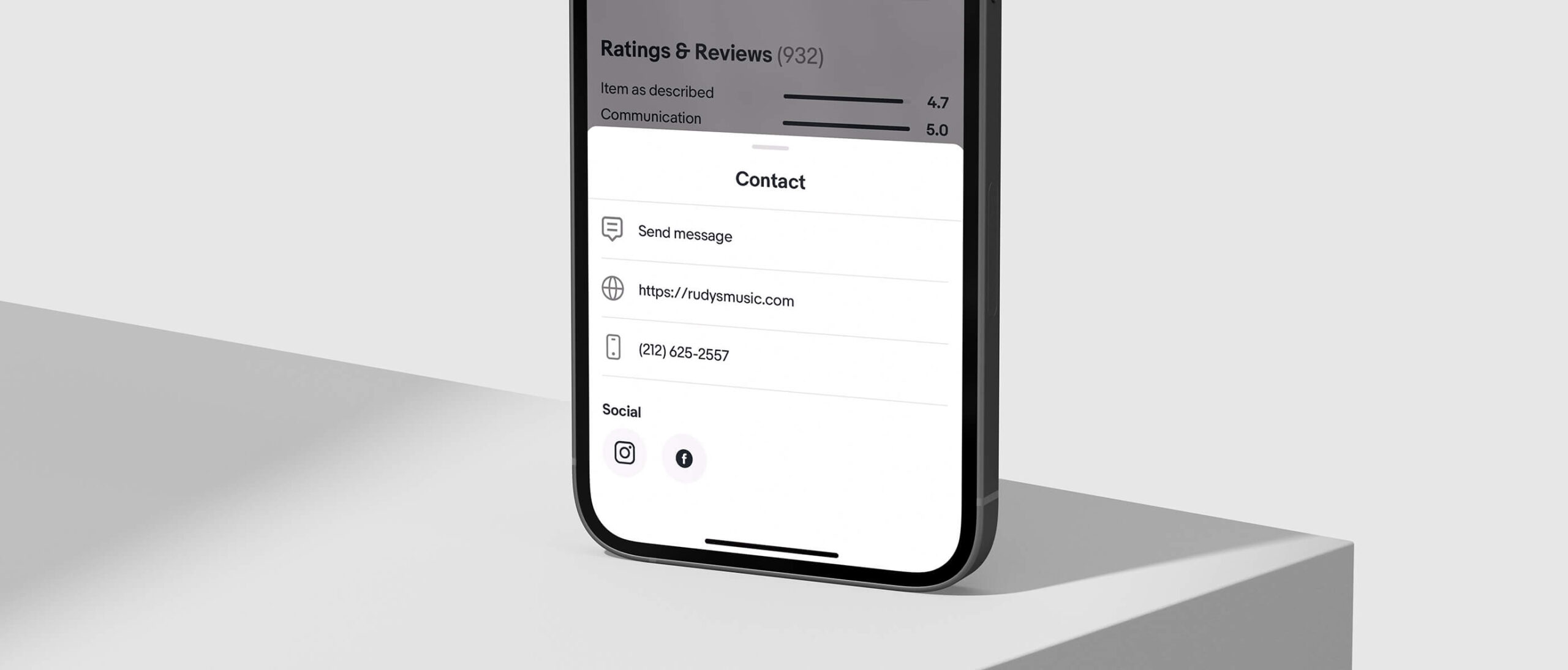
We made seller information and contact easily accessible throughout the page.
Dedicated zones for seller content included the "hand-shake" module as an intro at the top of the page followed by a larger seller section further down. Buyers can now see who the sellers are, their ratings/reviews, visit their shops, or contact them.
FLEXIBILITY
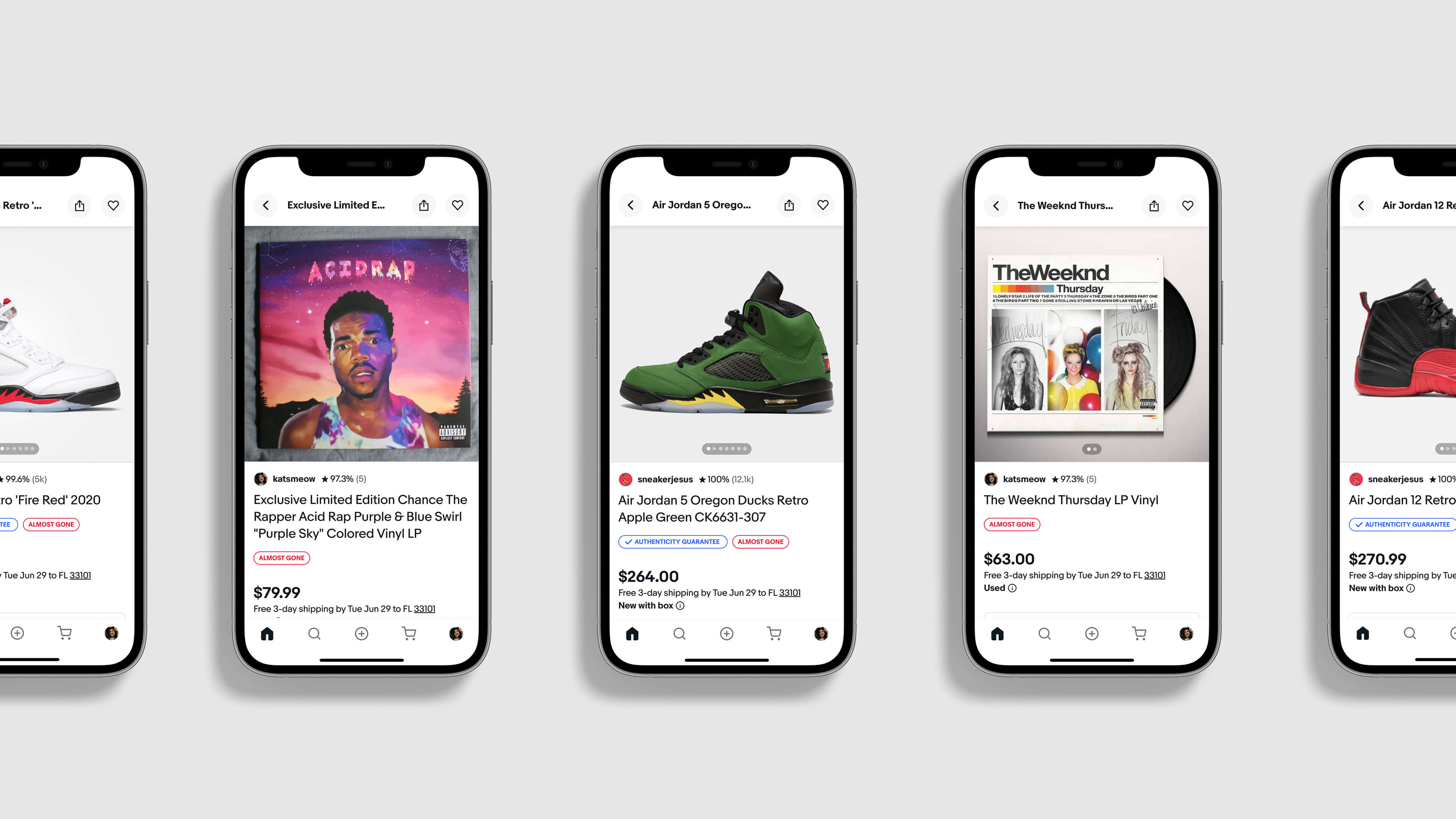
The page flexes for the needs of many categories of items that are sold.
Buyers can shop with familiarity across View Item pages while being introduced to category-specific content. For example, sneaker buyers experience a version of the page allowing them to evaluate products in immersive 3D and to learn about product features or how eBay's Authenticity Guarantee program works.
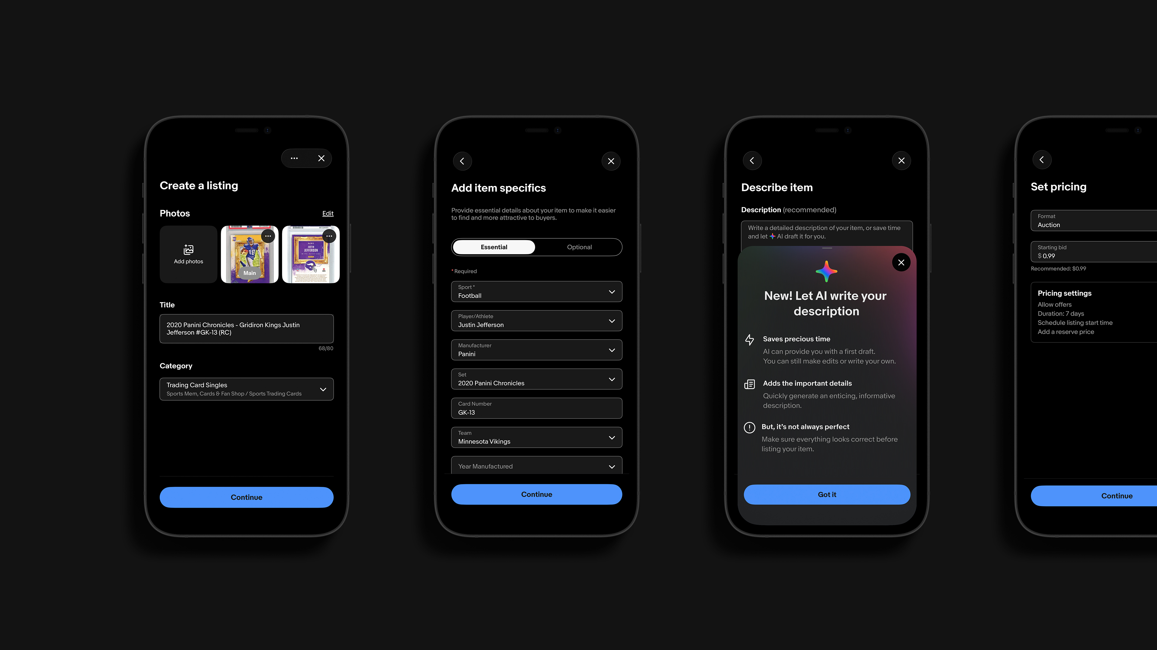
EBAY SIMPLIFIED LISTING
Creating an AI-powered listing experience.
BRAND: EBAY
DATE: 2023
PLATFORM: IOS/ANDROID
ROLE: DIRECTION/DESIGN
Have a big idea?
Let's bring it to life, together.
©2026 TALKAR - NEW YORK, NEW YORK

