
AT&T ICONOGRAPHY
Creating an ecosystem of digital icons.
BRAND: AT&T
DATE: 2020
PLATFORMS: DIGITAL/PRINT
ROLE: DIRECTION
TEAMS: AT&T X BUCK
Over 7 years old, AT&T's icon library was in drastic need of a redesign. Partnering with AT&T's internal brand team, entertainment product team, and Buck creative agency, I led the creative development of an ecosystem of icons that reflects the AT&T brand and that scales across all AT&T's touchpoints.
AT&T uses a system of icons that serve a variety of internal and external needs. Through time, updates to the icons, as well as the creation of ad-hoc custom icons, resulted in a massive library of over 1,600. The current suite of icons didn't function well within digital applications and were designed based on an older visual language. We needed a unified set of recognizeable icons that would function across all touchpoints—from digital to print, small to large.
*Some UI below was created by others and is shown for reference purposes.
HIGHLIGHTS
1,600+
Icons audited and redesigned.
25+
App icons redesigned.
1/3
Icons removed from a bloated system.
ALL
of AT&T aligned on new design system.
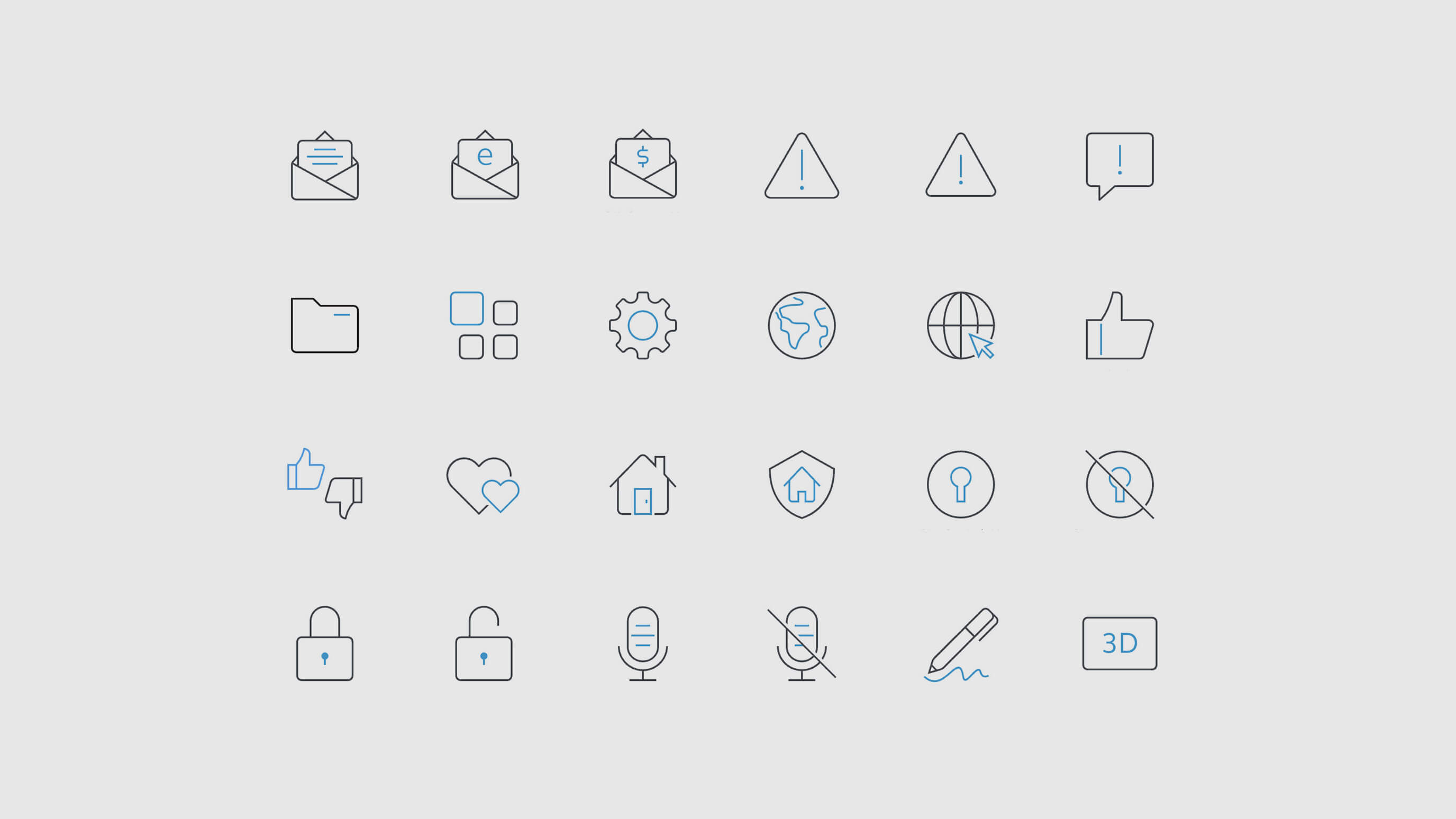
FUNCTIONAL ICONS
Functional icons were designed to ensure legibility and scalability across experiences. They informed the underlying design principles that guided the icon ecosystem.
Created without digital needs in mind, AT&T's original icons were complex—breaking down at small sizes and being applied inconsistenly across products. We created a family of functional icons that could support AT&T's many digital experiences. Building the system on a foundation of digital requirements, the suite was designed to work at small scale and be simple, modern, and clear. The icon's drew inspiration from AT&T's custom font, Aleck Sans. With Aleck's combination of sharp and round elements, it's bold yet approachable. The icons incorporated these characteristics to create synergy in the environments they'd populate.
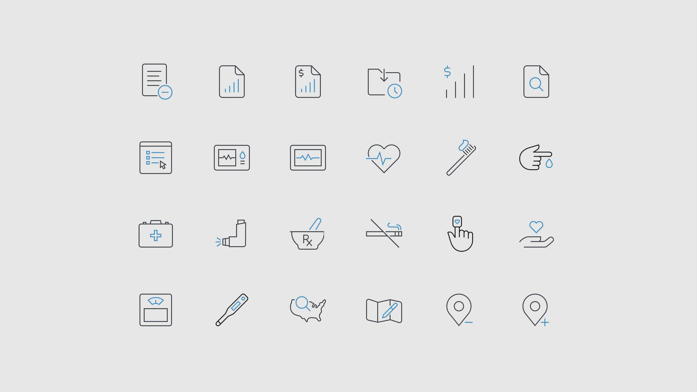
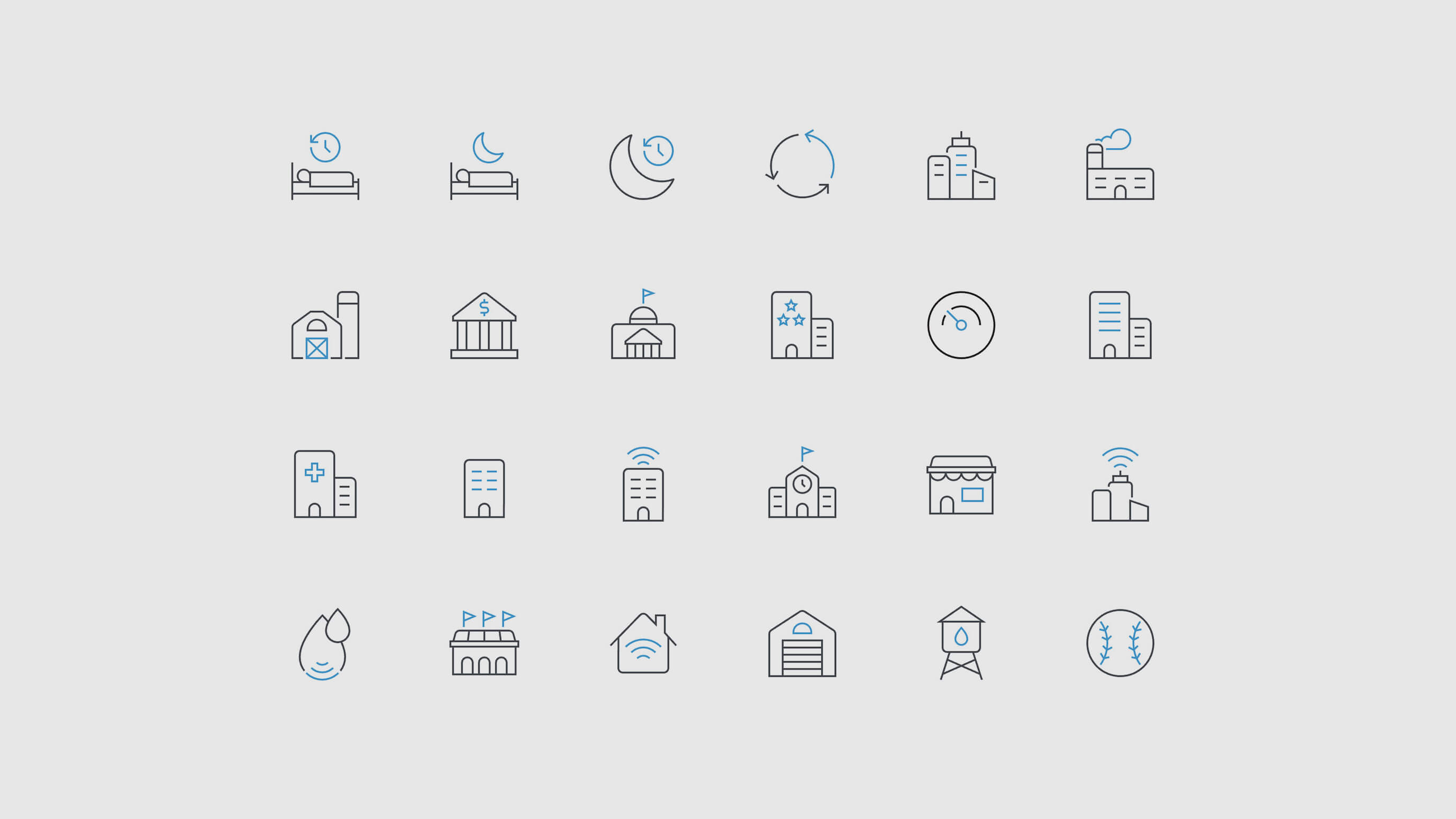
PICTOGRAMS
Created for expressive uses of iconography—Pictograms are intended to be used at larger scales to signal the brand.
Building from the DNA of the Functional icons, Pictograms were designed to work in harmony as part of the overall icon family. Intended for use at 96px or larger, we were able to up the fidelity allowing each icon to communicate more, visually. AT&T brand-blue highlighted key aspects of each metaphor. These worked extremely well in digital brand placements, print collateral, and business presentations.
APP ICONS
App Icons were redesigned to build brand awareness, drive consistency, and maximize legibility for each AT&T app.
The landscape of AT&T app icons was fragmented with individual business units creating the icons in various and often poorly designed ways. We established an underlying design system to unify them with each app icon consisting of three brand elements: the AT&T blue gradient, the AT&T globe, and either a product logo or icon. Used together, this established the icons as part of a cohesive family that would help them stand apart from other apps.

AT&T PHOTOGRAPHY
Charting a course for future pioneers.
BRAND: AT&T
DATE: 2020
PLATFORM: DIGITAL/PRINT
ROLE: DIRECTION/DESIGN
Have a big idea?
Let's bring it to life, together.
©2026 TALKAR - NEW YORK, NEW YORK
