HCOM Evolution
Reconnecting brand and product into one direction for savvy trip takers.
- Project
- 02/14
- Brand
- Expedia
- Date
- 2025
- Platforms
- iOS/Android/Web
- Role
- Principal Designer
- Teams
- Hotels.com, Expedia Group
- Status
- In Progress
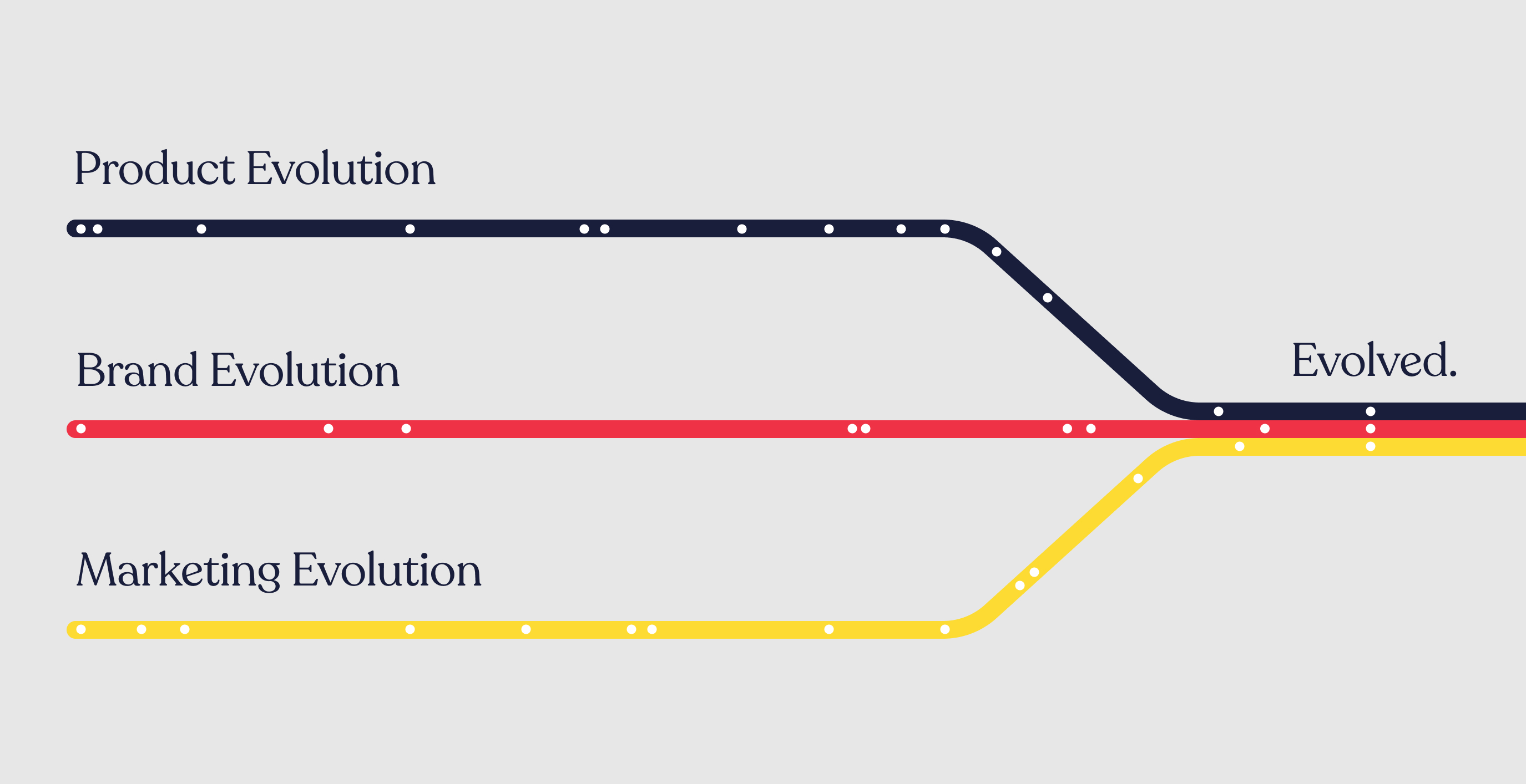
Brand, product, and marketing had each been evolving independently. Creating synergy between them was the premise of the entire program.
Three teams had been improving their own surface area and the result still read as inconsistent to a traveler who experiences all three as one company. Aligning the evolutions mattered more than perfecting any one of them.
As Principal Designer, I led the digital product evolution of Hotels.com—reconnecting brand strategy, design foundations, and product experience into a single direction. Working across the Traveler Design Organization, I defined the design principles behind our "savvy trip taker" audience, evolved the brand's digital vocabulary, and applied it through four strategic experience pillars.
The work is a conceptual vision, meant to inspire the teams on how brand and product can connect, and where the product needs to go to deliver those pillars. The expectation is to align on that direction, then refine the design system and the key pages step by step, against real user needs and use cases.
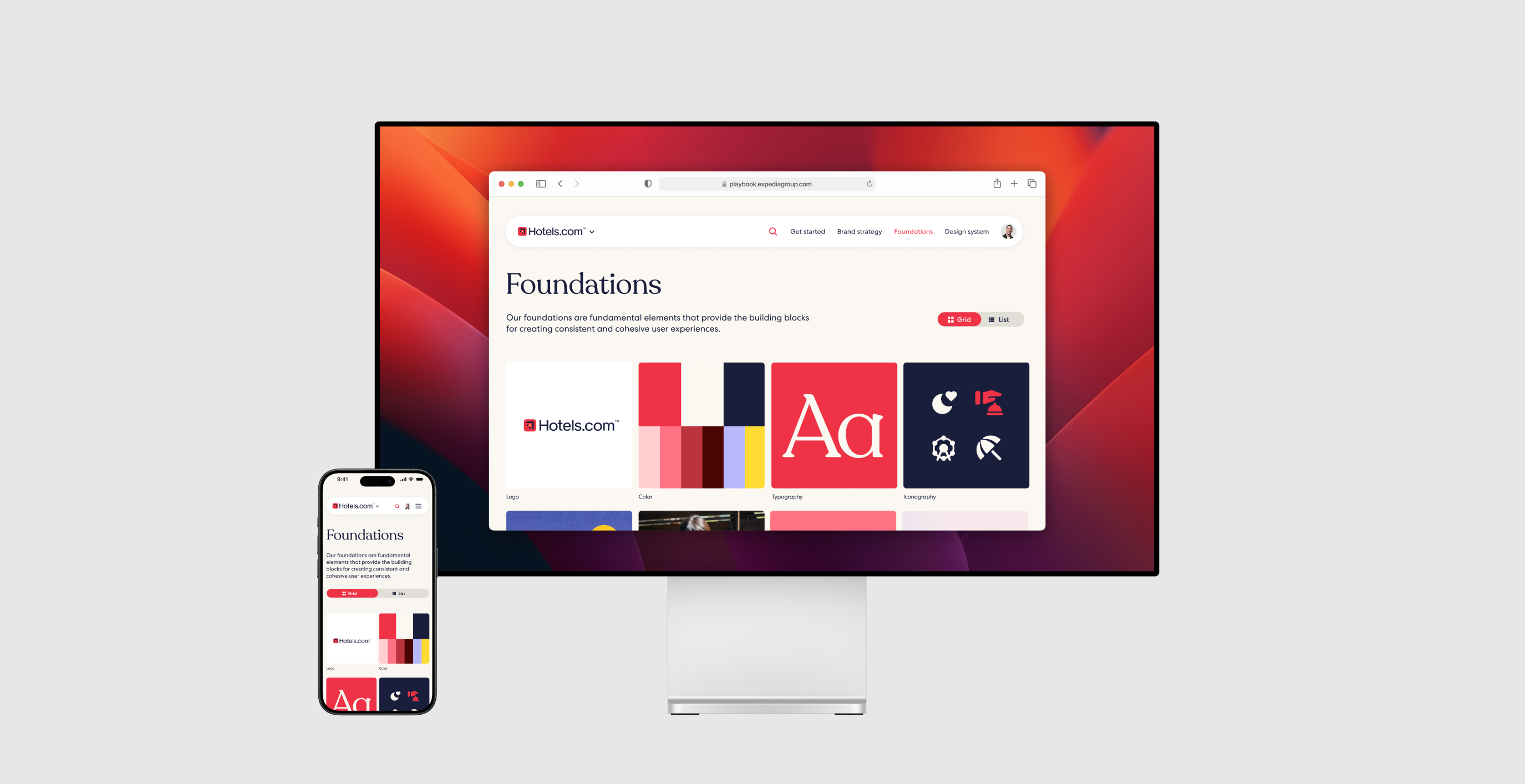
Foundations
Brand strategy and the foundations had to become one system, built for a product rather than a campaign.
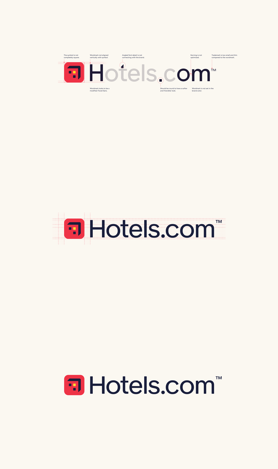
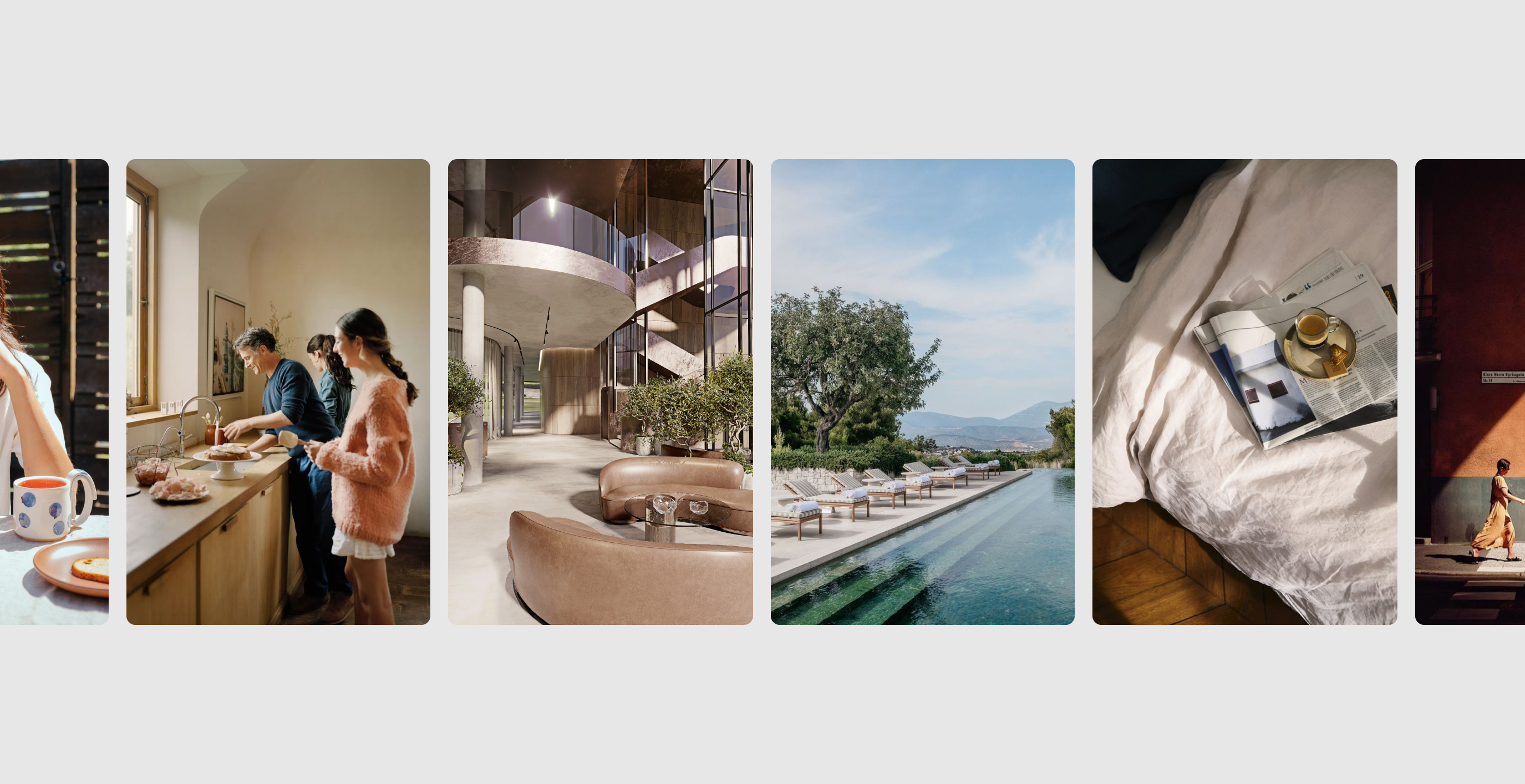
The brand hadn’t been able to sufficiently reflect its identity in digital products. I took the new brand strategy and foundations and explored how best to implement them in the product, meeting product goals while appealing to a younger, more savvy audience of travelers.
Everything starts with the savvy trip taker: mobile-first, in control, and motivated by travel envy. The line we designed against was simple—designed to make you feel savvy. Confident becomes distinct, sophisticated becomes balanced, intuitive becomes natural, and practical becomes guided, so the product work stays tethered to the strategy.
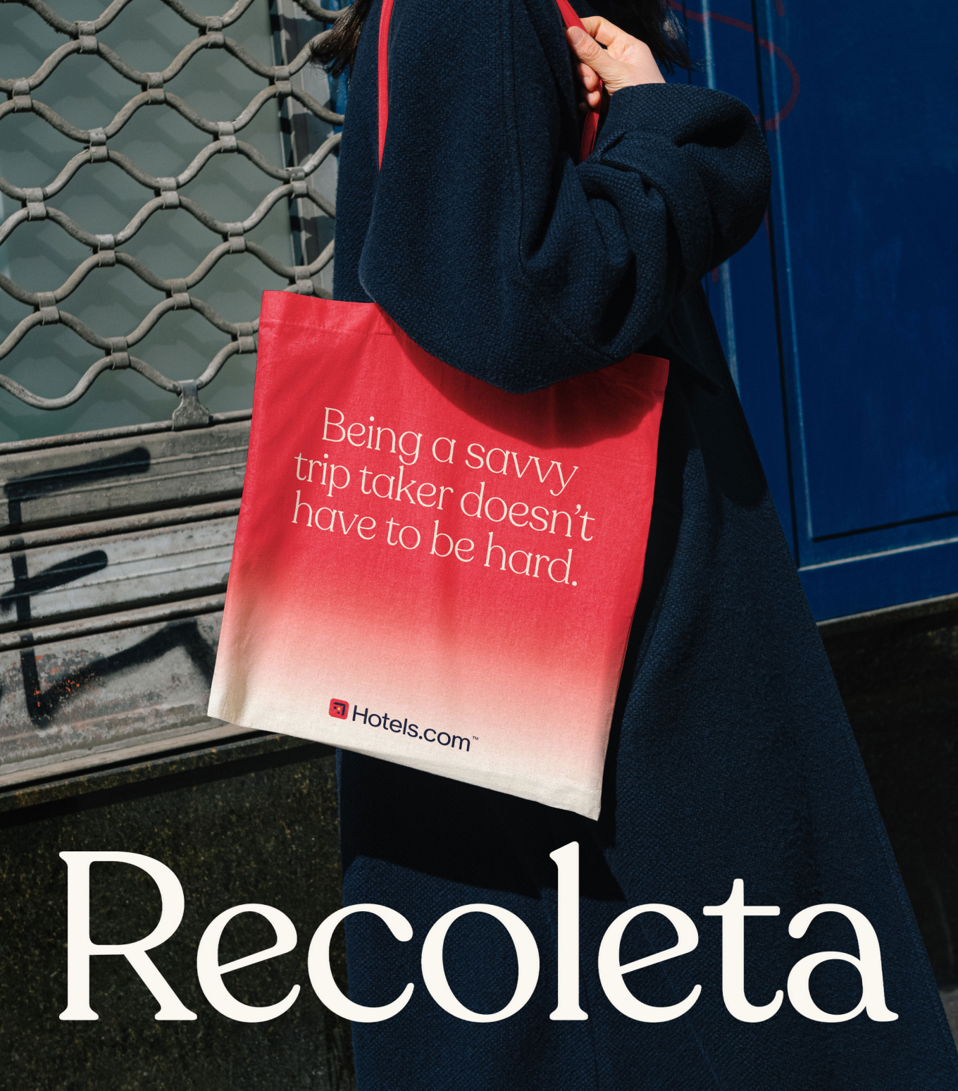
The brand team had already refreshed the foundations, introducing Recoleta and a run of new purples. Together they felt like Valentine’s Day. The identity wasn’t shaped around digital needs, and the design system applied it literally: bright blue buttons in the same style as Expedia and Vrbo, on a white app that was a minor skin of the Expedia app. I pulled yellow from the illuminated window of the logo to break up the pink and keep the meaning of light, on, and access. The aim was a bespoke Hotels.com that still fits the brand architecture—recognizable, and finally built for the screen.



Product
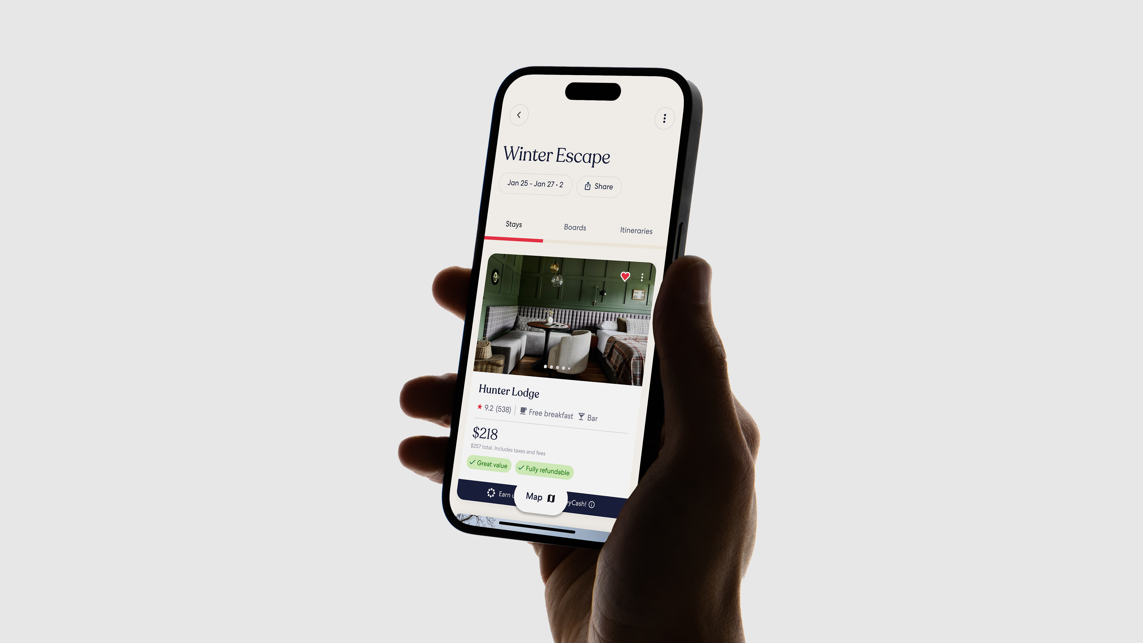
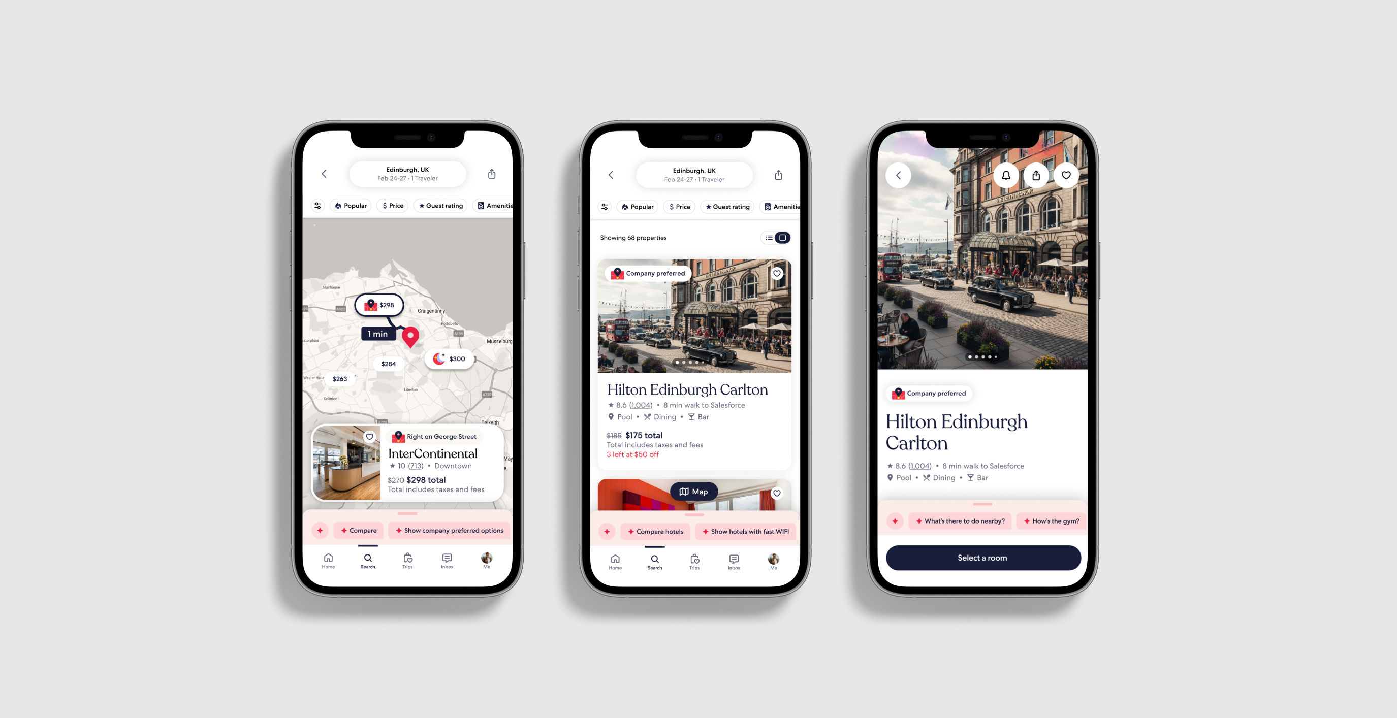
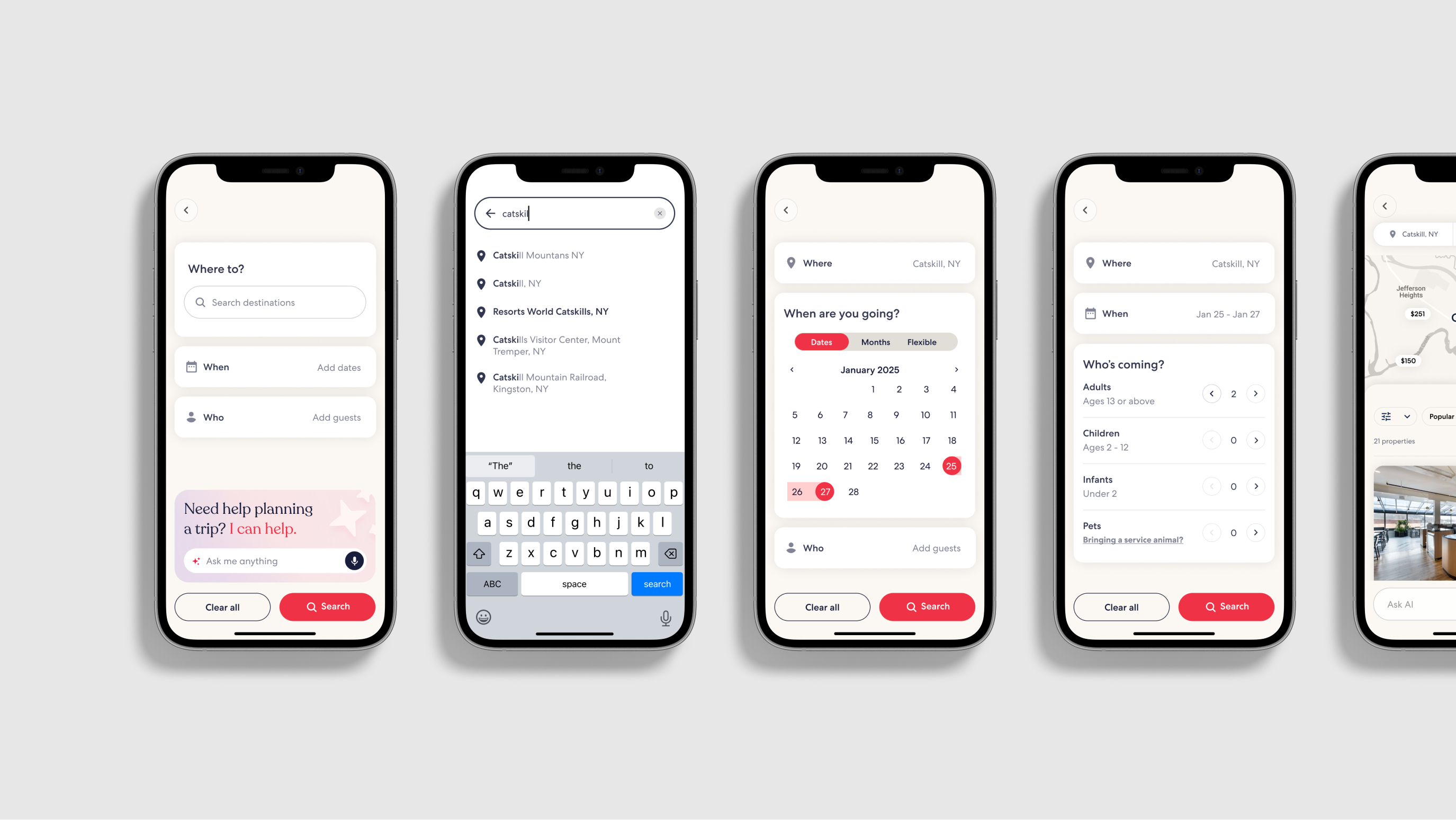
I imagined the core pages from the foundations and the pillars, as a picture of where the product needs to go.
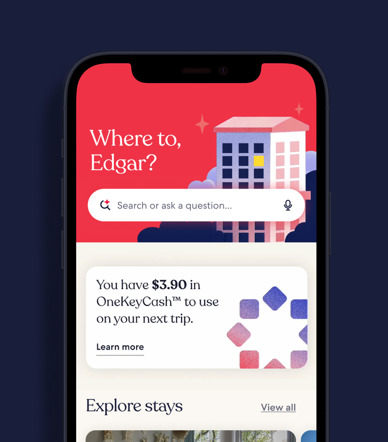
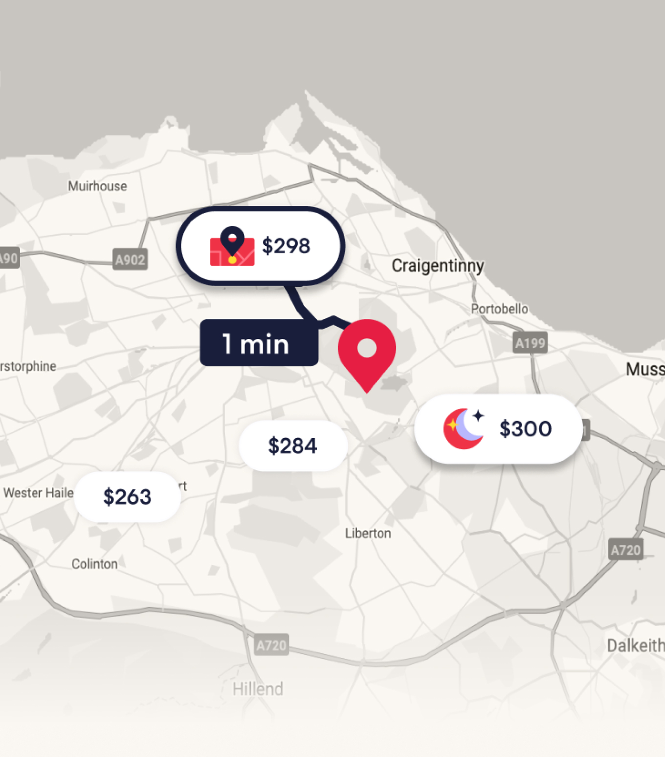
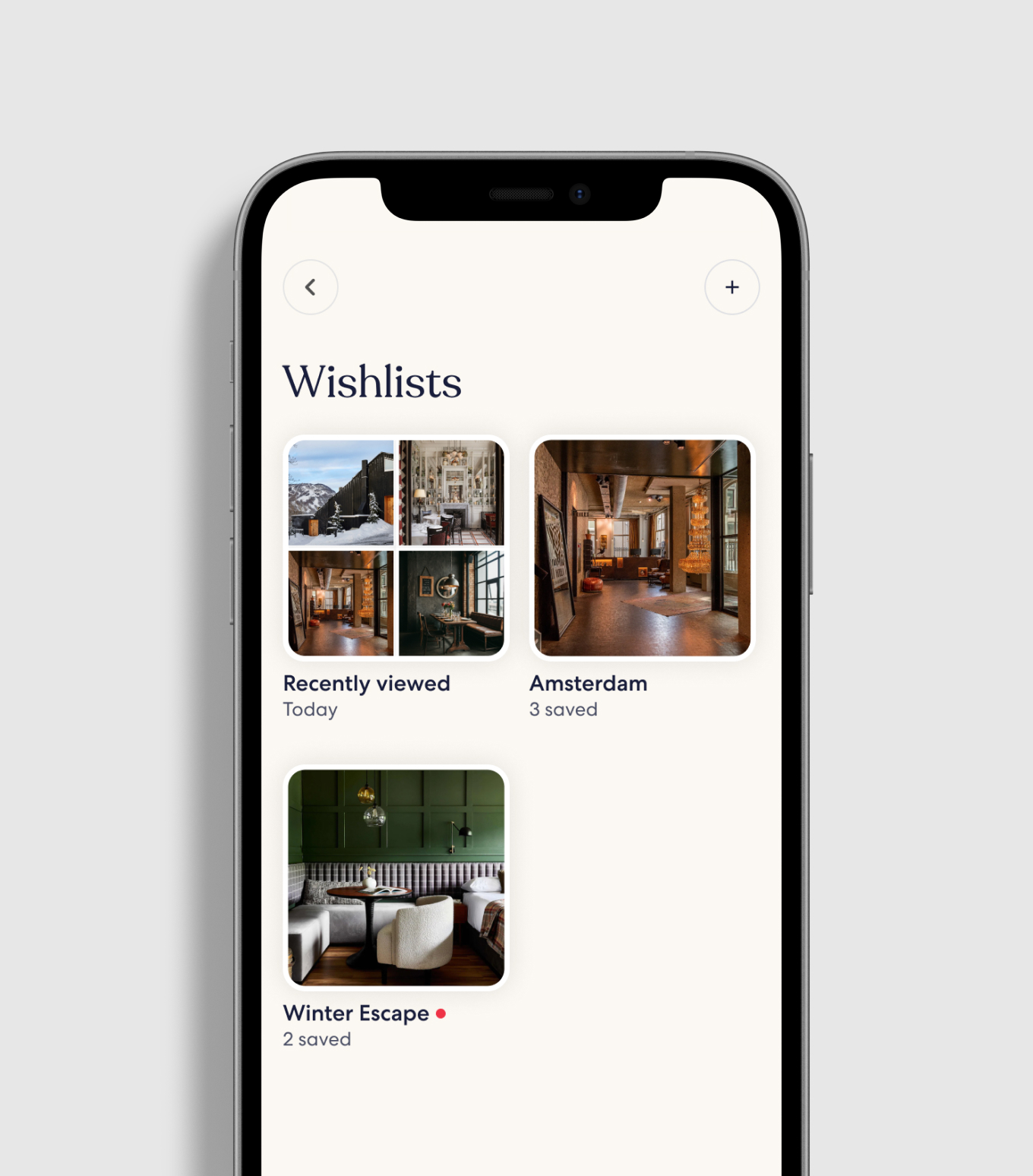
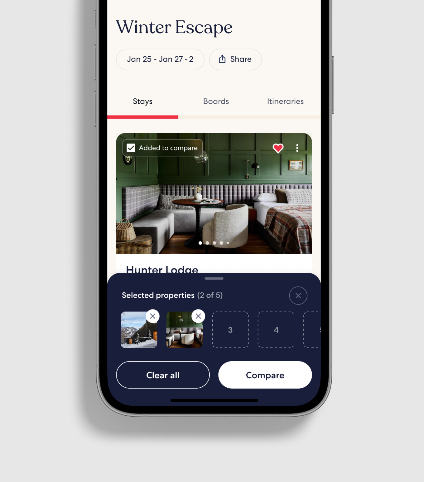
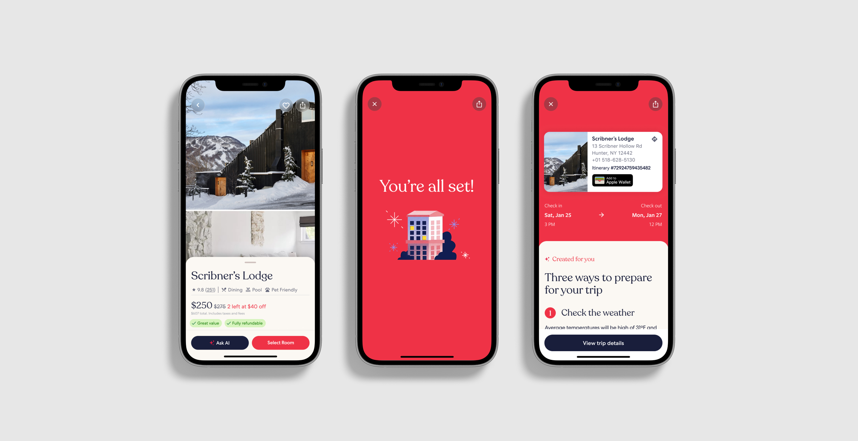
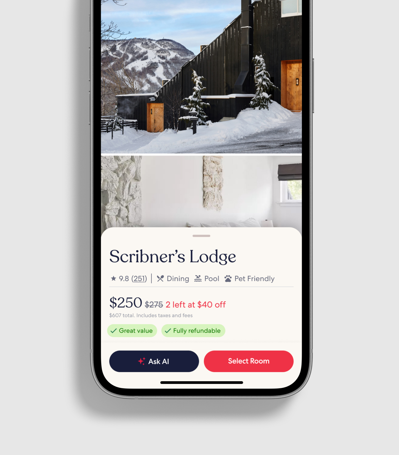
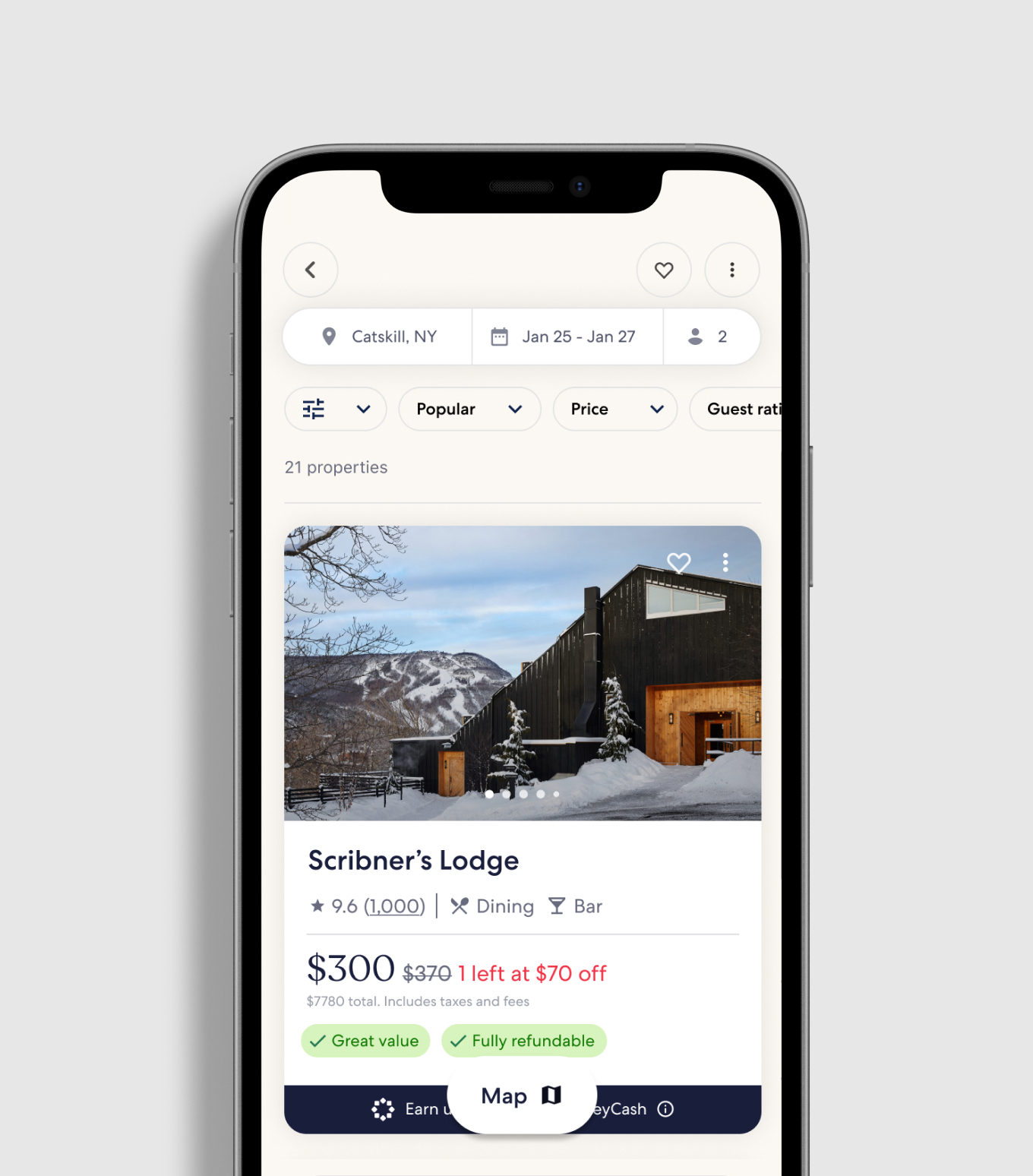
Four pillars—Inspired Discovery, Meaningful Choice, Complete Confidence, and Boundless Appreciation—name why travelers come to us: to explore, to search, for ease, and for delight. Home, results, comparison, and membership are built from that, aimed at the insights and the pain points. Cream replaces the white Expedia canvas, and each page is drawn as a complete step rather than a half-applied system.
I pushed a darker, more sophisticated blue for the CTA buttons, and Recoleta through the headers, to connect the app back to the brand and differentiate it from Expedia and Vrbo. Softly elevated cards increase the interactive affordance and group the content on the page. Red is kept for the most precious moments—Select or Book a trip, a trip confirmed. Light pink is reserved for the magical moments of AI. Held together, the system makes a simple, elegant, poised UI.
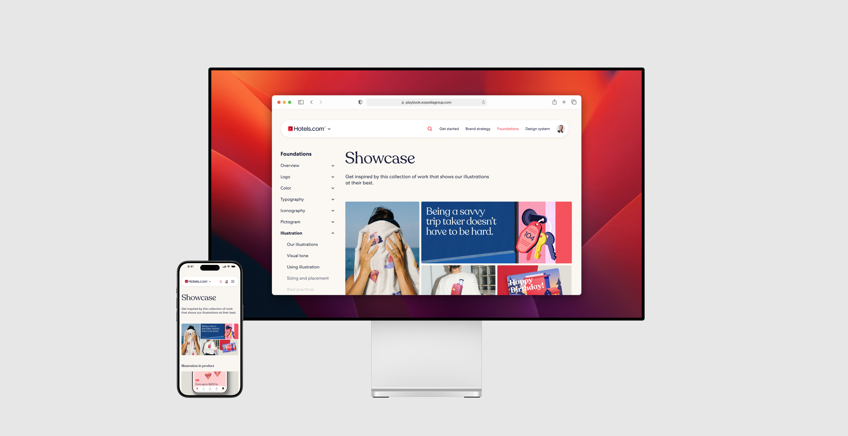
Playbook
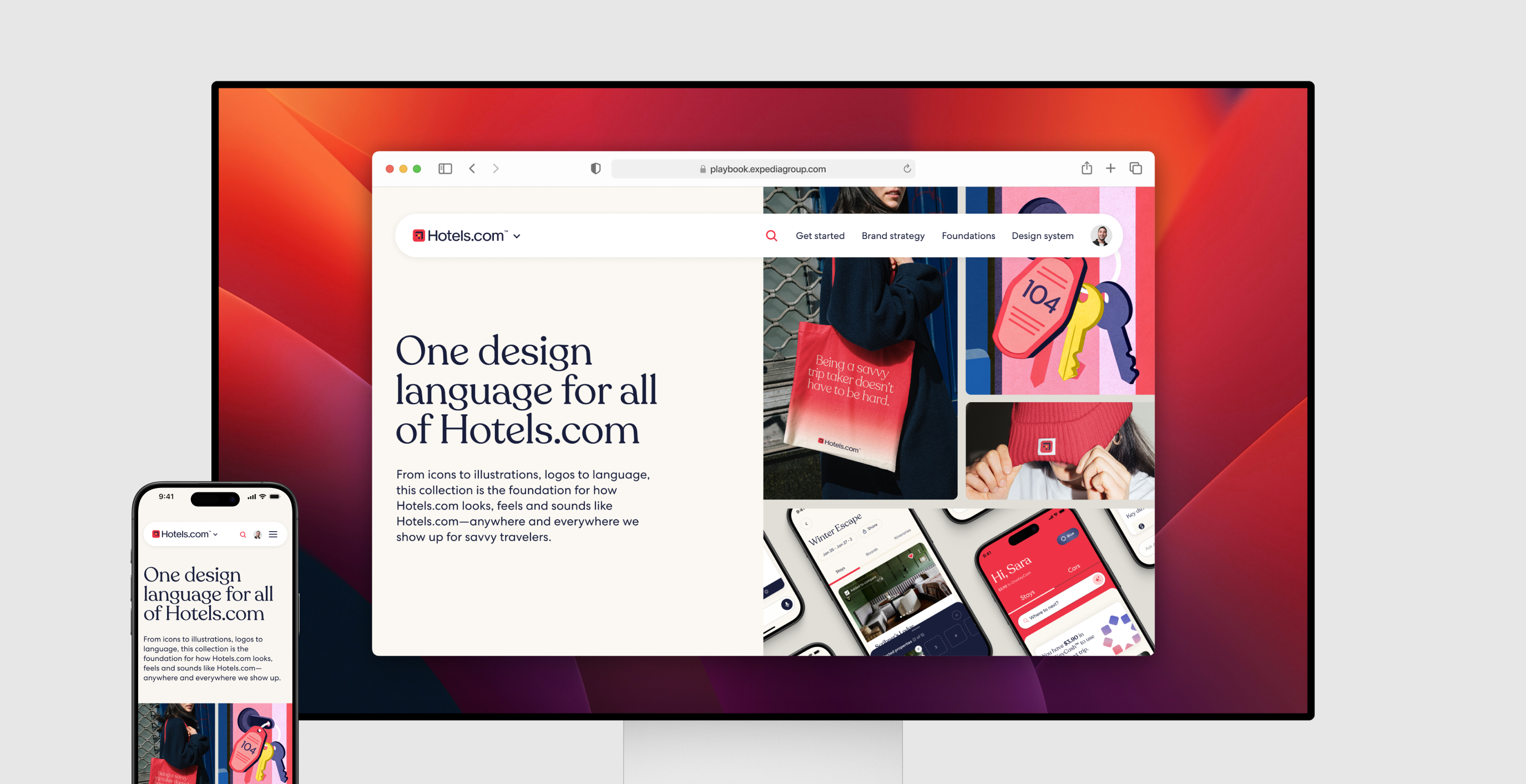
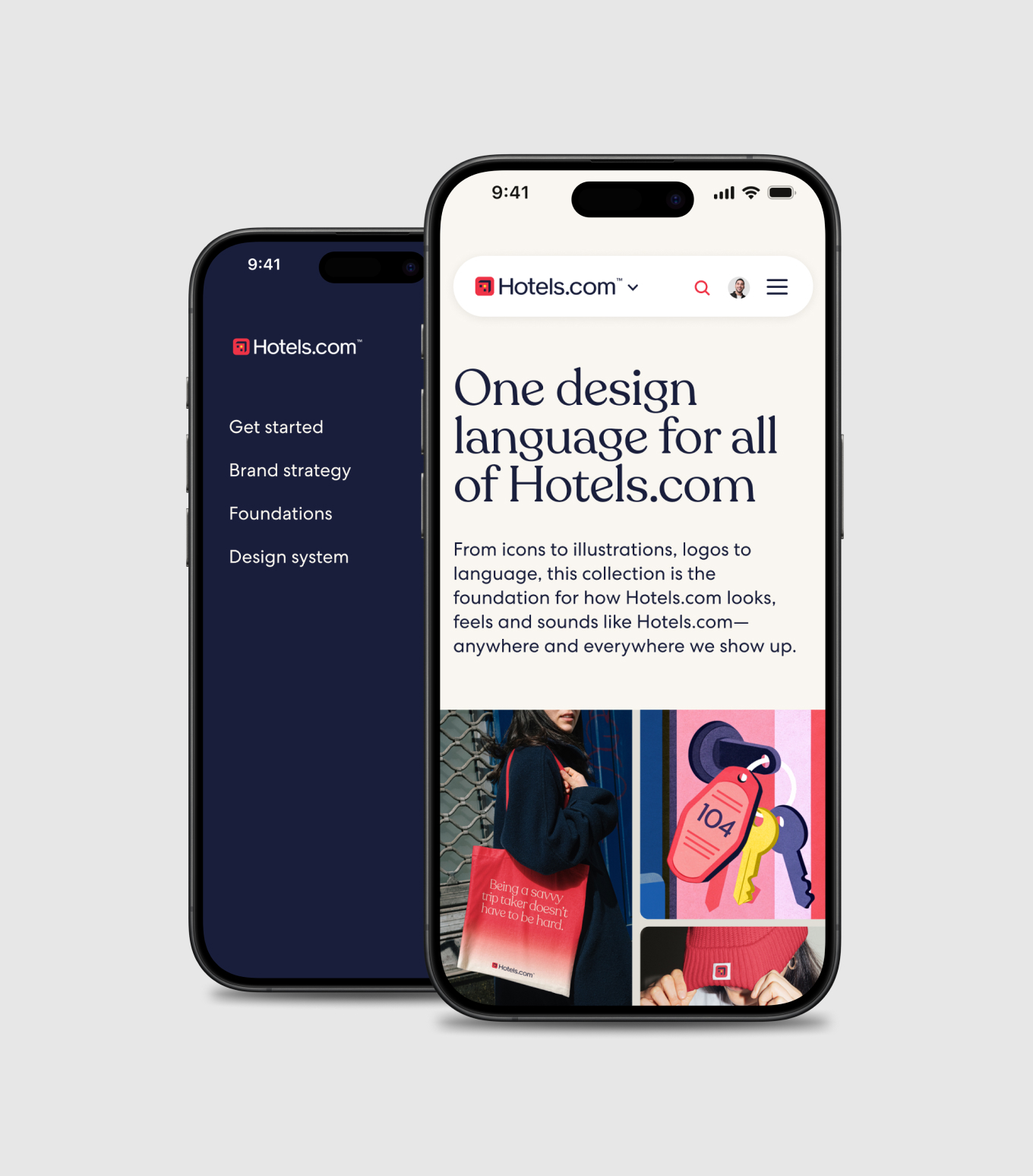
A single playbook makes the foundations easier to follow than to ignore.
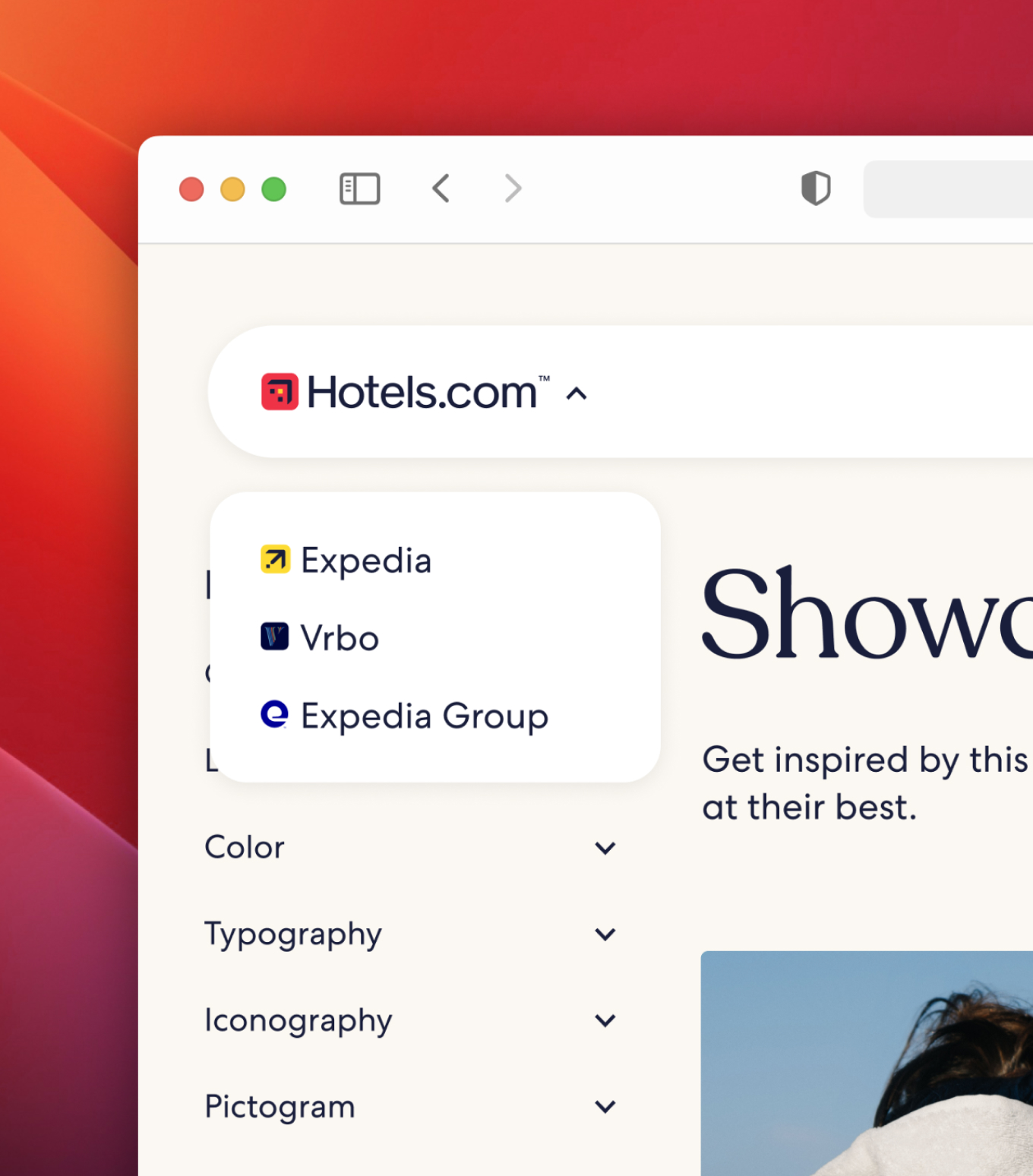
Brand guidelines, the token library, Storybook, Figma plugins, and asset management had been five separate sources. One destination is what makes consistency the default. The process around it—kickoff, working sessions, and layered reviews—lets teams engage, evolve, and co-own the work, so the people who shape the system are the ones who use it.