
LILY+ERIC WEDDING
Designing a wedding in Upstate New York.
BRAND: N/A
DATE: 2021
PLATFORMS: PRINT/WEB
ROLE: DIRECTION/DESIGN
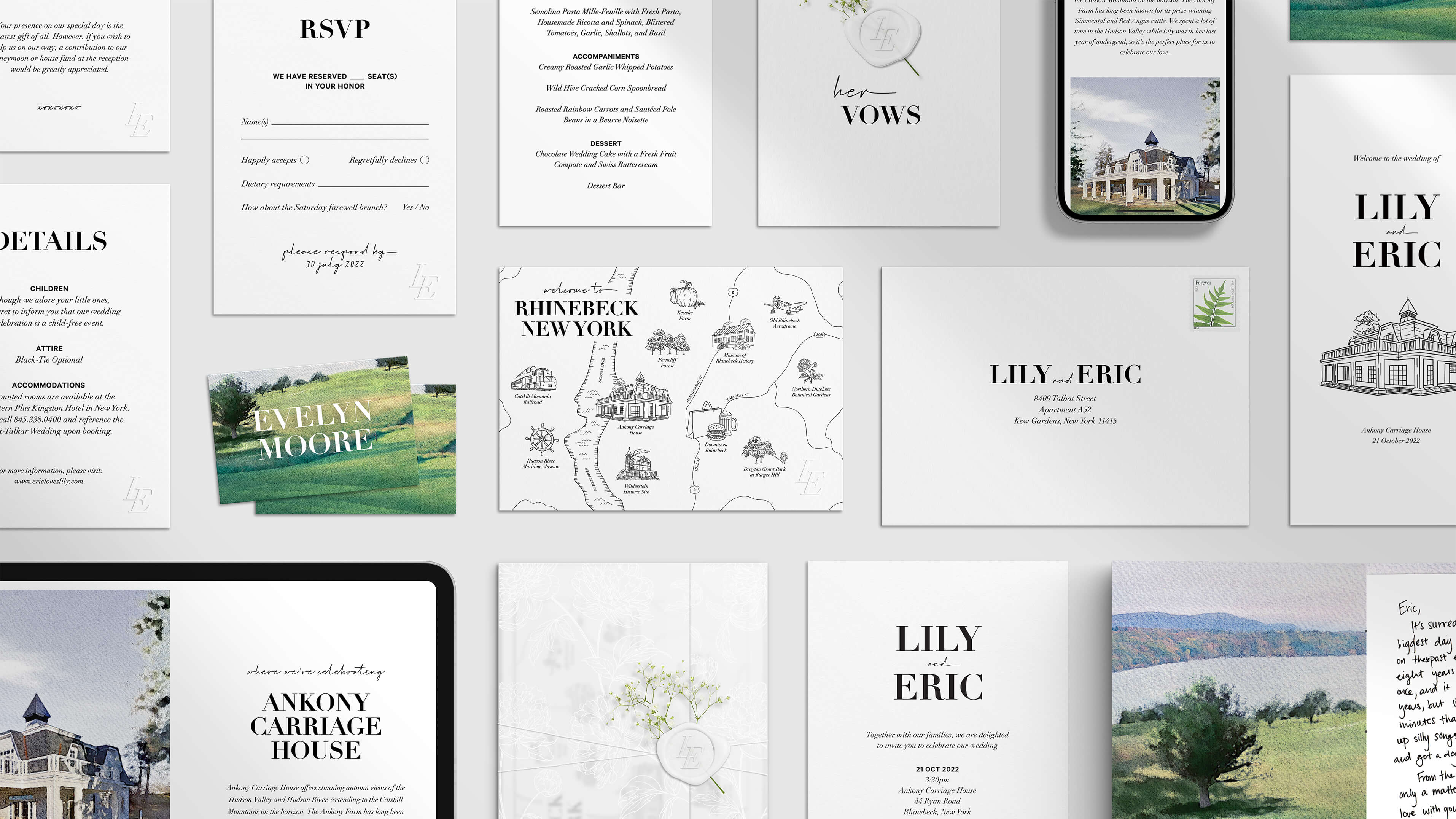
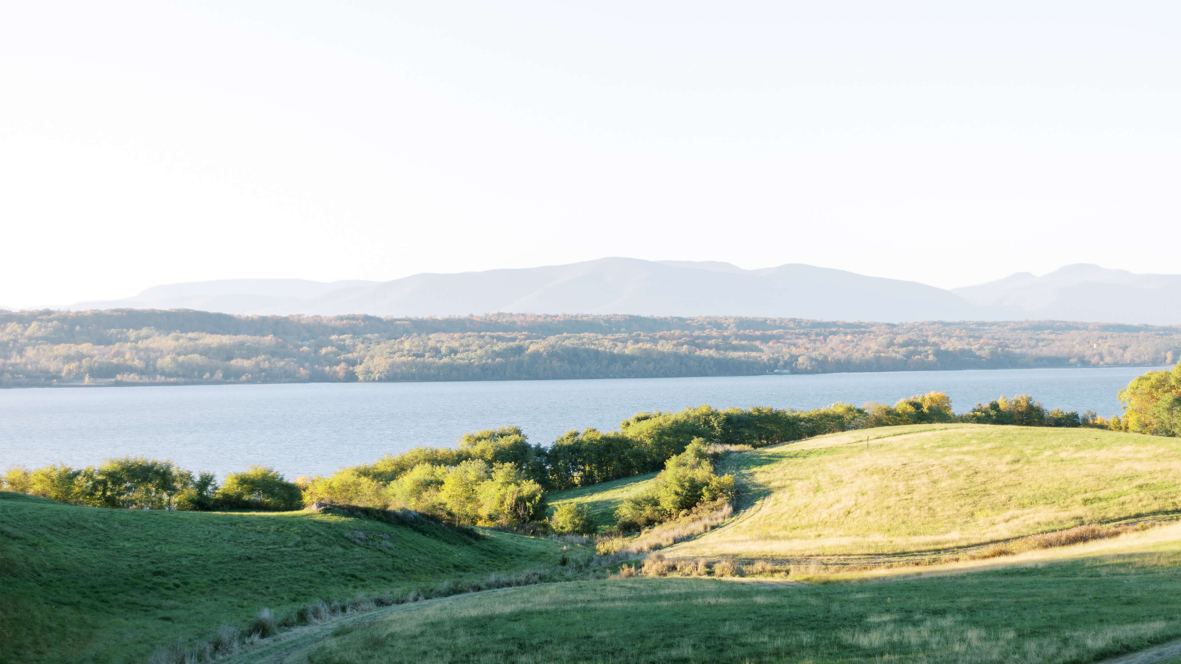
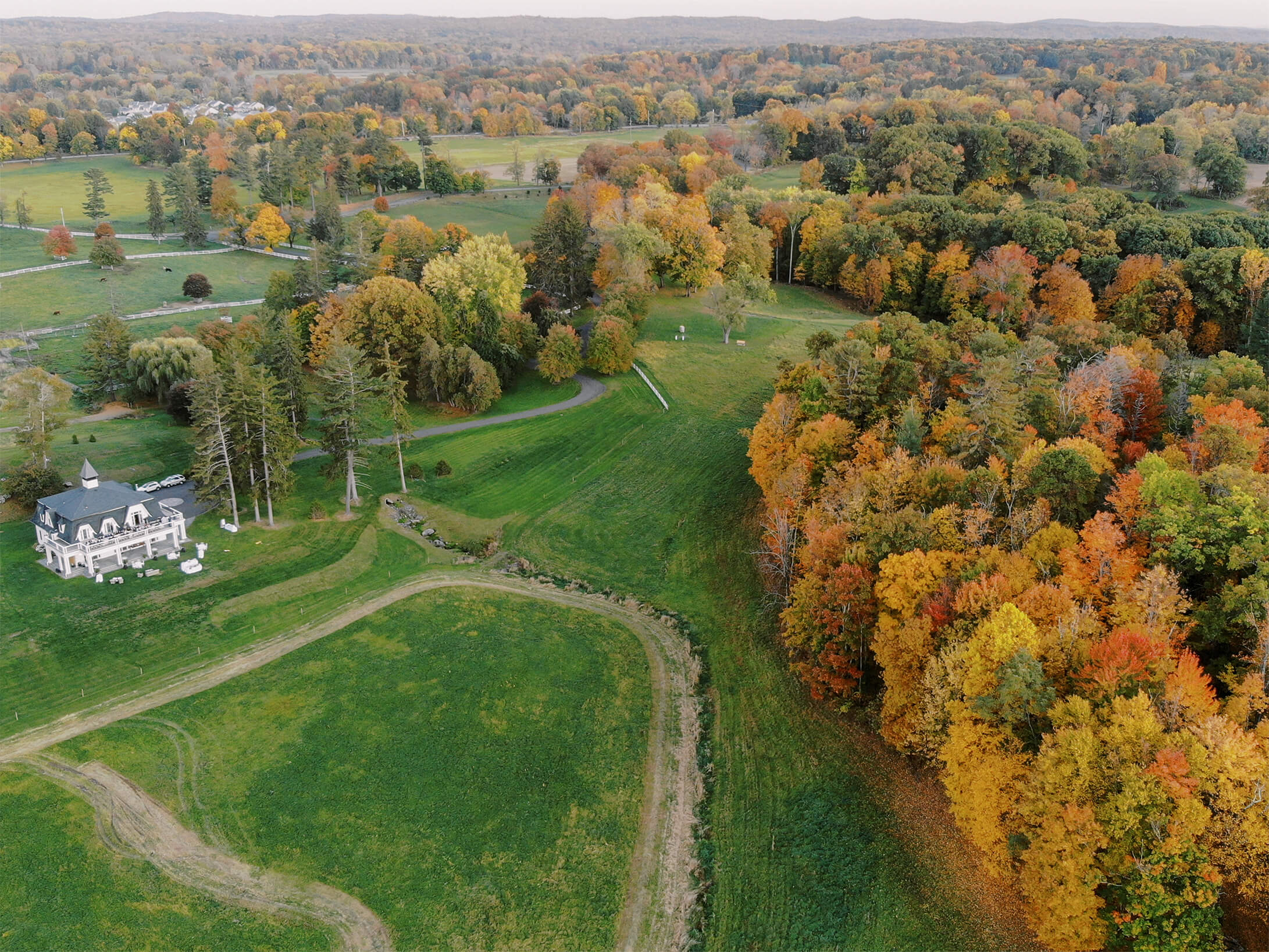
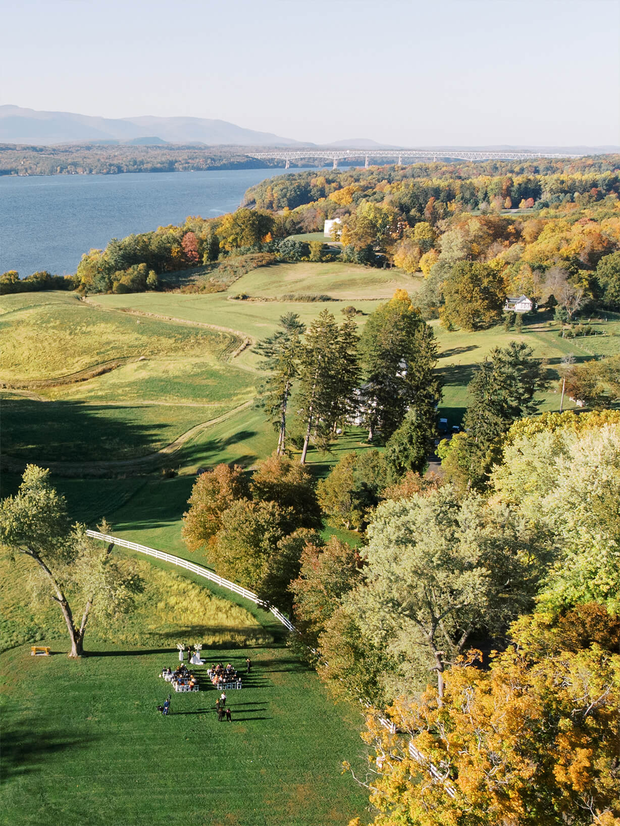
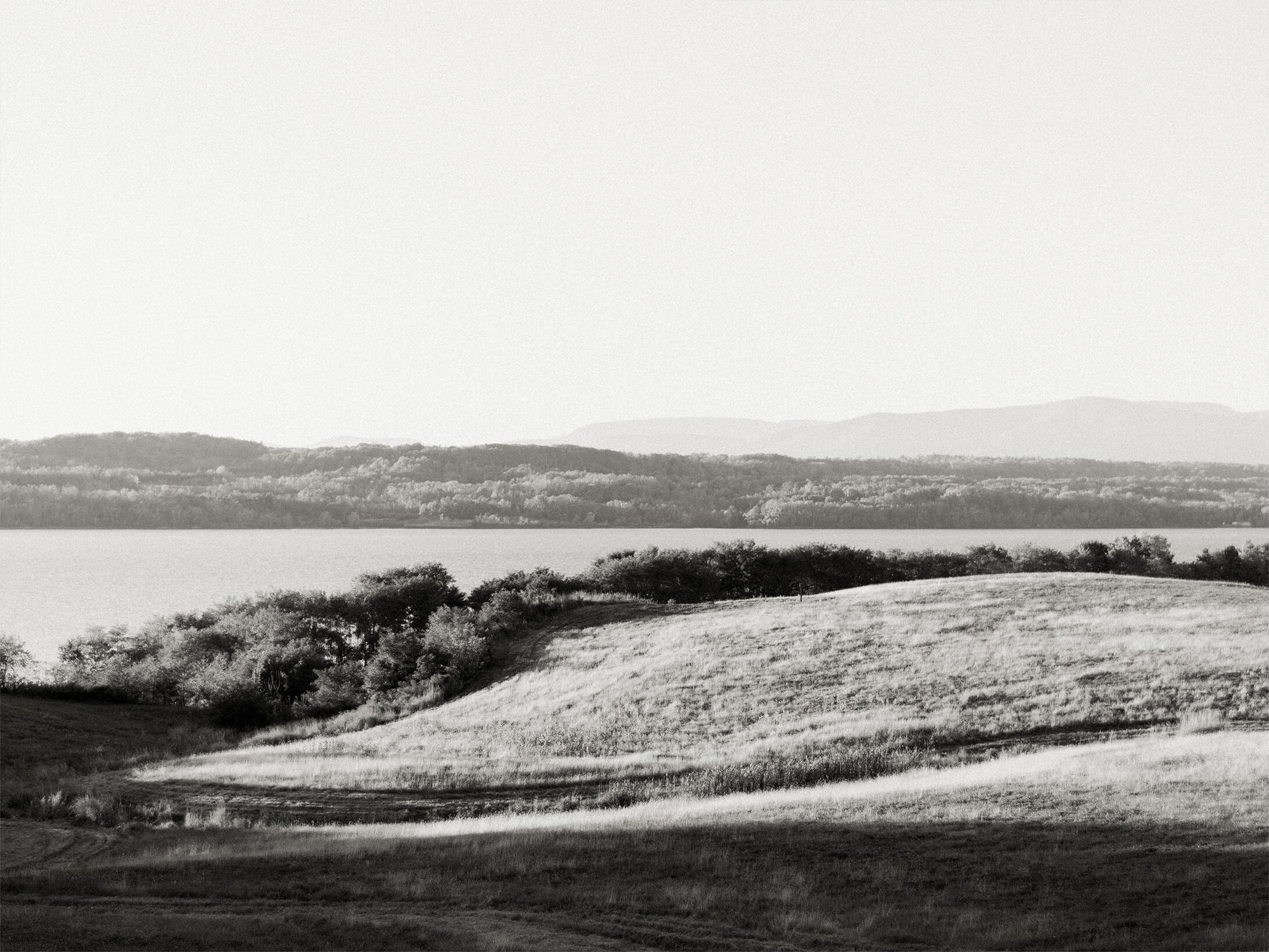
Our wedding at Ankony Carriage House in Rhinebeck, New York was a deeply personal and intentional celebration. We envisioned an intimate gathering of just 50 guests, designed to feel simple, modern, and allow the breathtaking atmosphere of one of our favorite places to take center stage.
I designed every element myself—from the invitations and website to all of the day-of details—bringing a DIY spirit to the process that made it even more meaningful. I worked closely with a local printer to source the most luxurious papers and materials, ensuring everything came together with a sense of quiet elegance and flawless execution. Every detail was a reflection of our story and the experience we wanted to share with the people we love most. It was a complex, all-consuming process, but truly a labor of love.
BRANDING
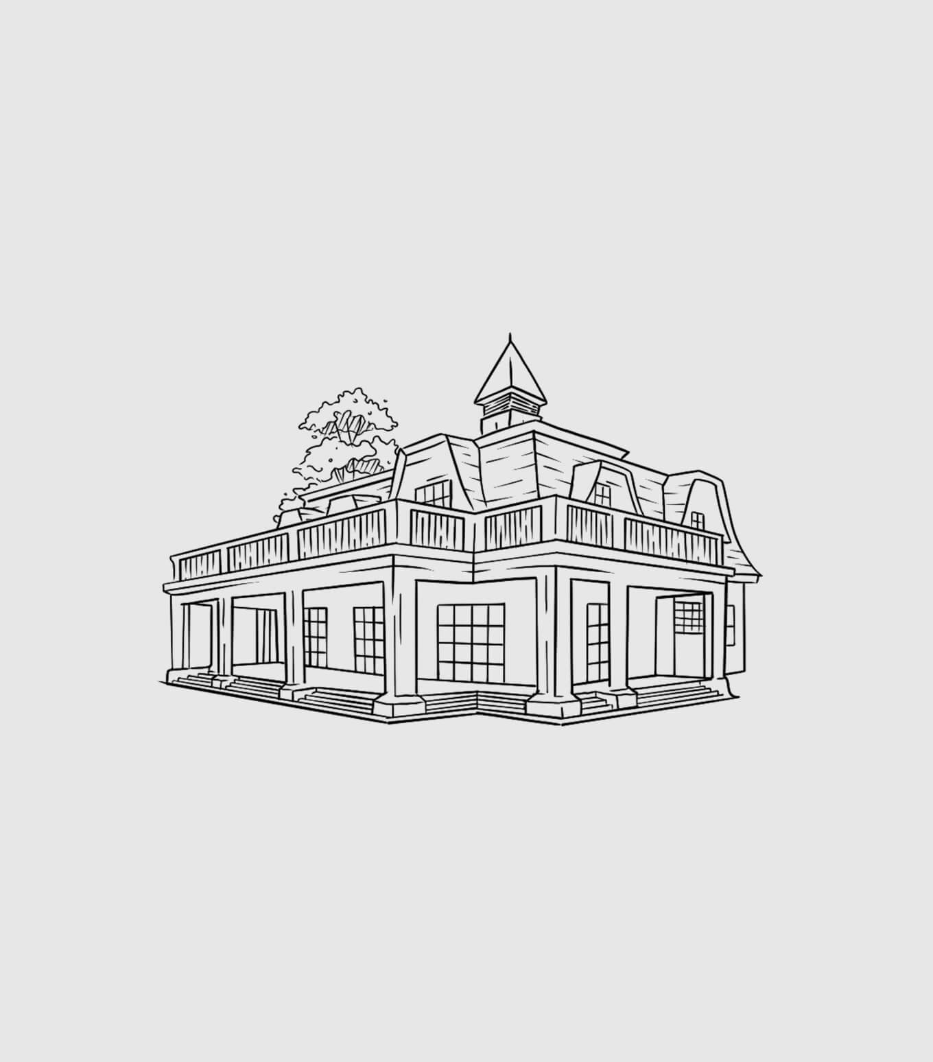
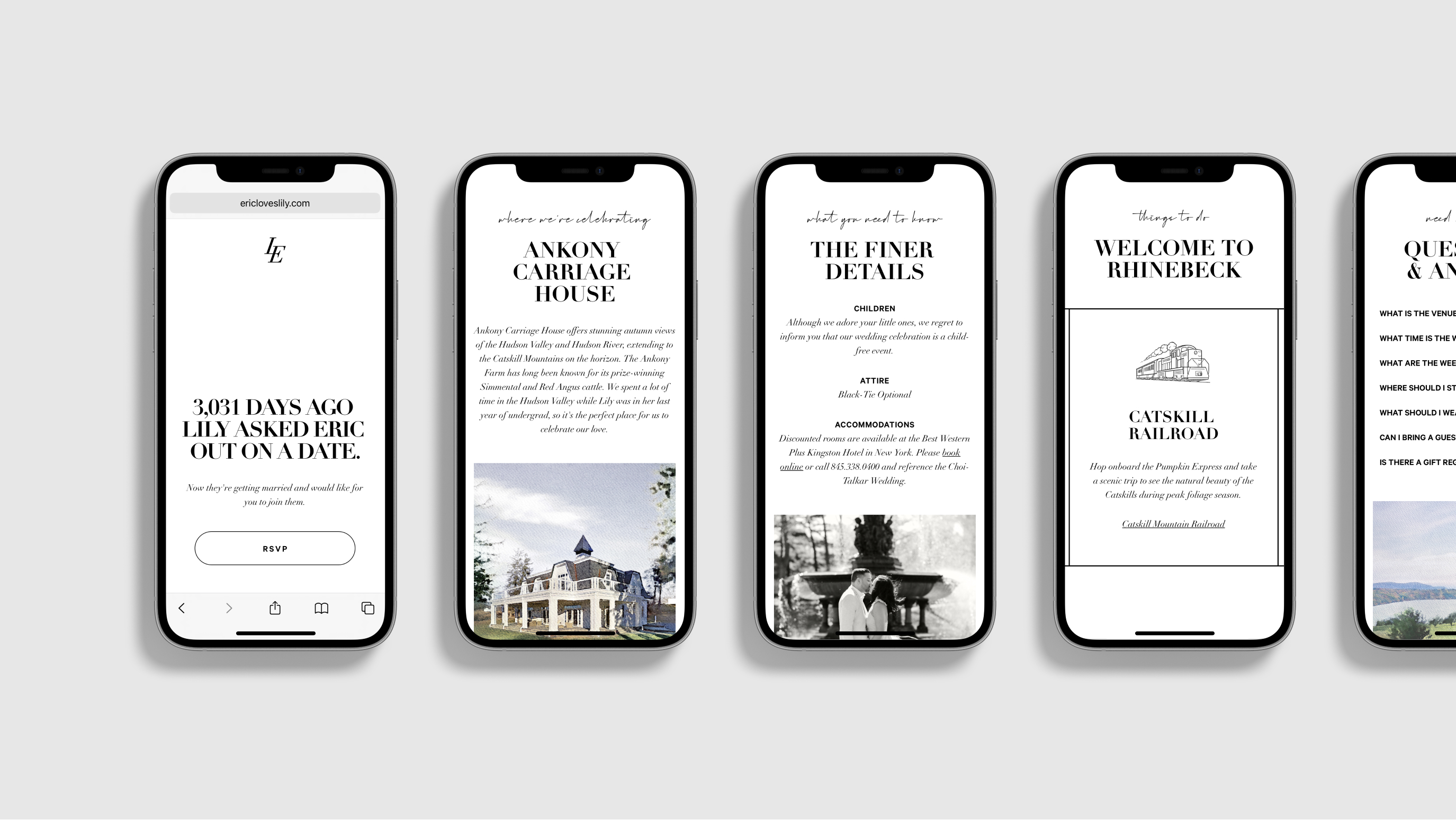
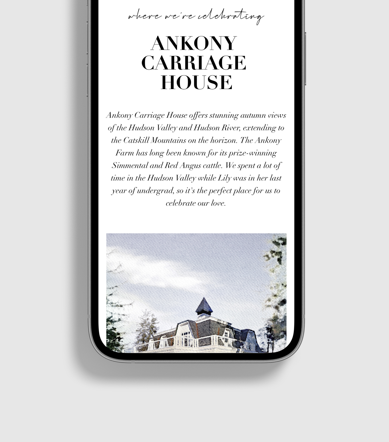
An understated brand identity was inspired by the Ankony Carriage House and allowed the scenic venue of the Catskill mountains to take center stage.
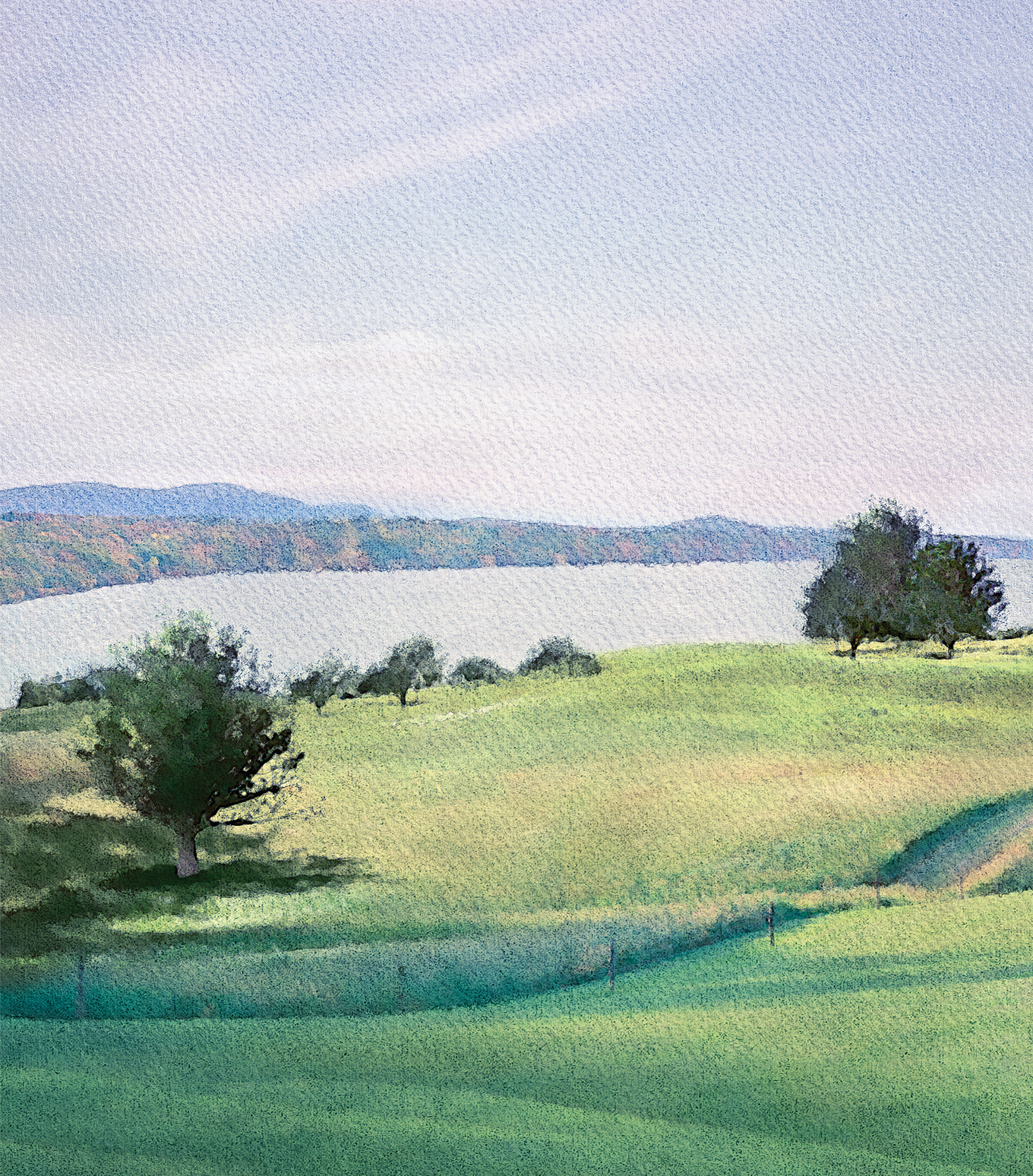
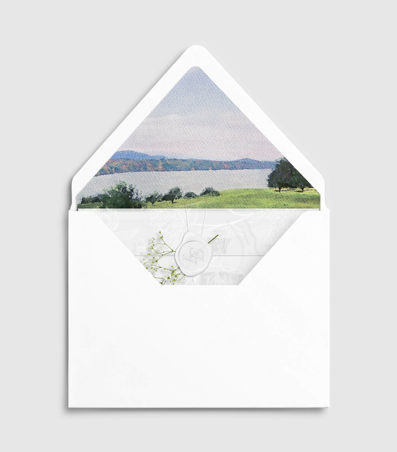
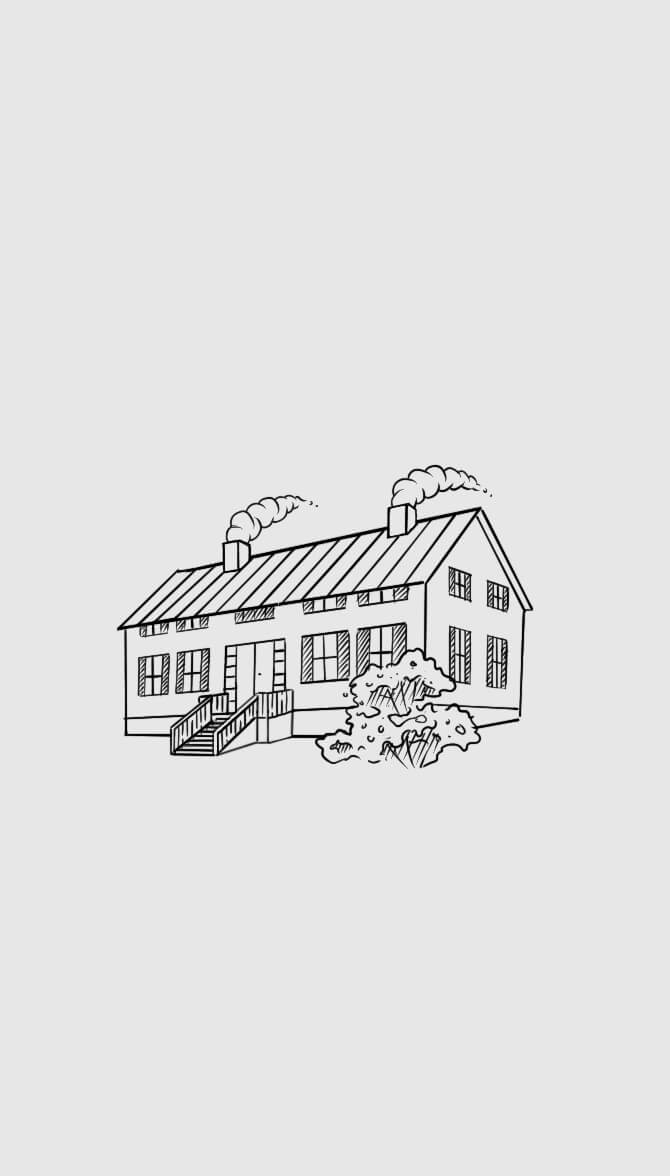
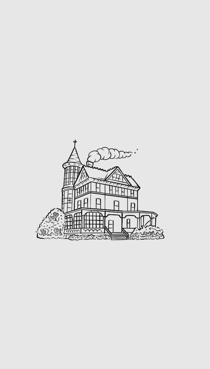
This wedding brand identity was crafted to evoke simplicity, modern elegance, and timeless romance. Anchored in a primarily white and black palette, it introduces green as a subtle nod to the natural beauty of the outdoors. The typography pairs the refined sophistication of Didot with the clean legibility of Calibri, striking a balance between classic and contemporary. Central to the brand are custom design elements including a bespoke monogram, a cohesive set of illustrations, and a digitally-painted watercolor scene capturing the breathtaking backyard view.


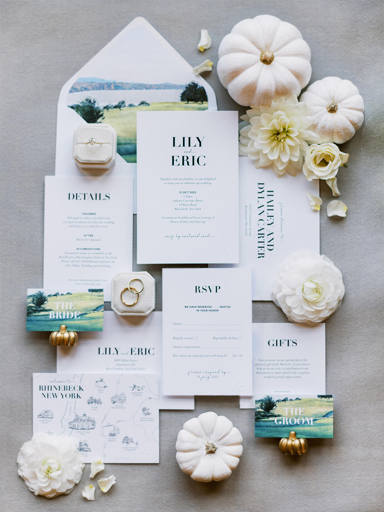
INVITATION
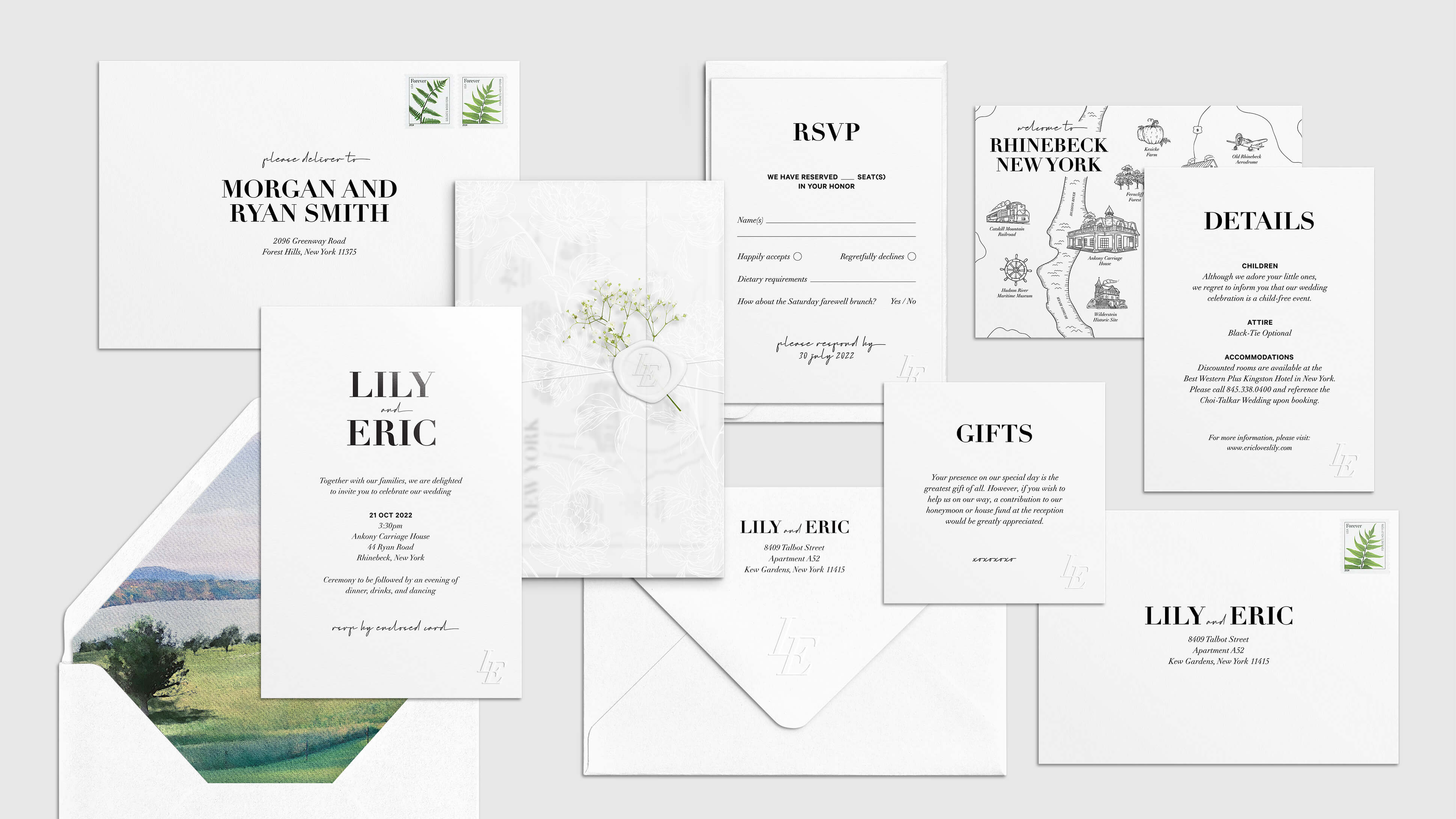
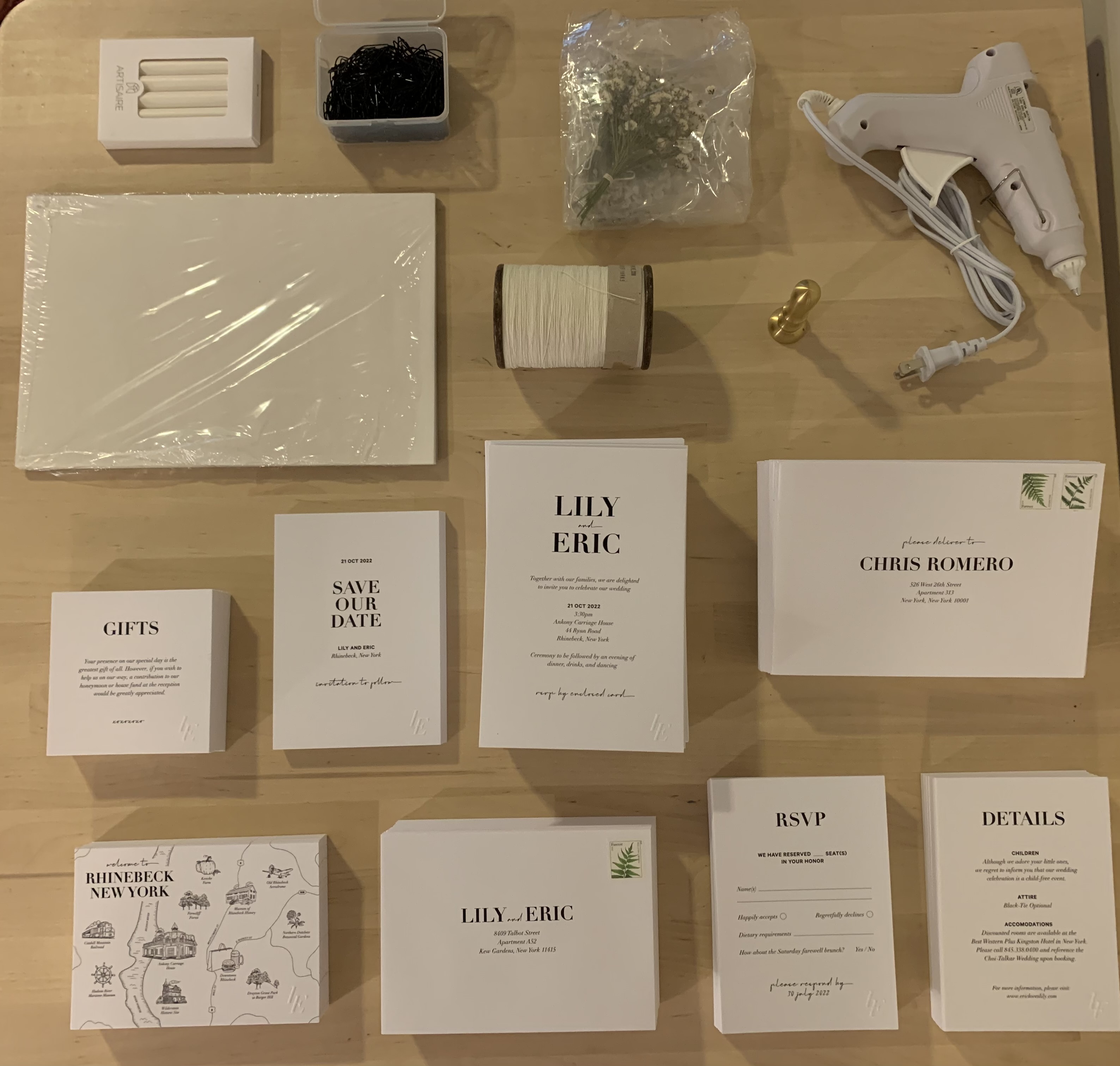
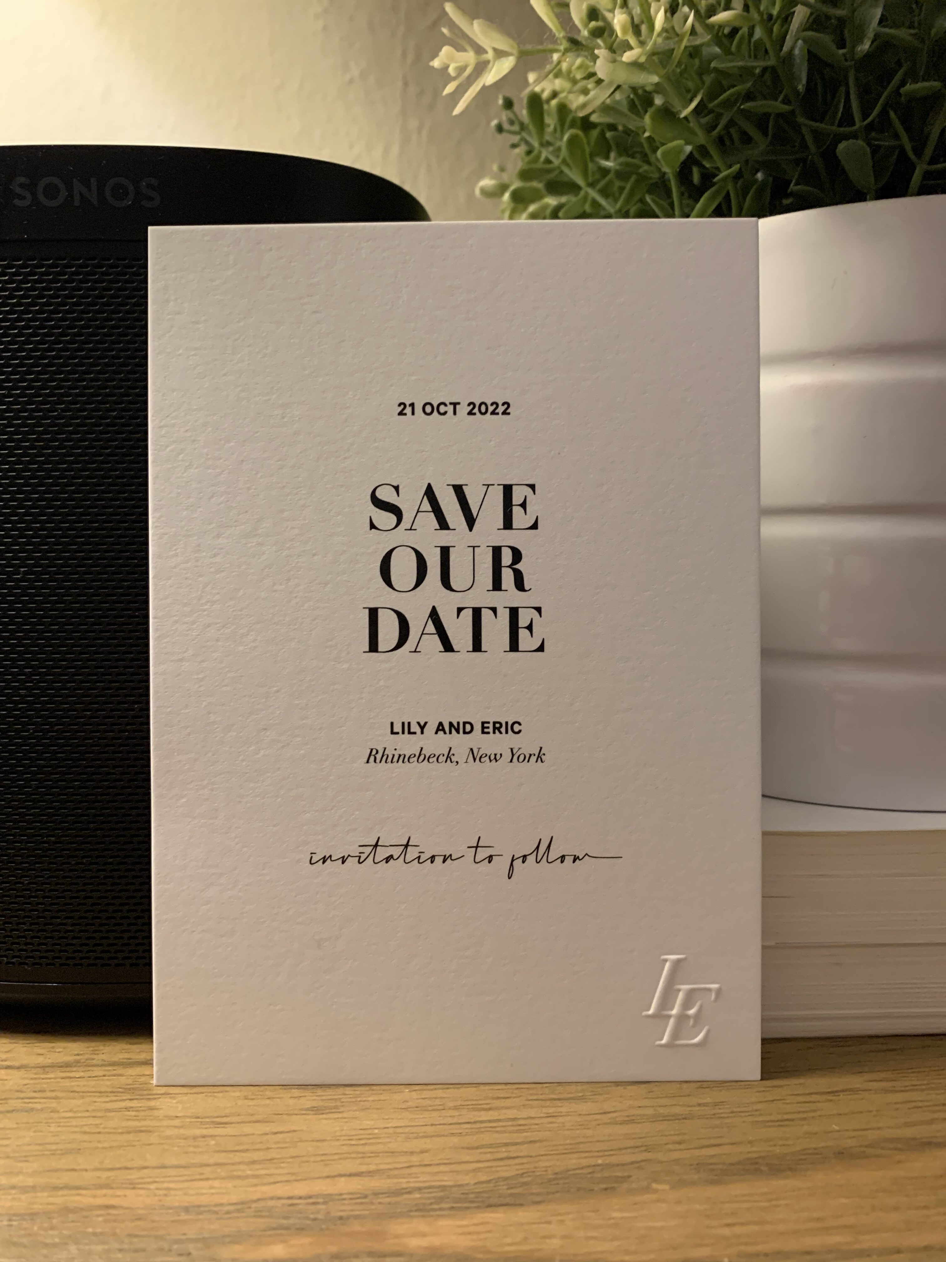
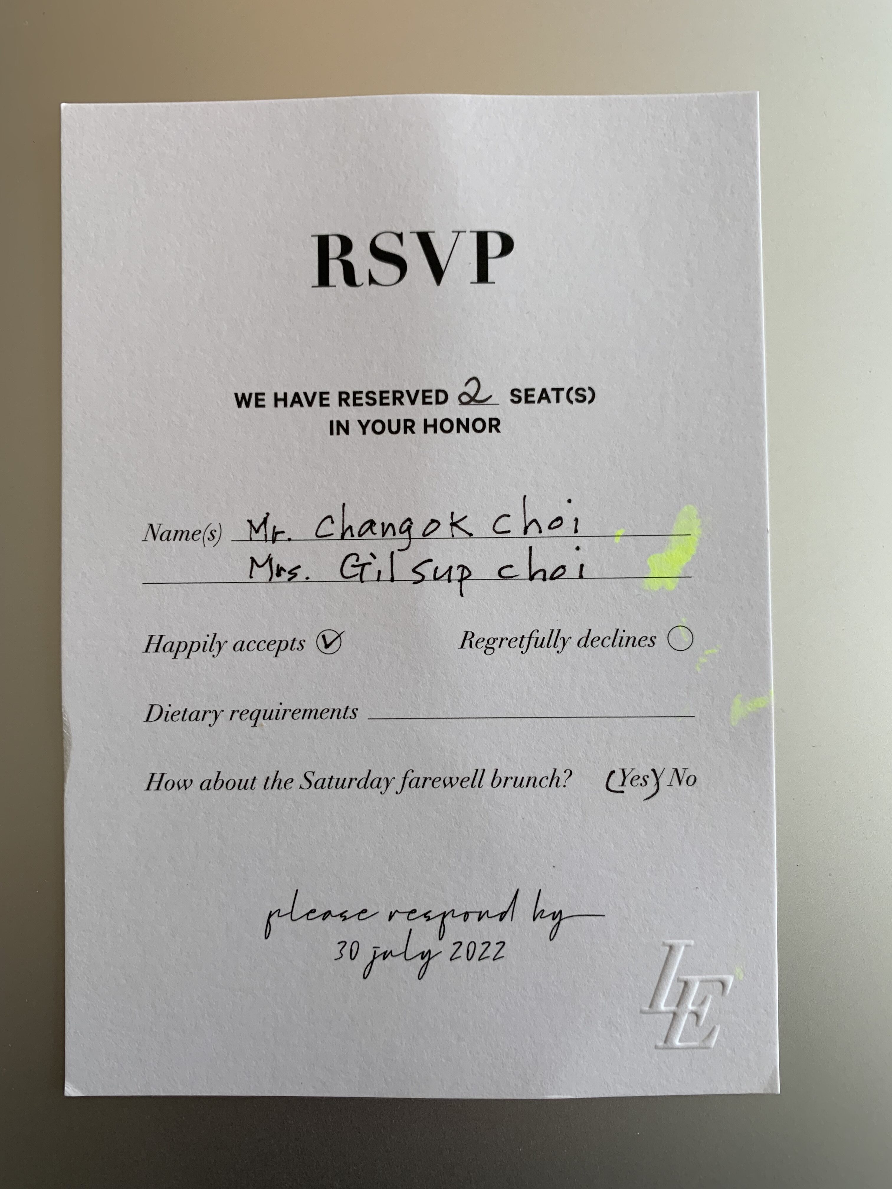
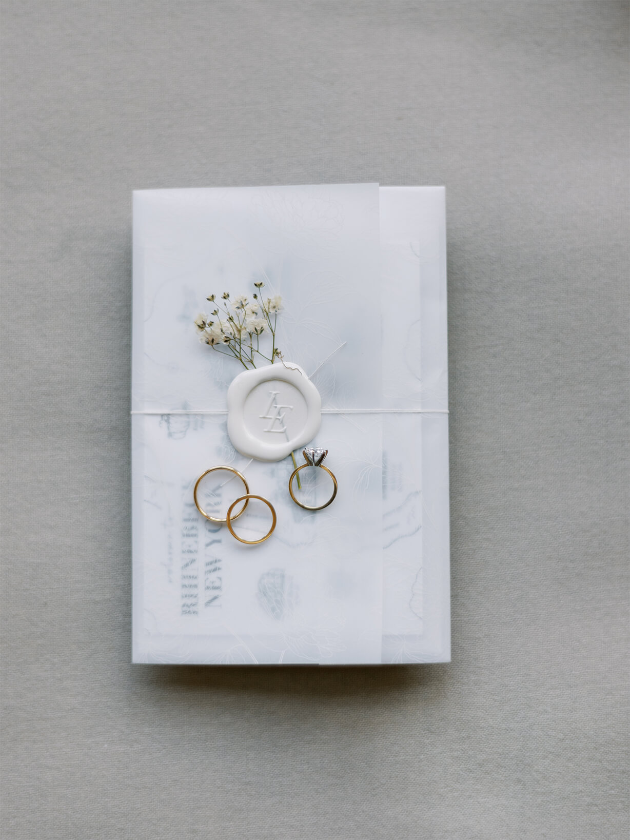
Guests received a premium 10-piece invitation package that brought the luxurious vibes of the venue to them while conveying the details of the wedding weekend.
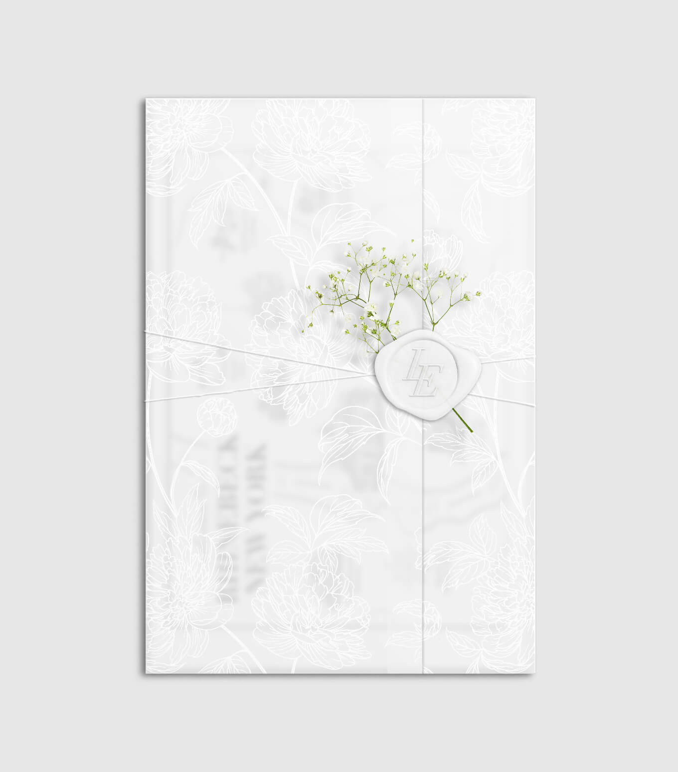
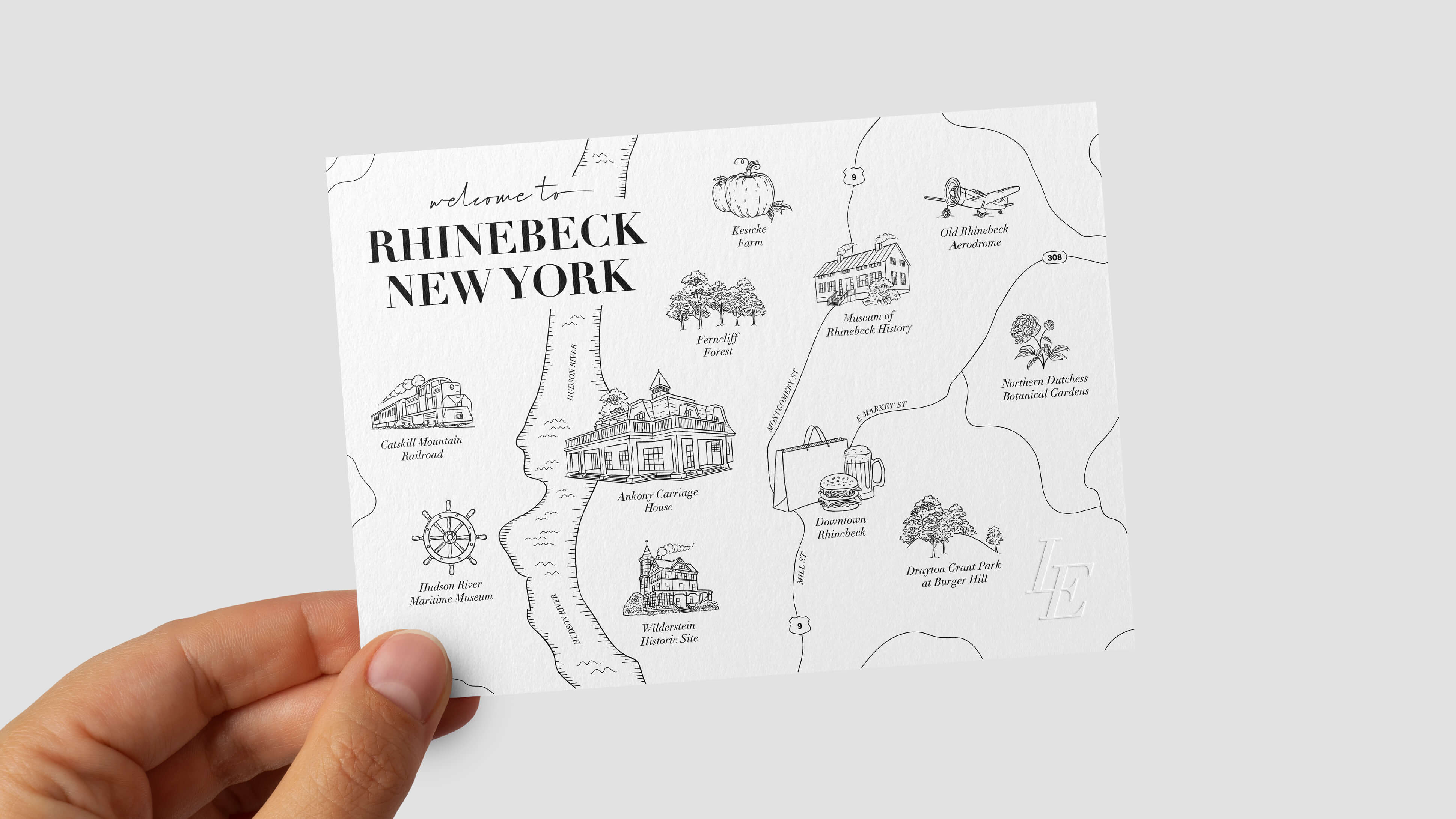
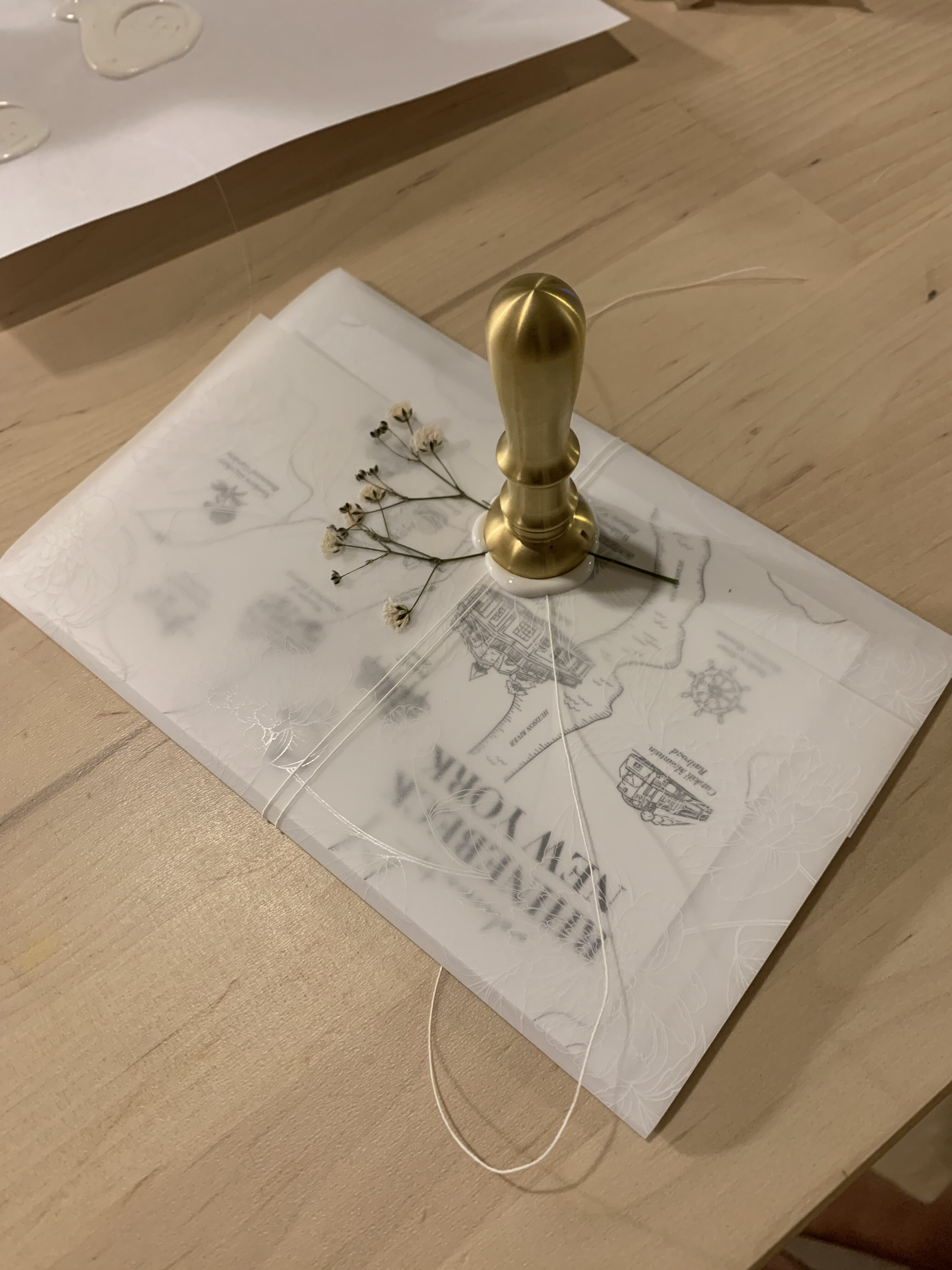
The wedding invitation package was thoughtfully designed to deliver a premium, inspiring unboxing experience that set the tone for an elegant celebration. Printed on luxurious GMUND Colors Matte paper, the suite featured a rich, textured cardstock that elevated every detail. The custom LE monogram was tastefully embossed for a tactile, sophisticated touch, and sealed with a bespoke wax stamp for a sense of timeless romance. A hand-illustrated map of Rhinebeck, New York added a personal, story-driven element, blending functionality with artistry.


DIGITAL DESIGN
For more information and to RSVP, guests were directed to ericloveslily.com, an editorialized and custom-designed wedding website.
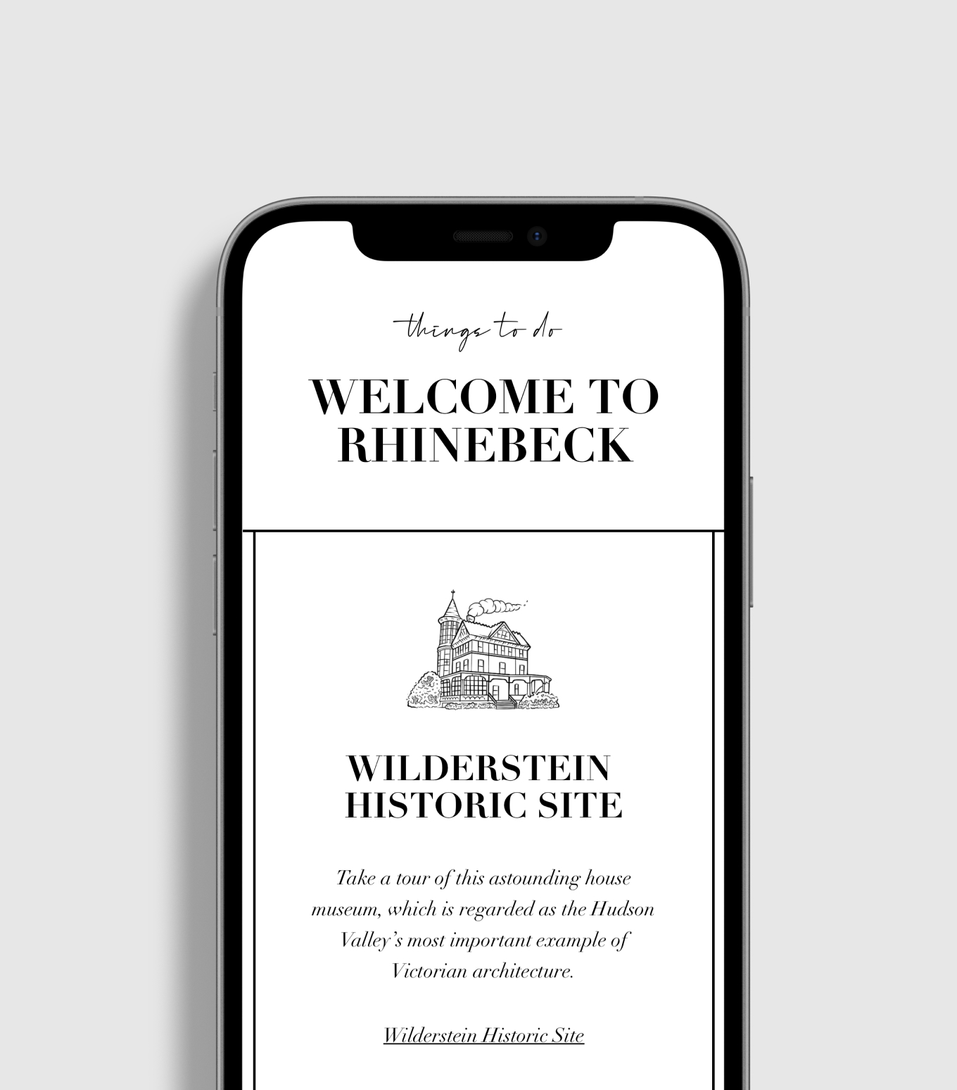
The wedding website was a seamless digital extension of the invitation package, carrying through the same refined design vocabulary—elegant typography, minimal layout, and the signature color palette. It told our love story with warmth and authenticity, offering guests a deeper connection to us as a couple and our journey. The custom illustrated map was brought to life online with an interactive guide to Rhinebeck, featuring curated recommendations of local favorites—from charming cafés and scenic hikes to boutique shops and historic landmarks. Every detail was designed to reflect our style while thoughtfully enhancing the guest experience.
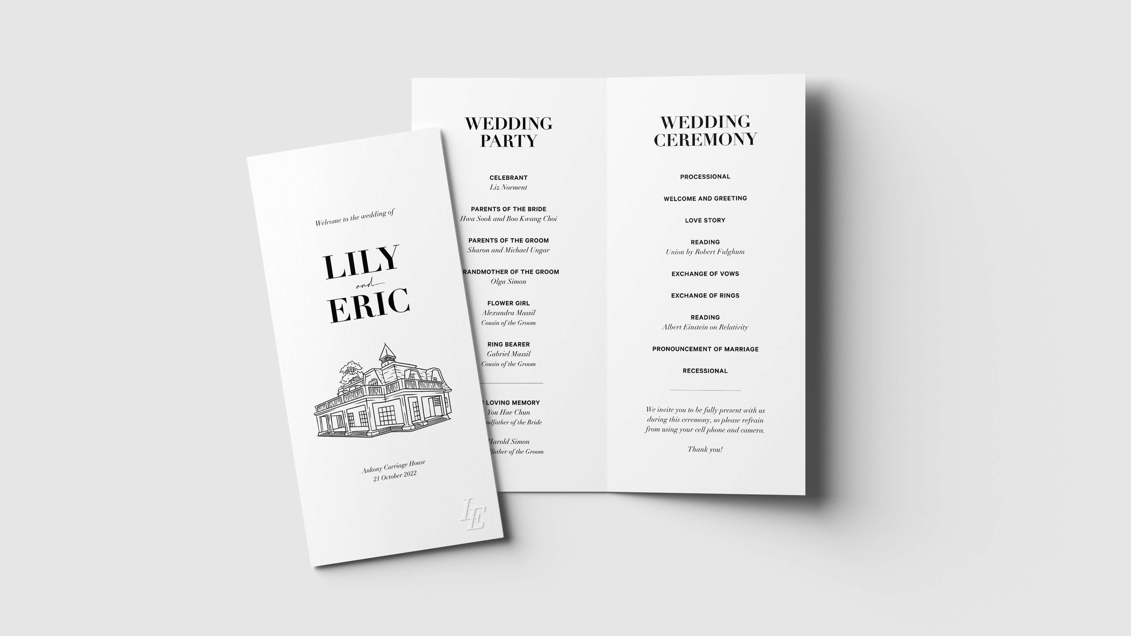
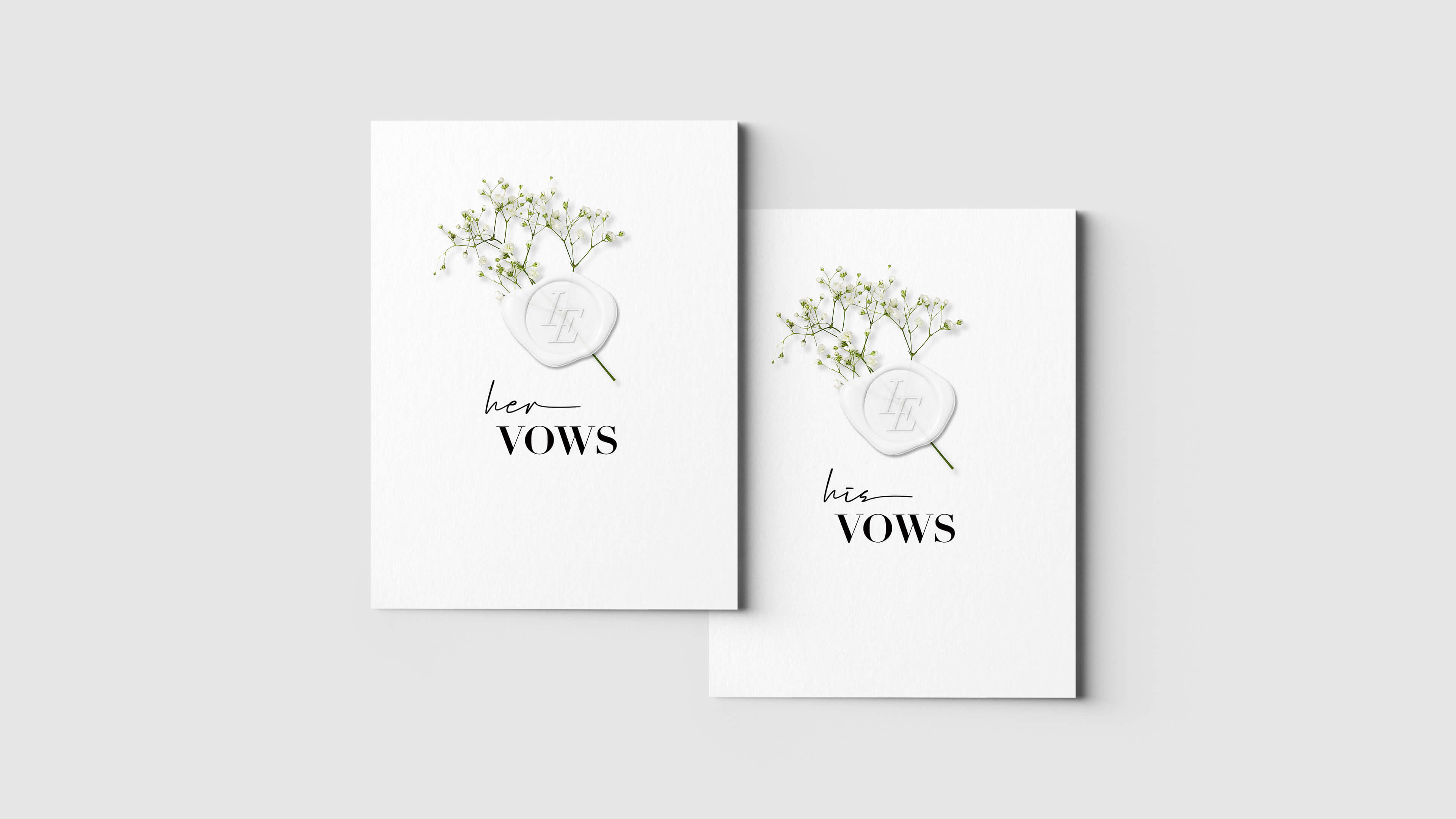
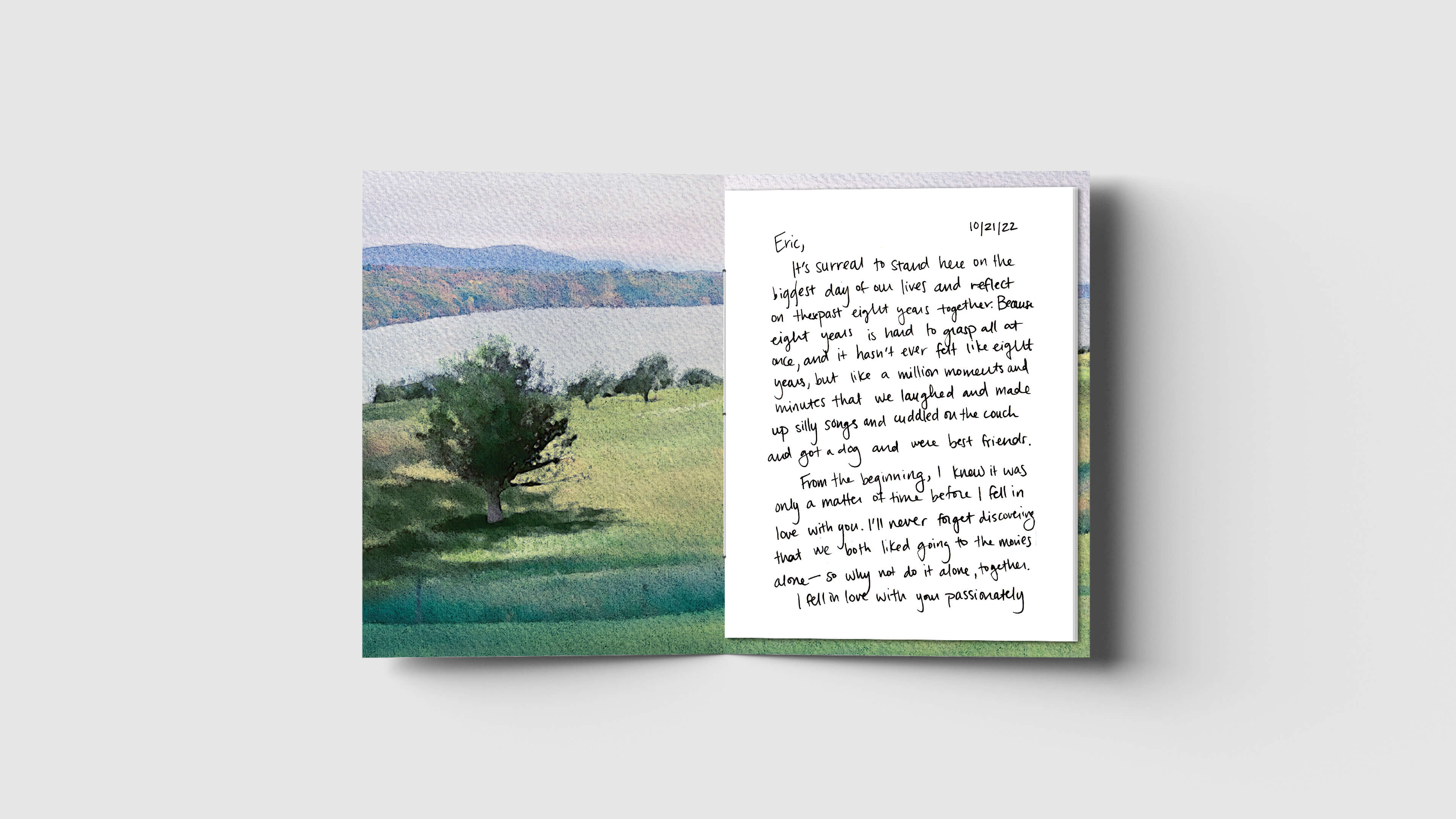
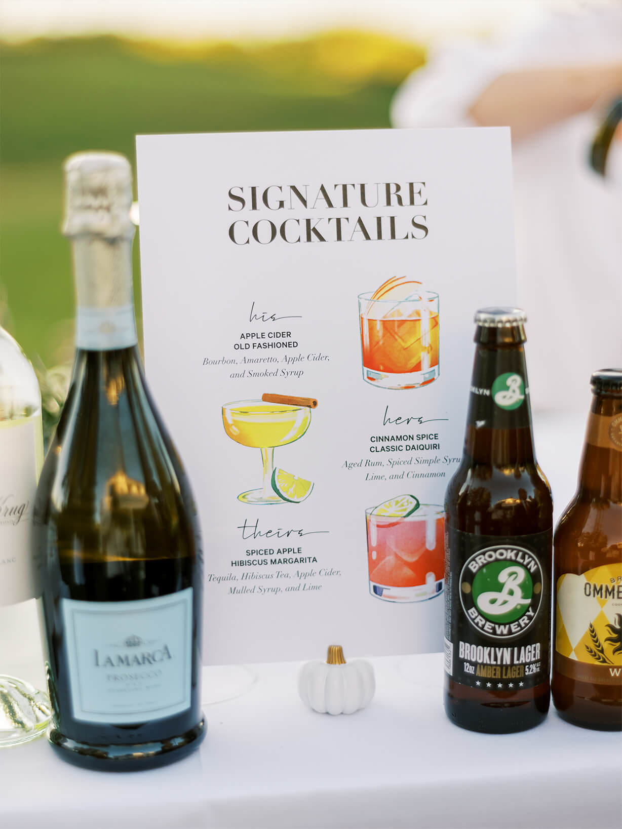
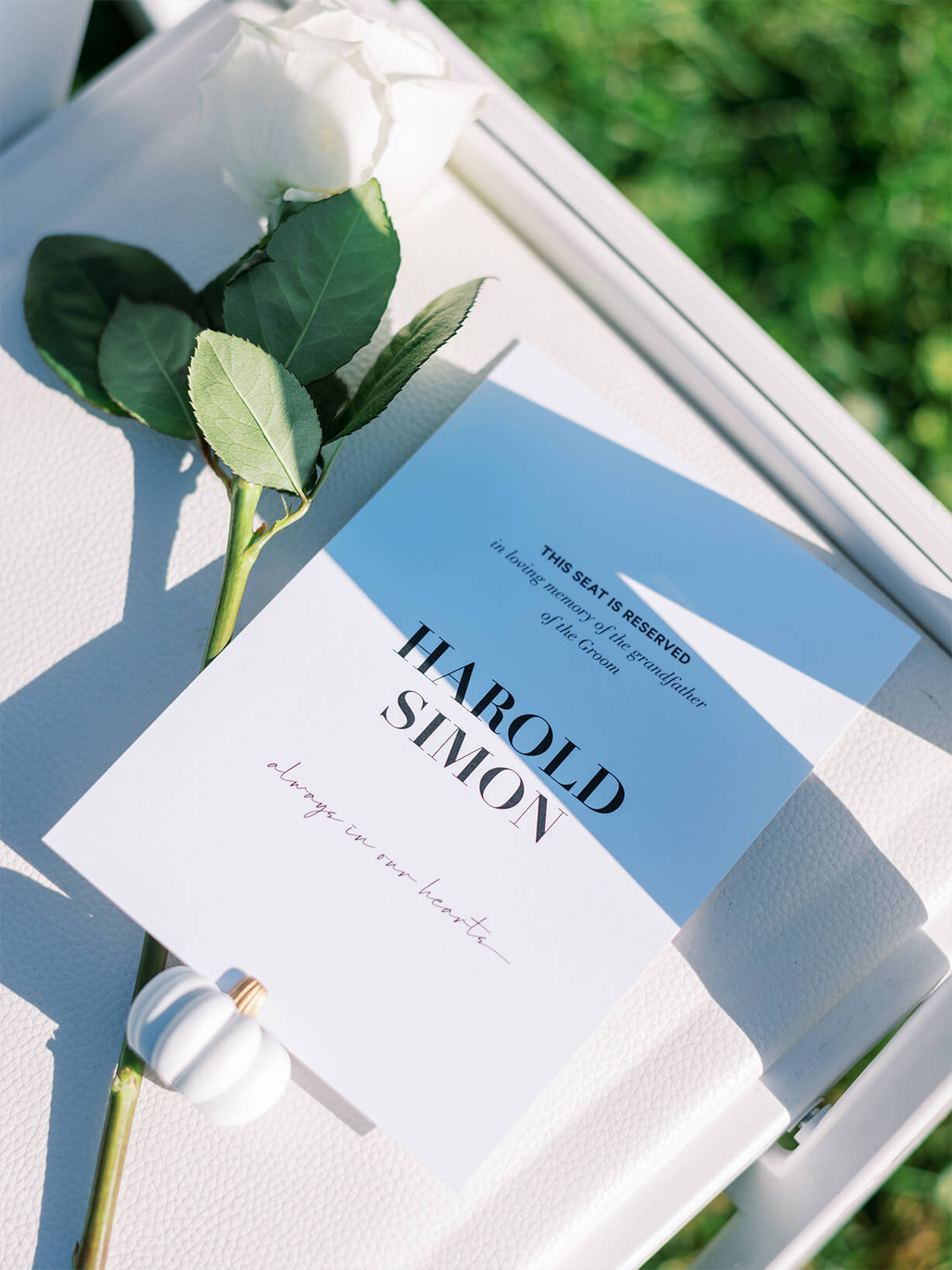
CEREMONY
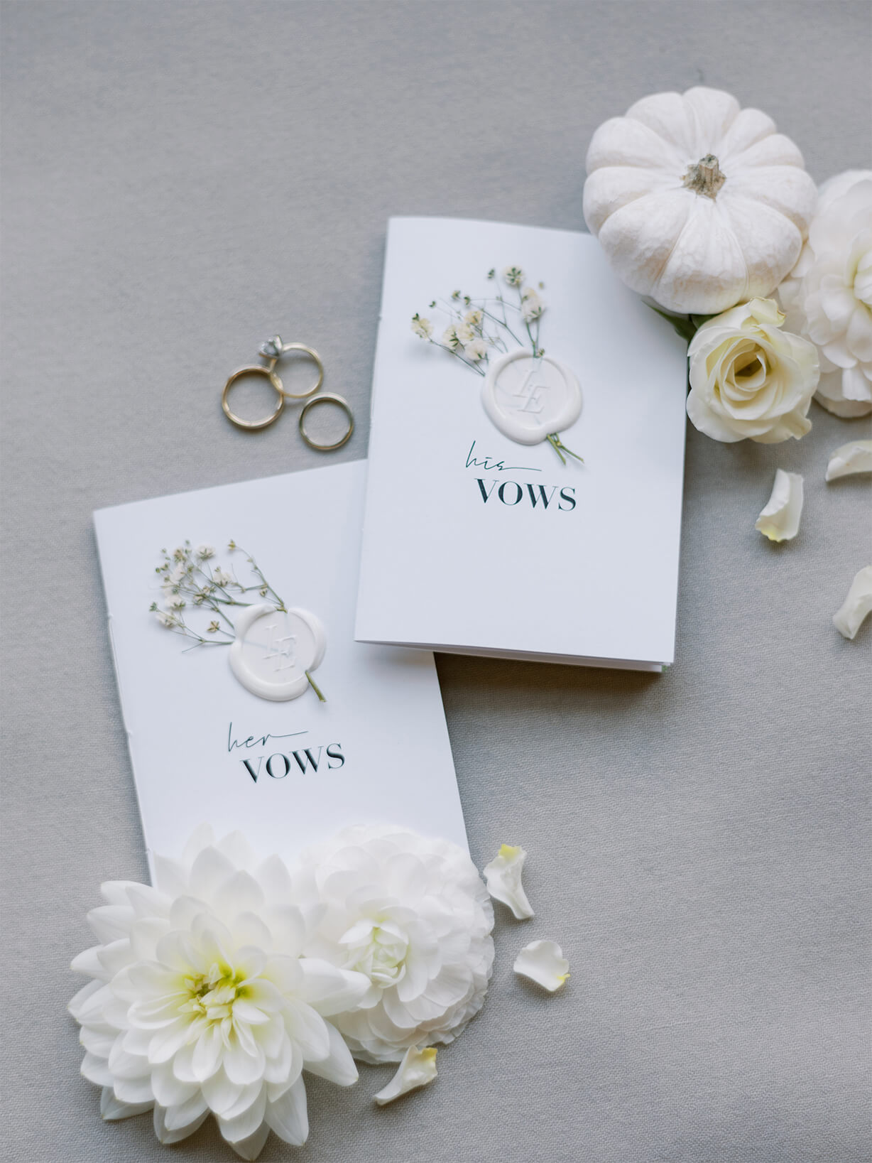
The wedding day was brought to life with heartfelt designs that welcomed guests and guided the flow of the ceremony.
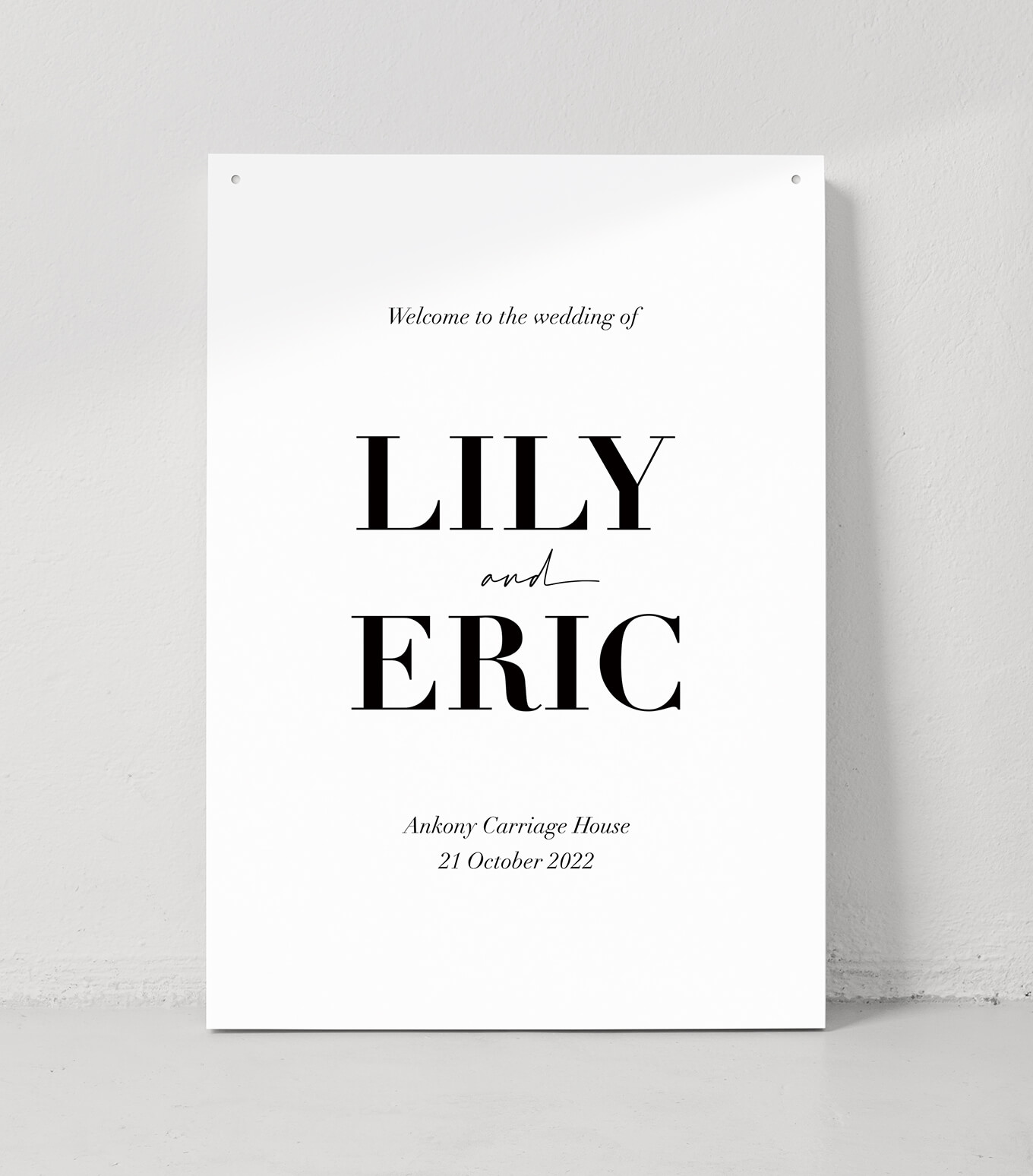
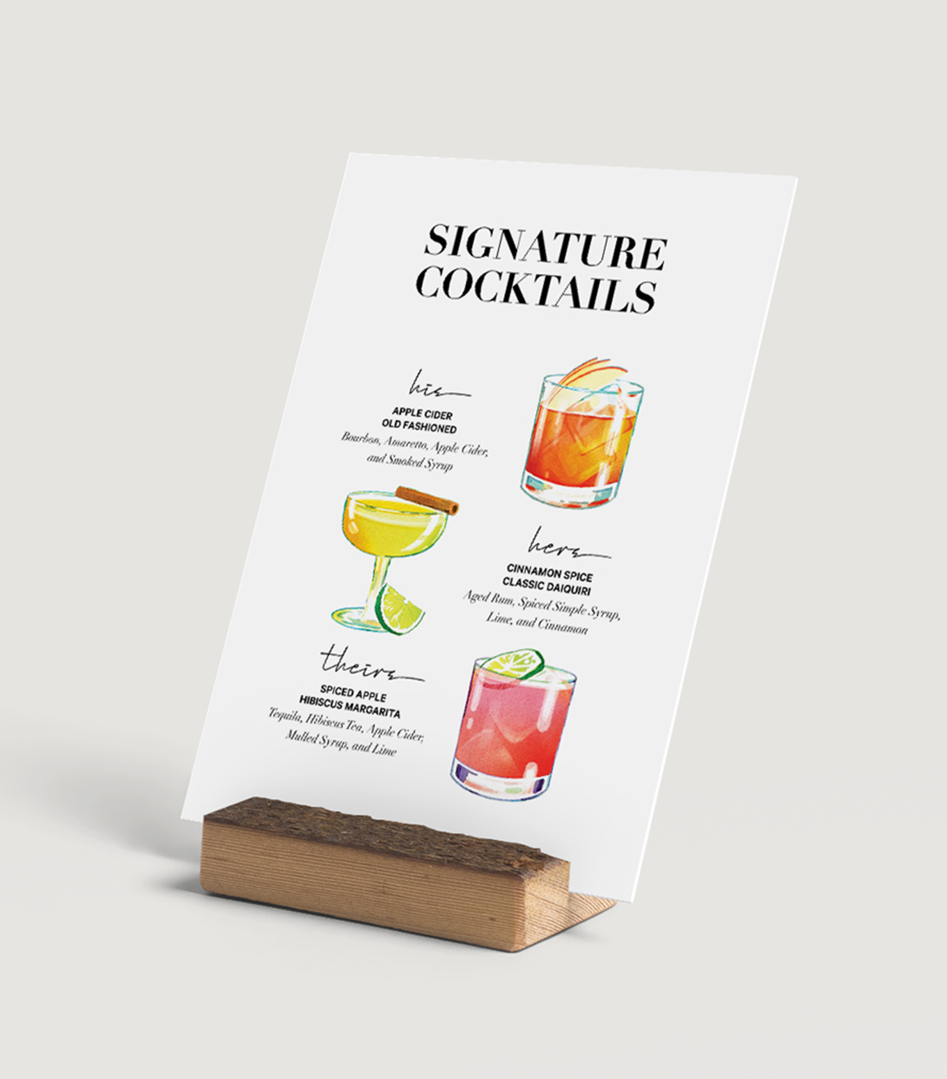
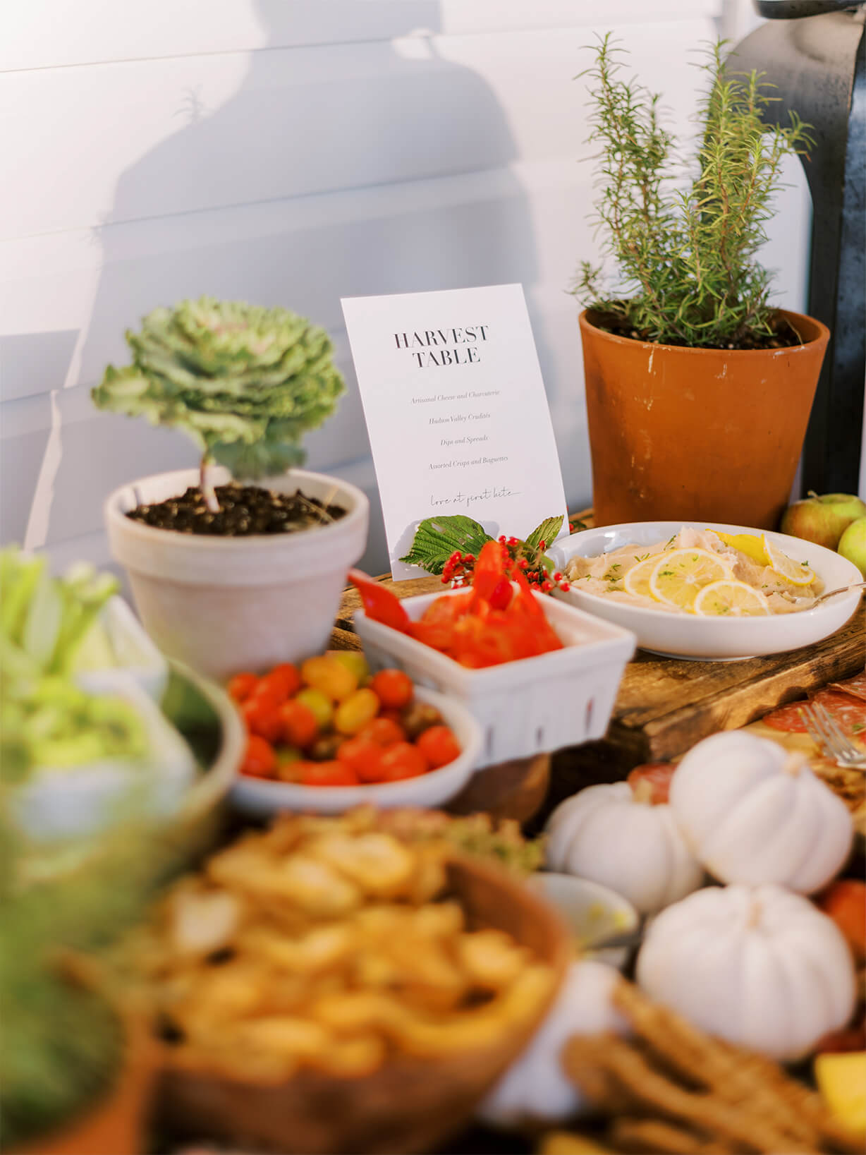
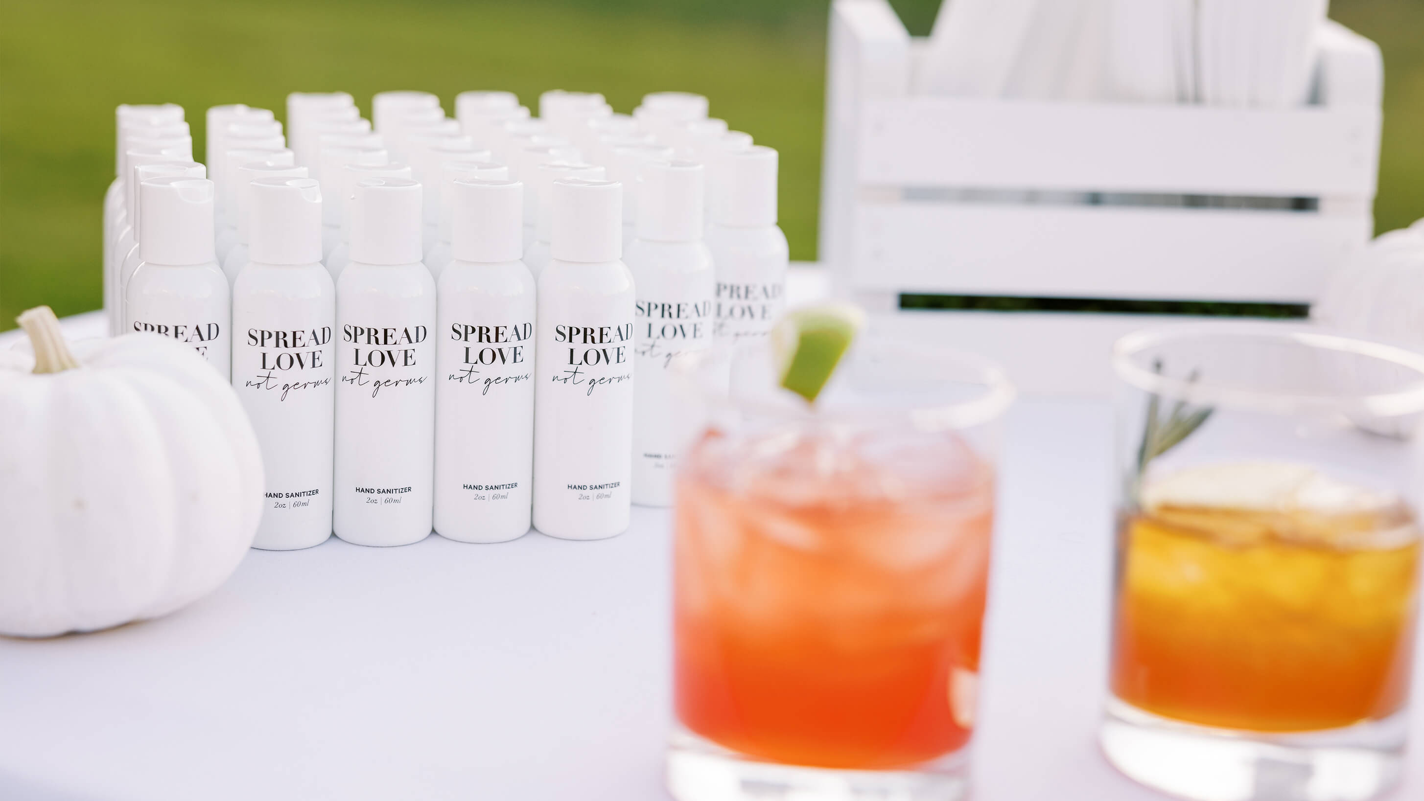
I designed a cohesive set of wedding day details—including a welcome sign displayed on a custom DIY stand, flower petal cones featuring the venue watercolor, ceremony pamphlets, and handcrafted vow booklets which I stitched myself—all thoughtfully created to elevate the guest experience with personal, artful touches.

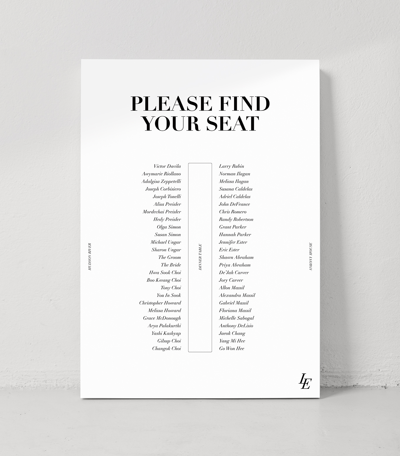
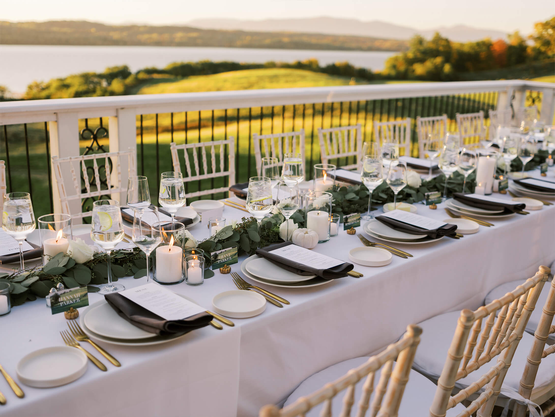
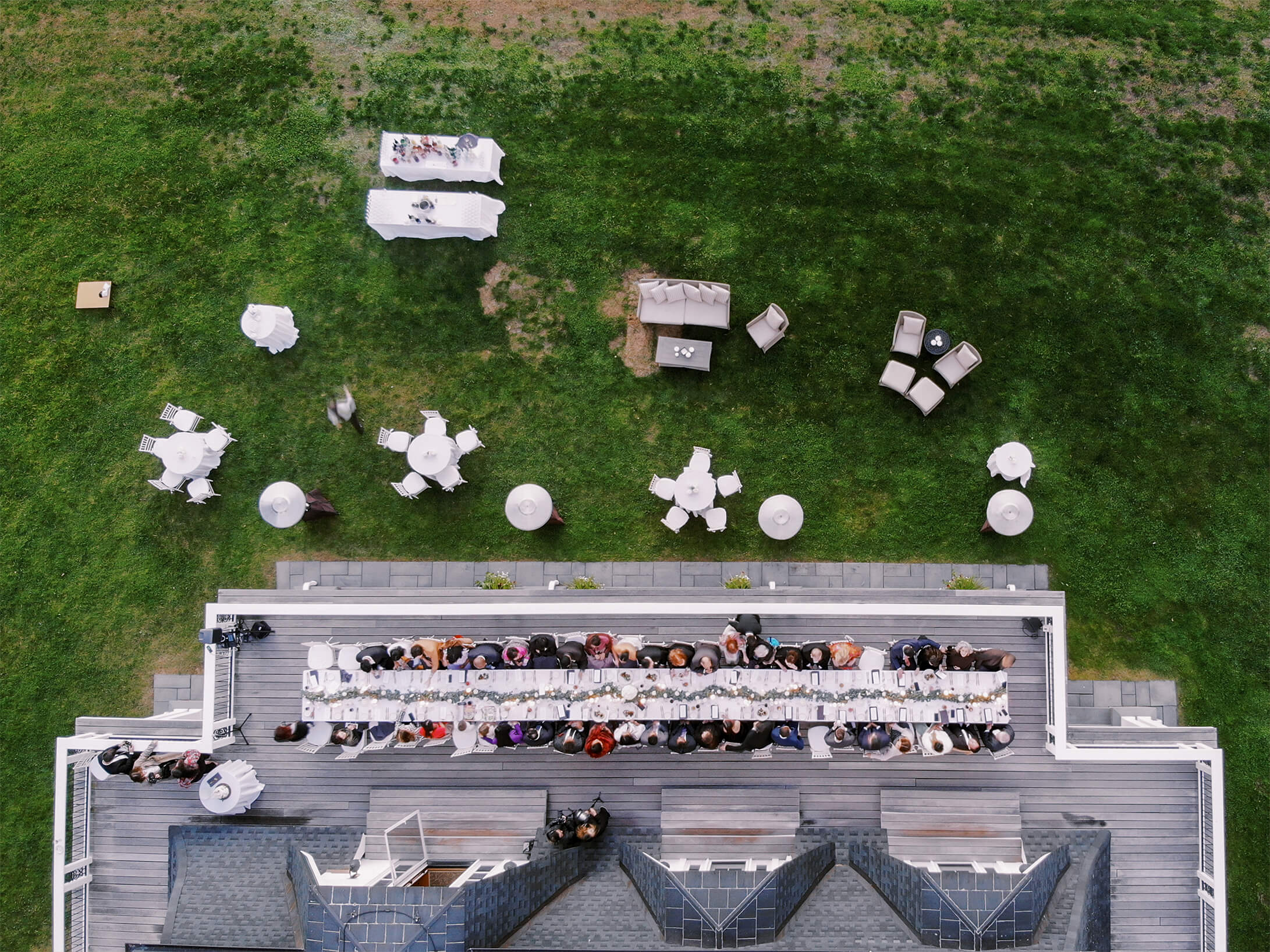
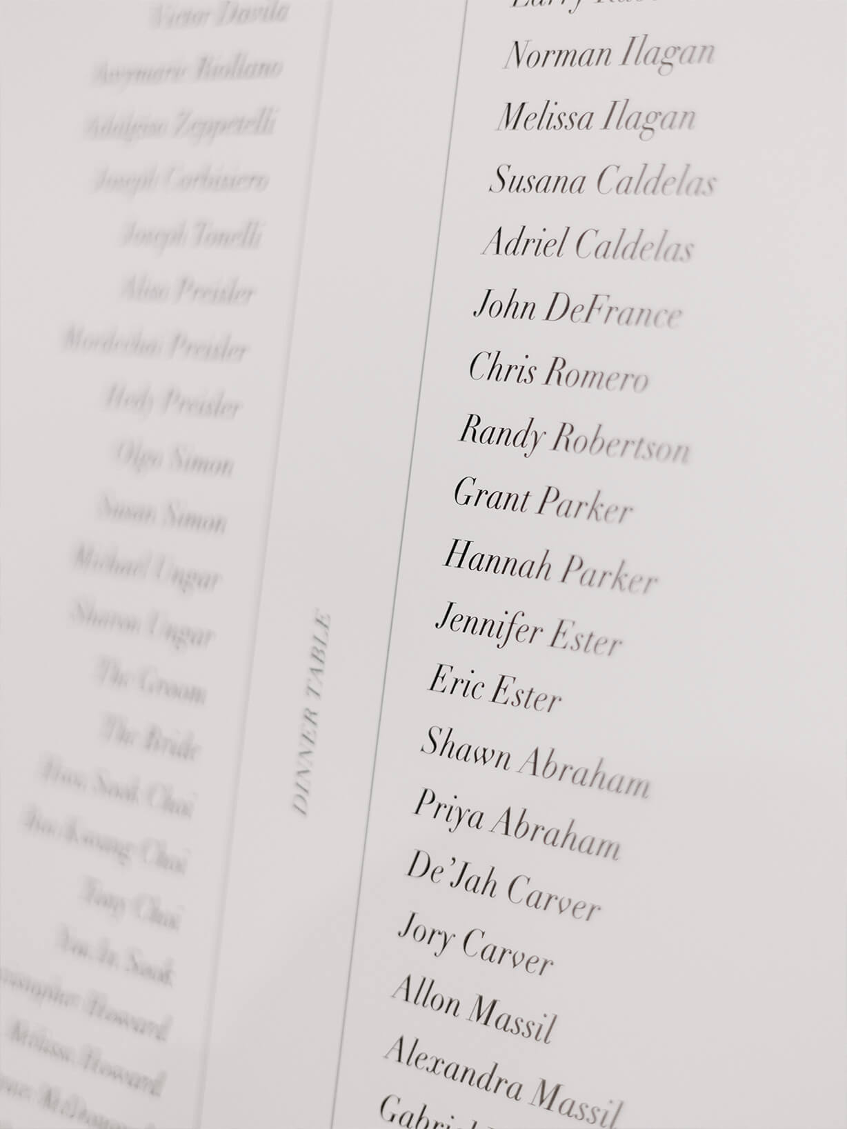
DINNER
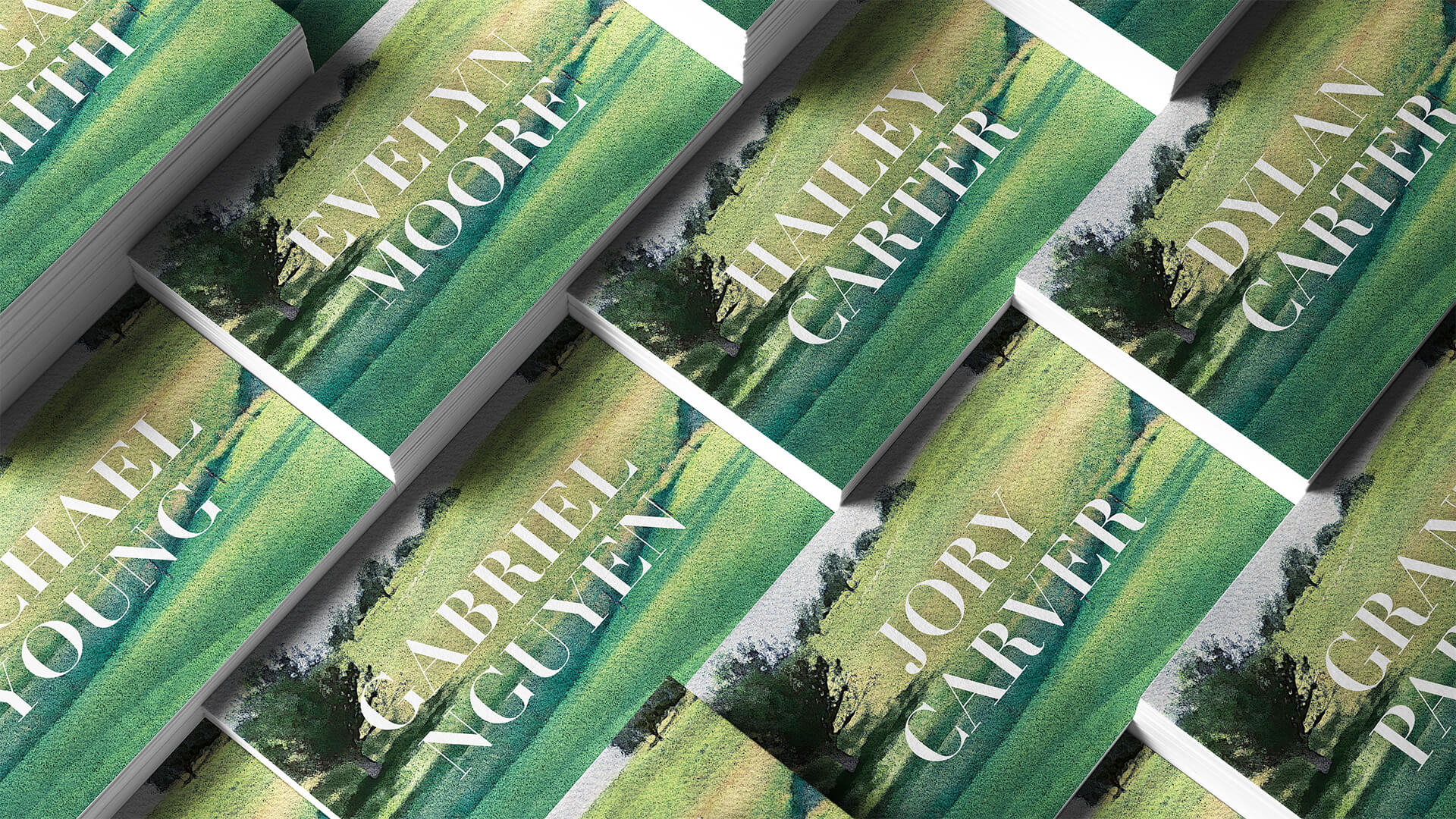
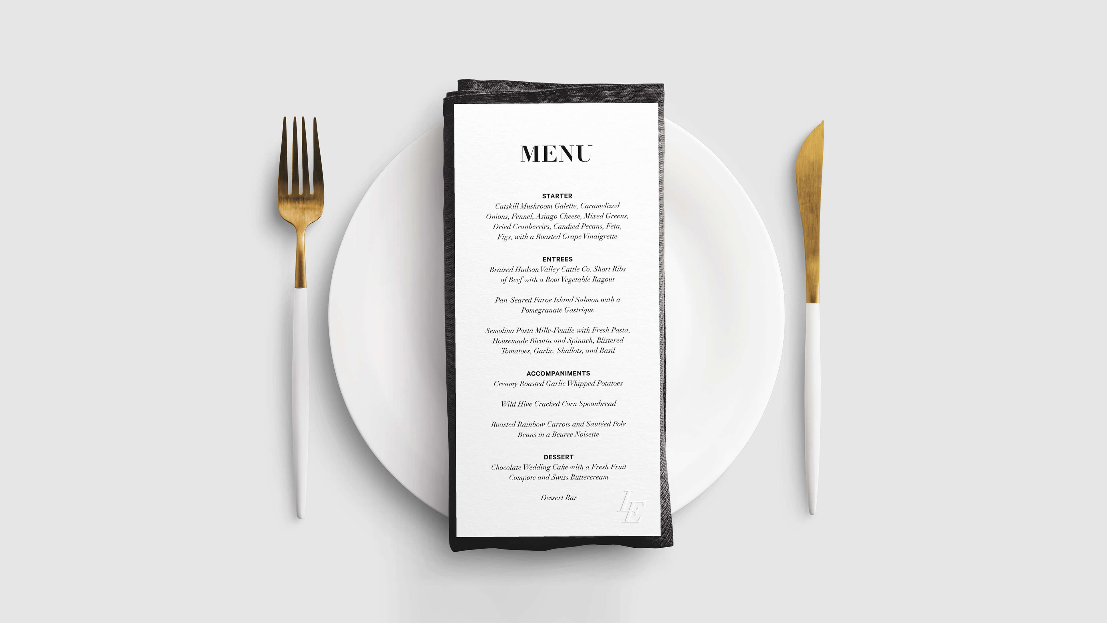
Dinner was family-style on the upstairs patio overlooking the Hudson River and Catskill Mountains at sunset, elevated by thoughtful design details like personalized name tags and custom menus.
The large seating sign mirrored the elegance and intimacy of the dinner table, setting the tone for a shared, heartfelt celebration. Each guest’s name tag featured the custom watercolor illustration—capturing the same breathtaking view they enjoyed from the backyard as they ate—creating a deeply personal and visually cohesive moment. The menus were subtly embossed with the bespoke LE monogram, blending simplicity with quiet luxury. Together, these details created an atmosphere that felt intimate, intentional, and beautifully reflective of our vision.

BEHIND THE SCENES
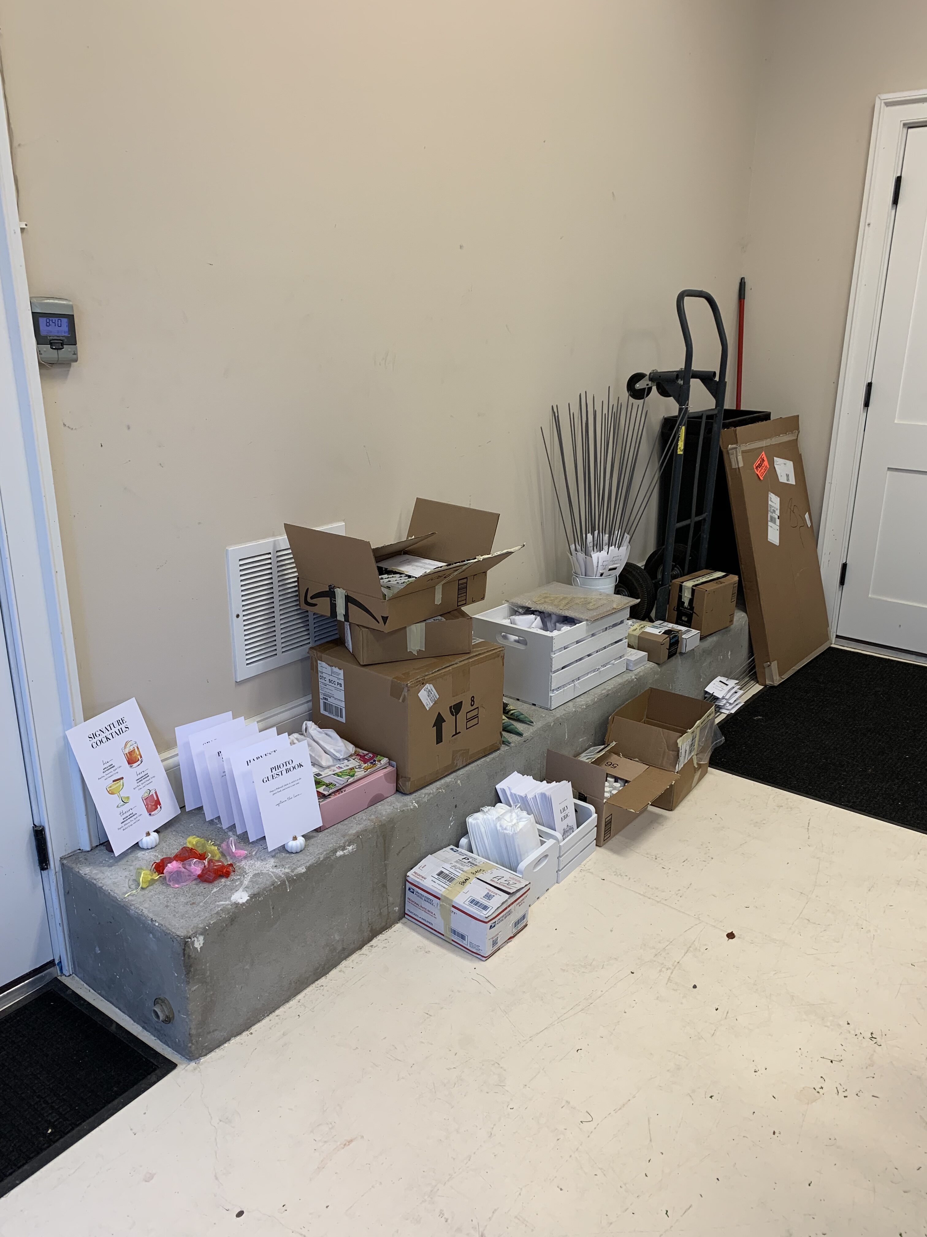
A lot of DIY went into the development of the wedding to ensure things felt purposeful and carefully crafted.
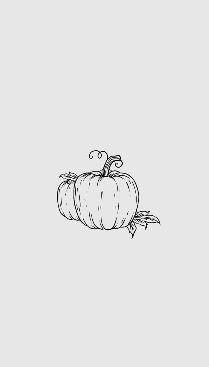
My wife and I assembled the invitation packages, built a welcome sign frame out of a clothing rack and painted it, and painted white pumpkins that had unfortunately turned slightly yellow hours before our big day! Needless to say, we put our heart and soul into this project.

"An absolutely beautiful wedding. Just incredible."
JORY CARVER
BEST MAN

AT&T ICONOGRAPHY
Creating an ecosystem of digital icons.
BRAND: AT&T
DATE: 2020
PLATFORM: DIGITAL/PRINT
ROLE: DIRECTION
Have a big idea?
Let's bring it to life, together.
©2026 TALKAR - NEW YORK, NEW YORK
