AT&T.com Redesign
Redefining a legacy telecom platform.
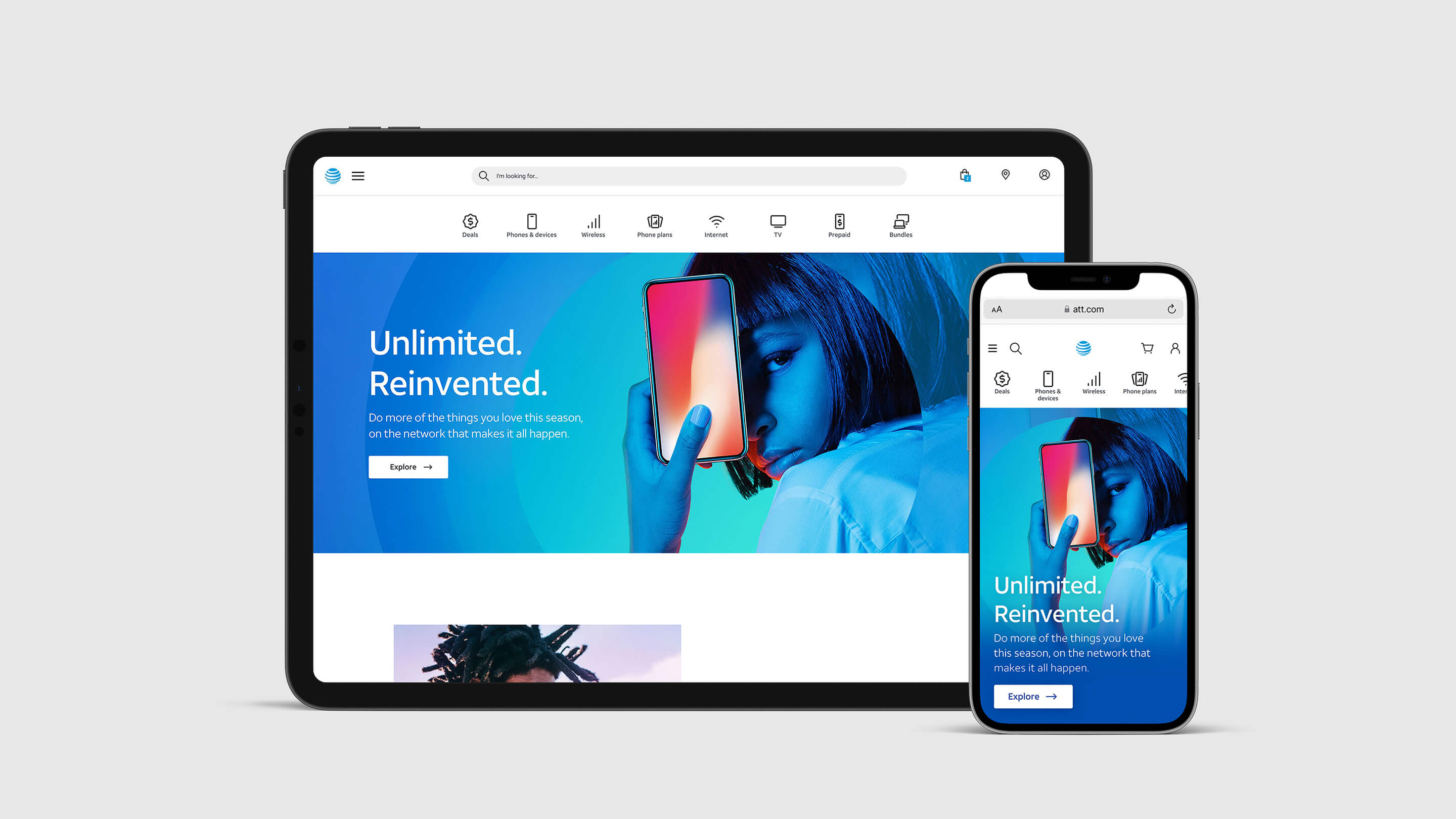
- Project
- 11/14
- Brand
- AT&T
- Date
- 2019
- Platforms
- Web
- Role
- Design Lead
- Teams
- AT&T
- Status
- Launched
AT&T.com needed to feel like a modern brand, not a legacy telecom archive. I directed it all — a brand refresh, accompanied by the homepage redesign, then the design system. I designed the refresh and the homepage, and directed and supported the other key pages and the system.
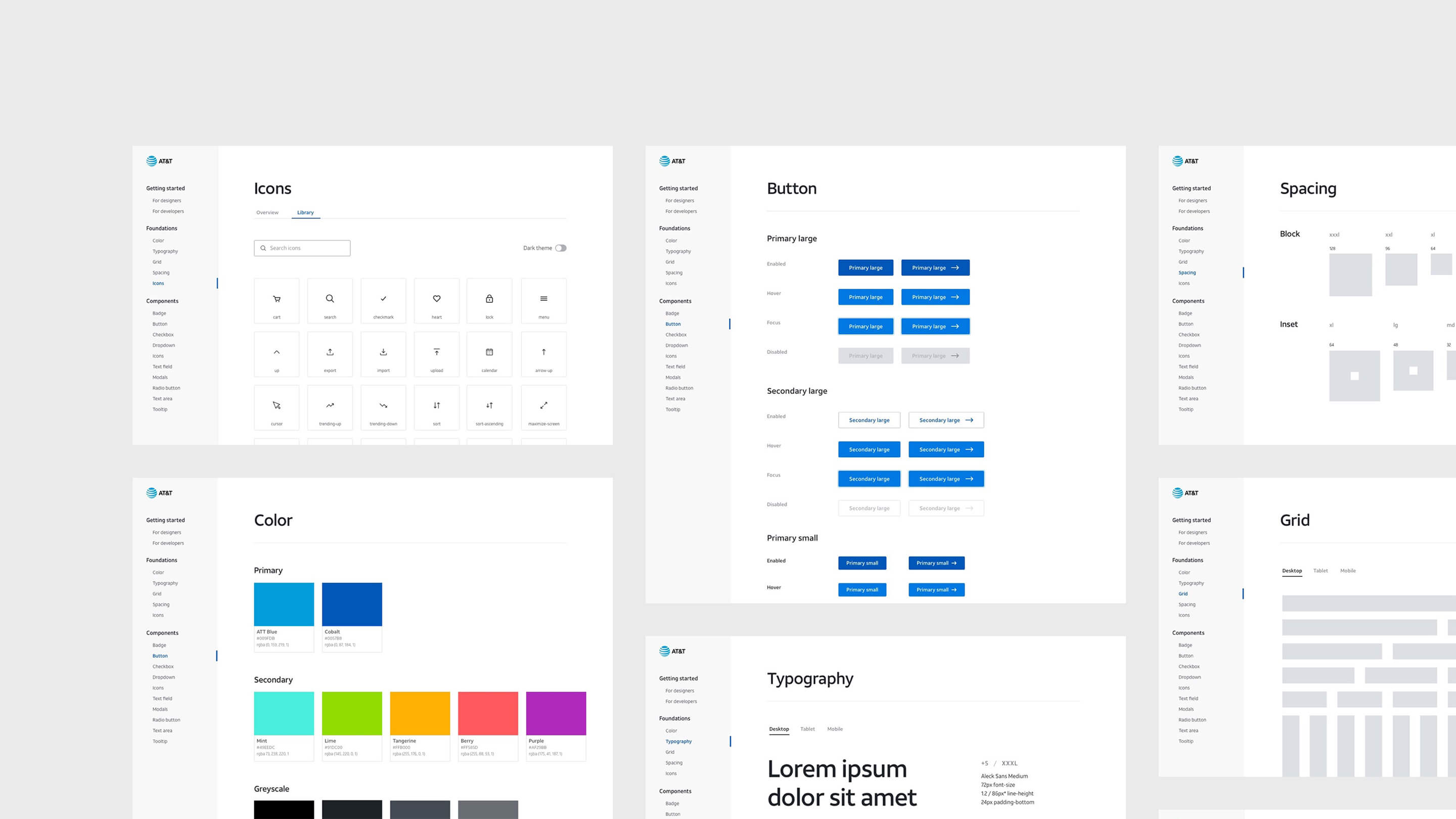
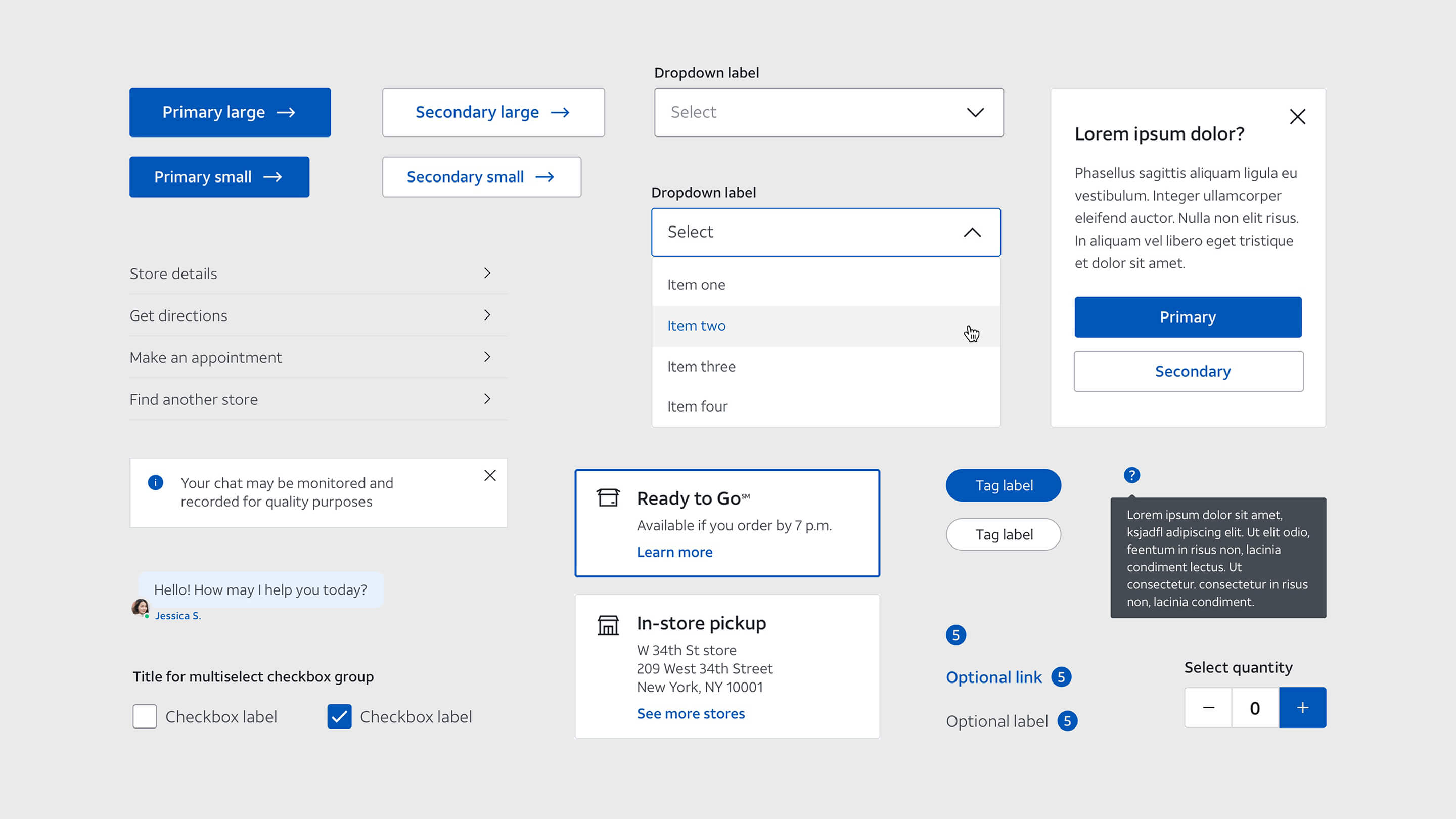
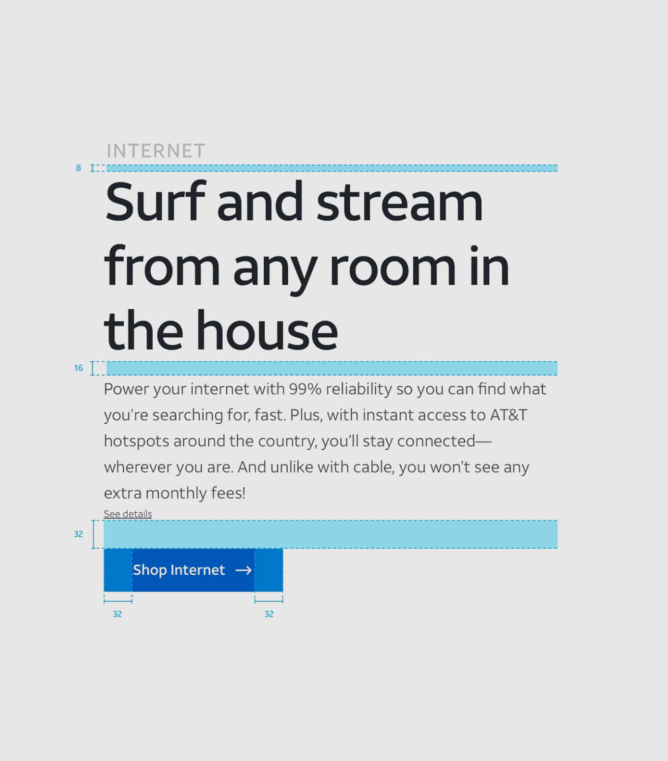
I directed a small team to establish and build the design system. Together we set the art direction of the elements, components, and patterns, so type, space, and UI could stay consistent after launch. The goal was a platform that felt youthful and usable, not just restyled.
Brand Refresh
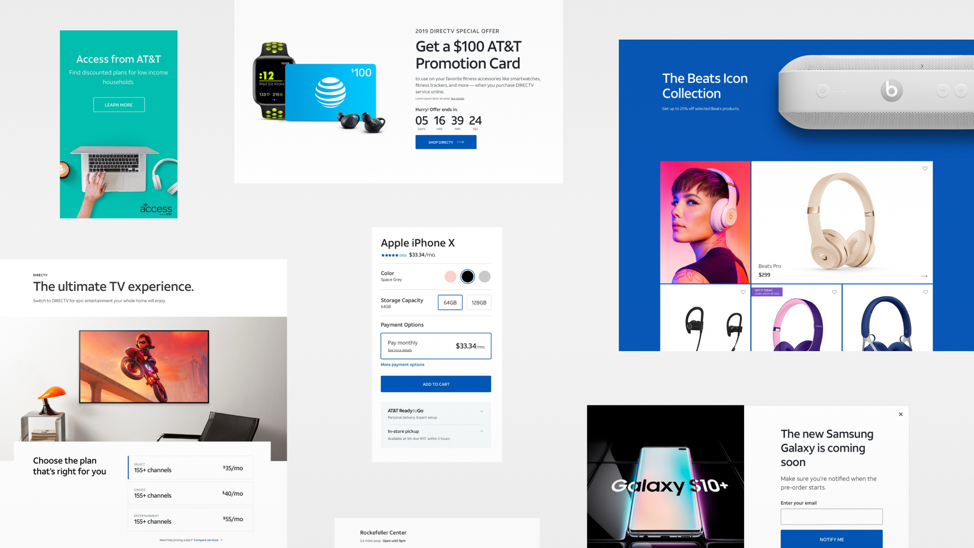
I designed the moodboards and helped define the brand refresh — color, type, and composition aimed at a more youthful audience.
We introduced several accent colors to the palette. I also explored more handwritten typography to contrast Aleck — a looser, human mark that could carry creativity and youthfulness against the brand’s structured sans. The moodboards I designed tested how those typefaces, colors, and imagery could compose together.
We tested three directions in research — Renaissance, the current brand, and #Adulting. Renaissance rated highest on fifteen of the sixteen measures, and #Adulting led on energy.





| Measure | | 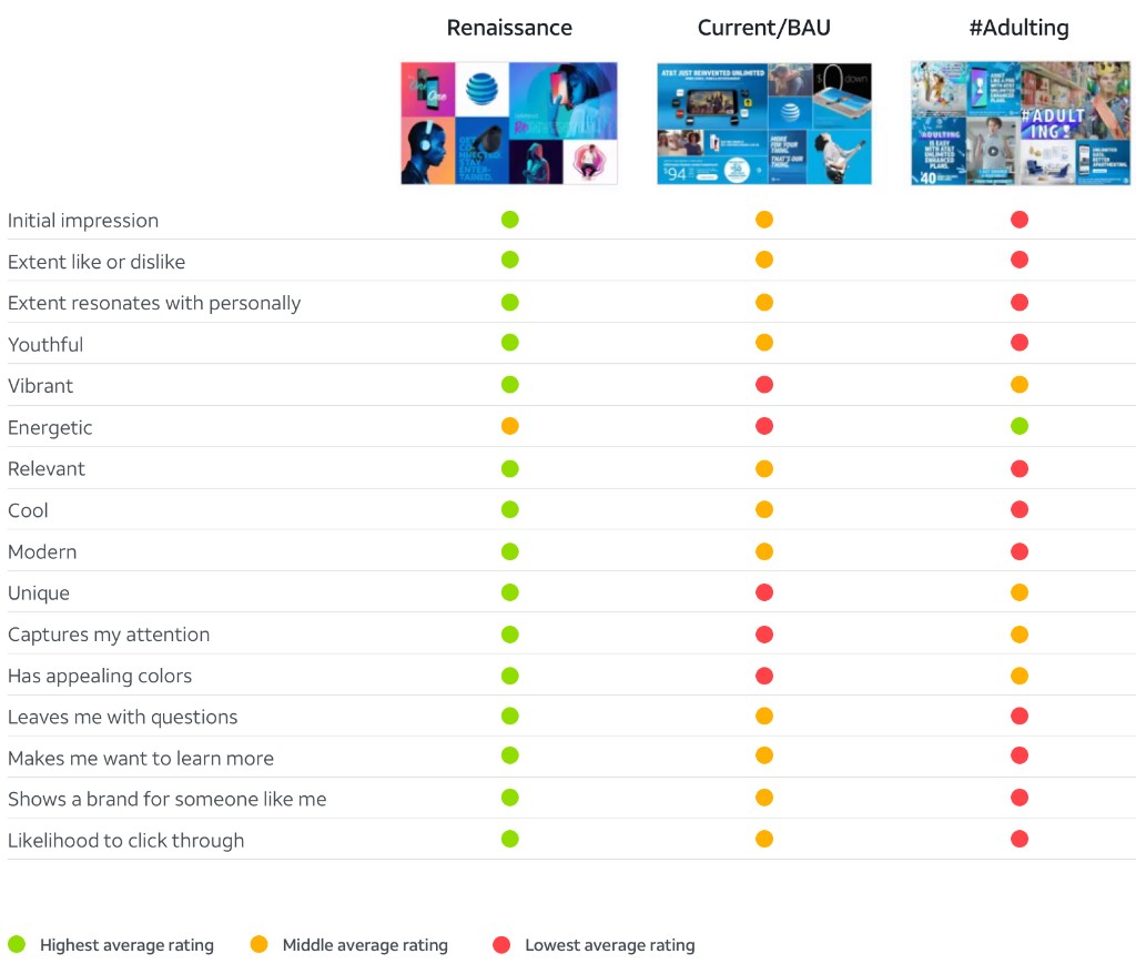 | |
|---|---|---|---|
| Initial impression | Highest average rating | Middle average rating | Lowest average rating |
| Extent like or dislike | Highest average rating | Middle average rating | Lowest average rating |
| Extent resonates with personally | Highest average rating | Middle average rating | Lowest average rating |
| Youthful | Highest average rating | Middle average rating | Lowest average rating |
| Vibrant | Highest average rating | Lowest average rating | Middle average rating |
| Energetic | Middle average rating | Lowest average rating | Highest average rating |
| Relevant | Highest average rating | Middle average rating | Lowest average rating |
| Cool | Highest average rating | Middle average rating | Lowest average rating |
| Modern | Highest average rating | Middle average rating | Lowest average rating |
| Unique | Highest average rating | Lowest average rating | Middle average rating |
| Captures my attention | Highest average rating | Lowest average rating | Middle average rating |
| Has appealing colors | Highest average rating | Lowest average rating | Middle average rating |
| Leaves me with questions | Highest average rating | Middle average rating | Lowest average rating |
| Makes me want to learn more | Highest average rating | Middle average rating | Lowest average rating |
| Shows a brand for someone like me | Highest average rating | Middle average rating | Lowest average rating |
| Likelihood to click through | Highest average rating | Middle average rating | Lowest average rating |
Digital Design
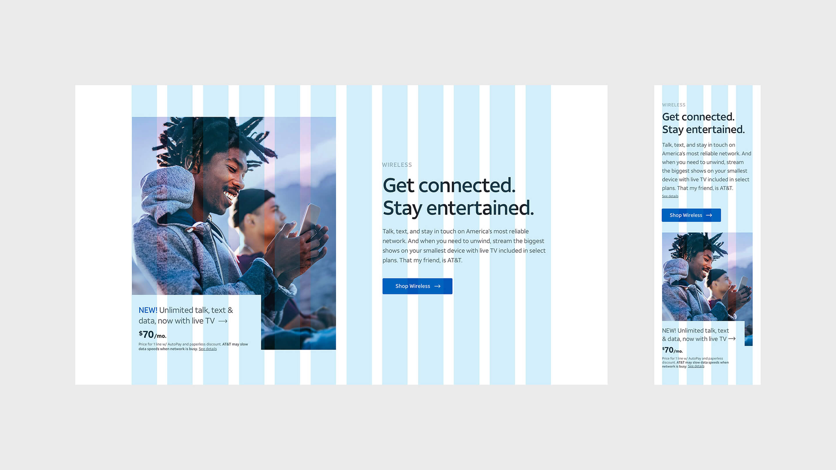
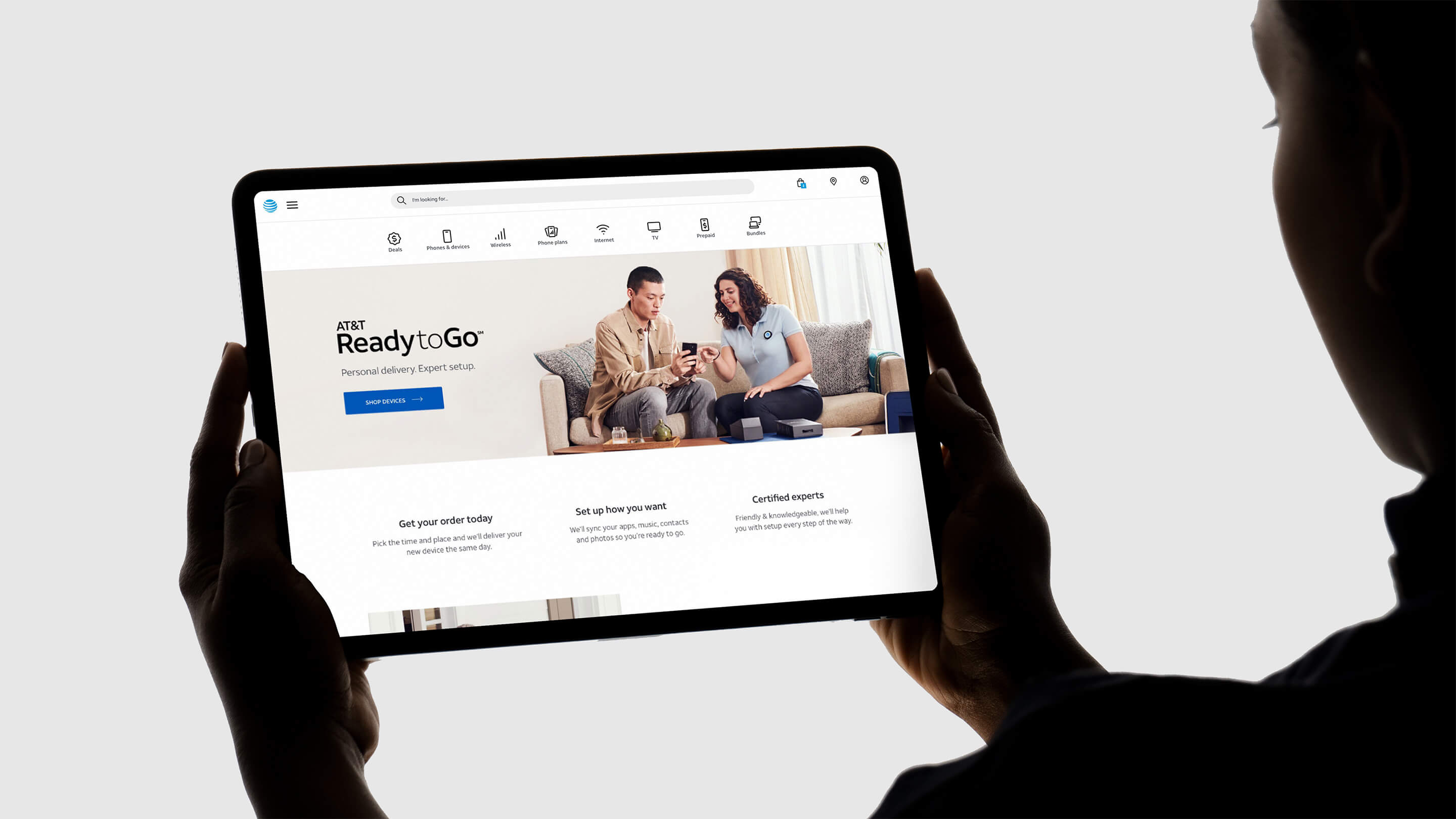
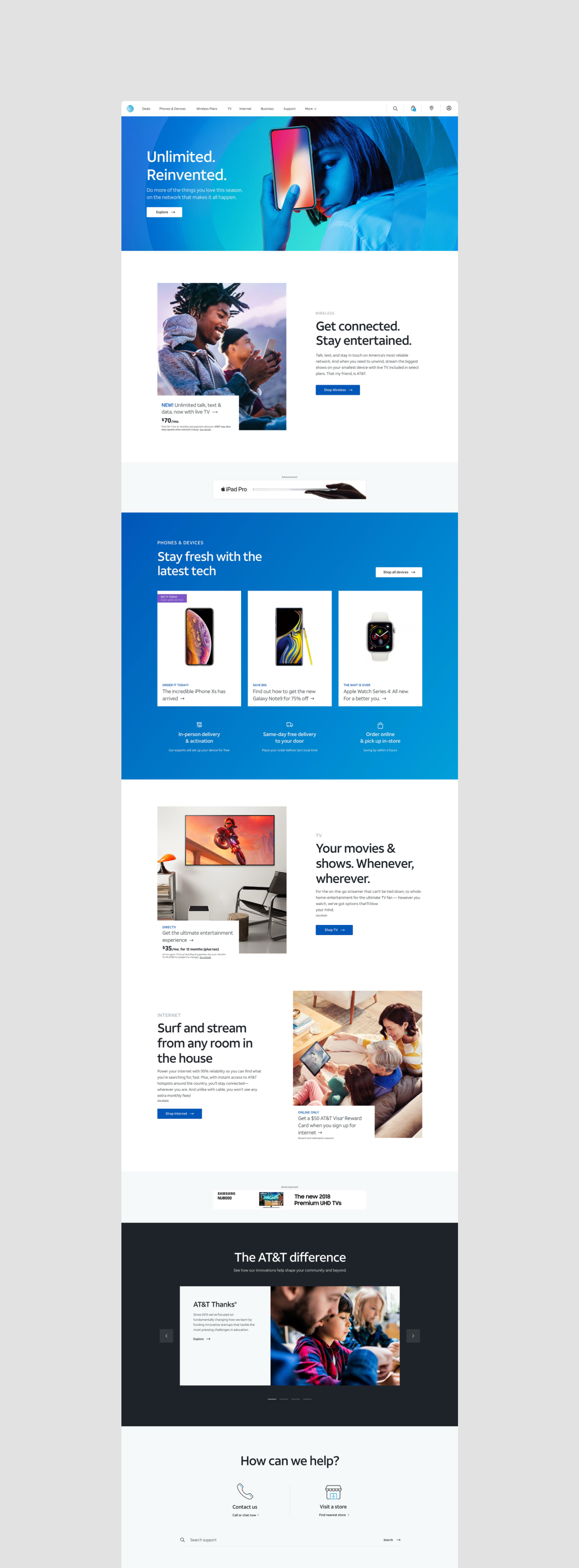
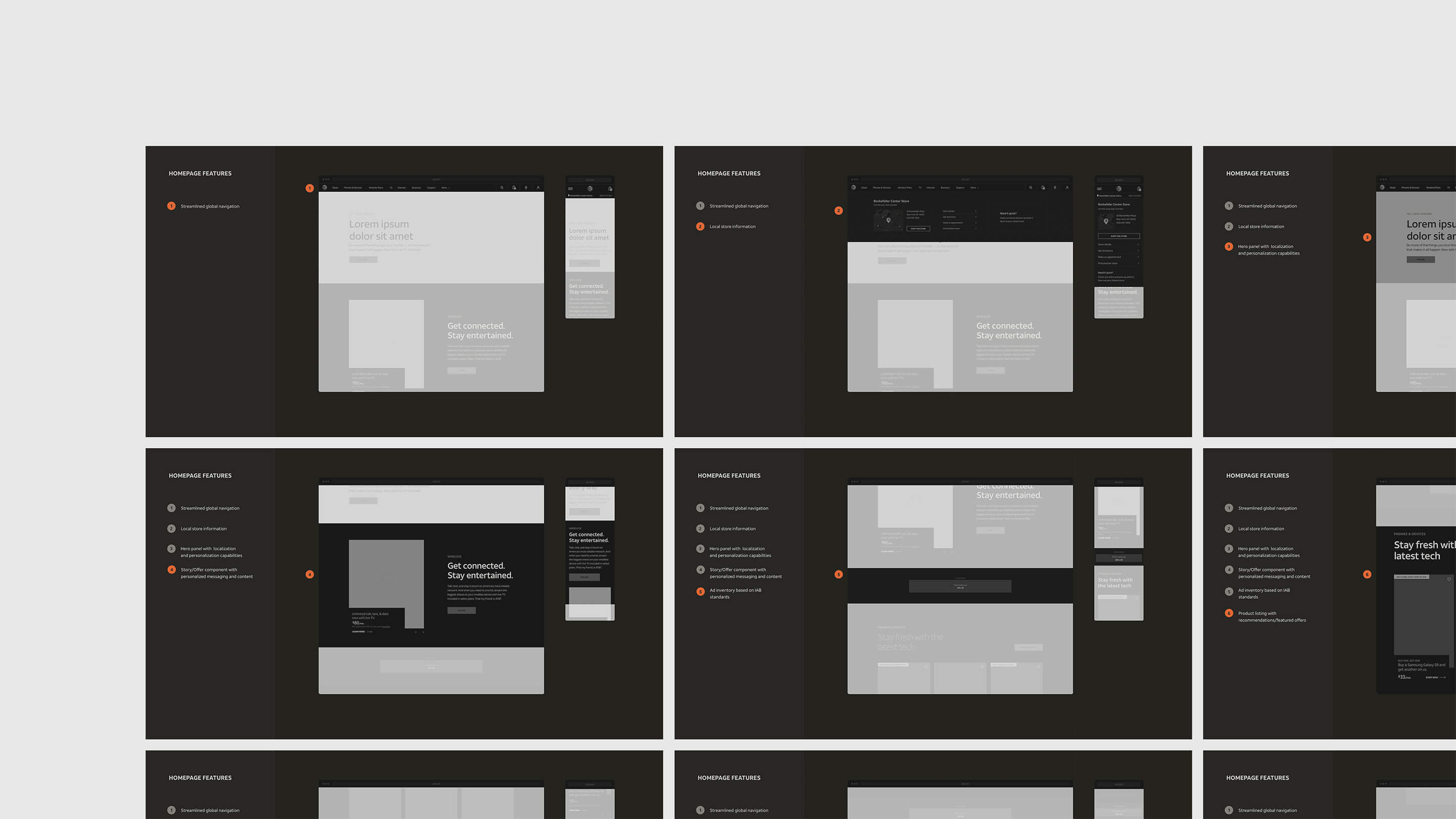
I designed the homepage so the refresh would show up in a real shopping path, not only on a brand board.
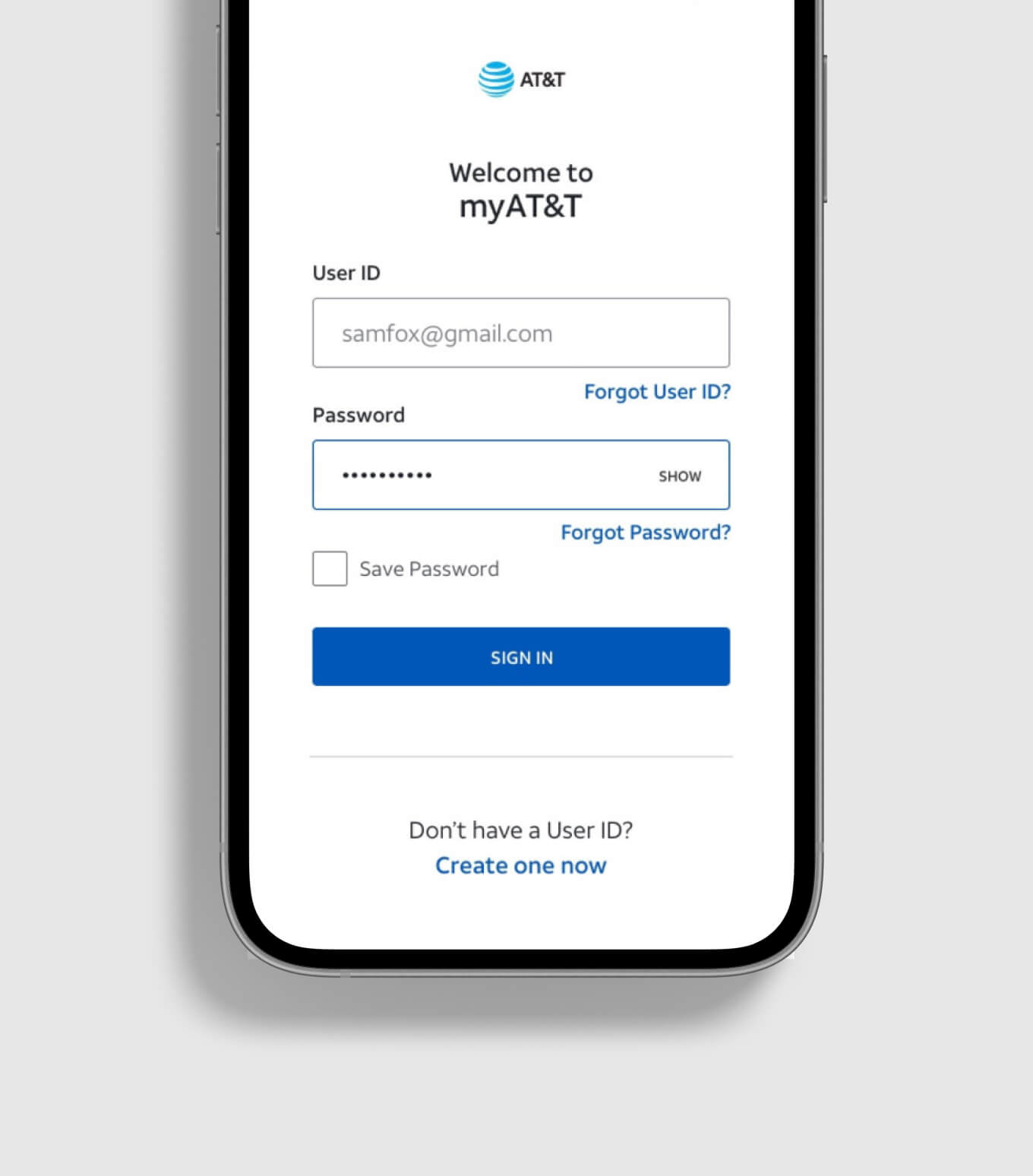
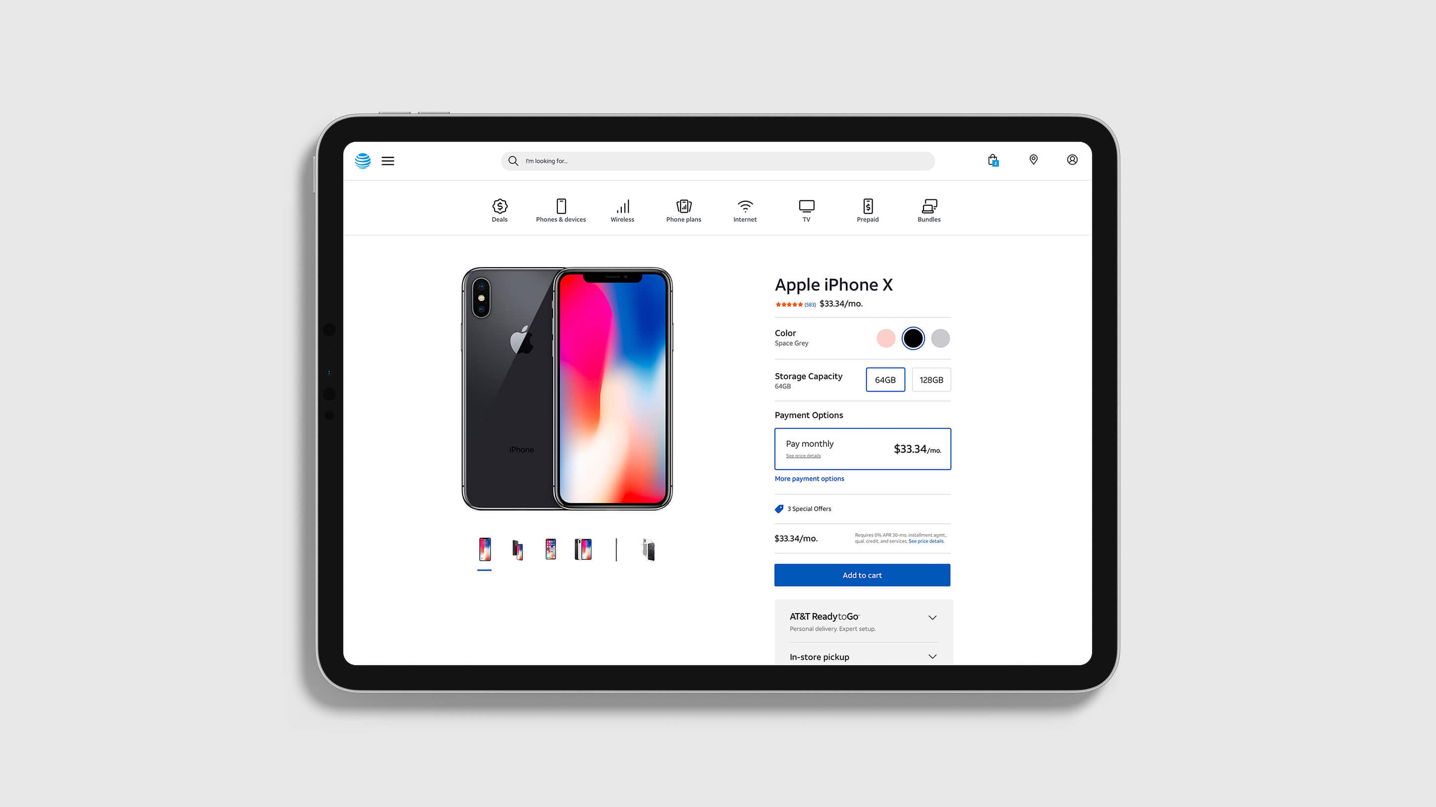
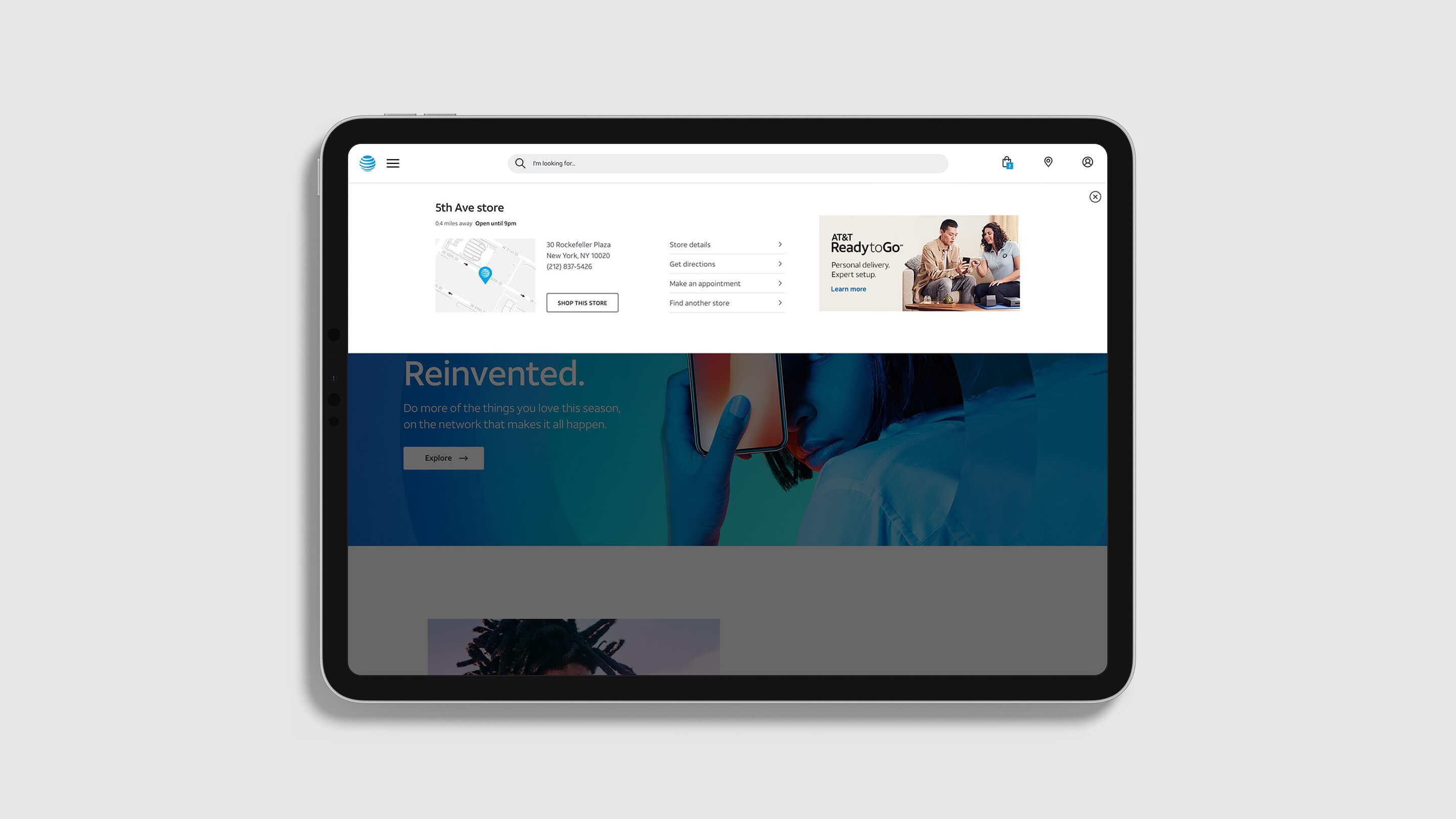
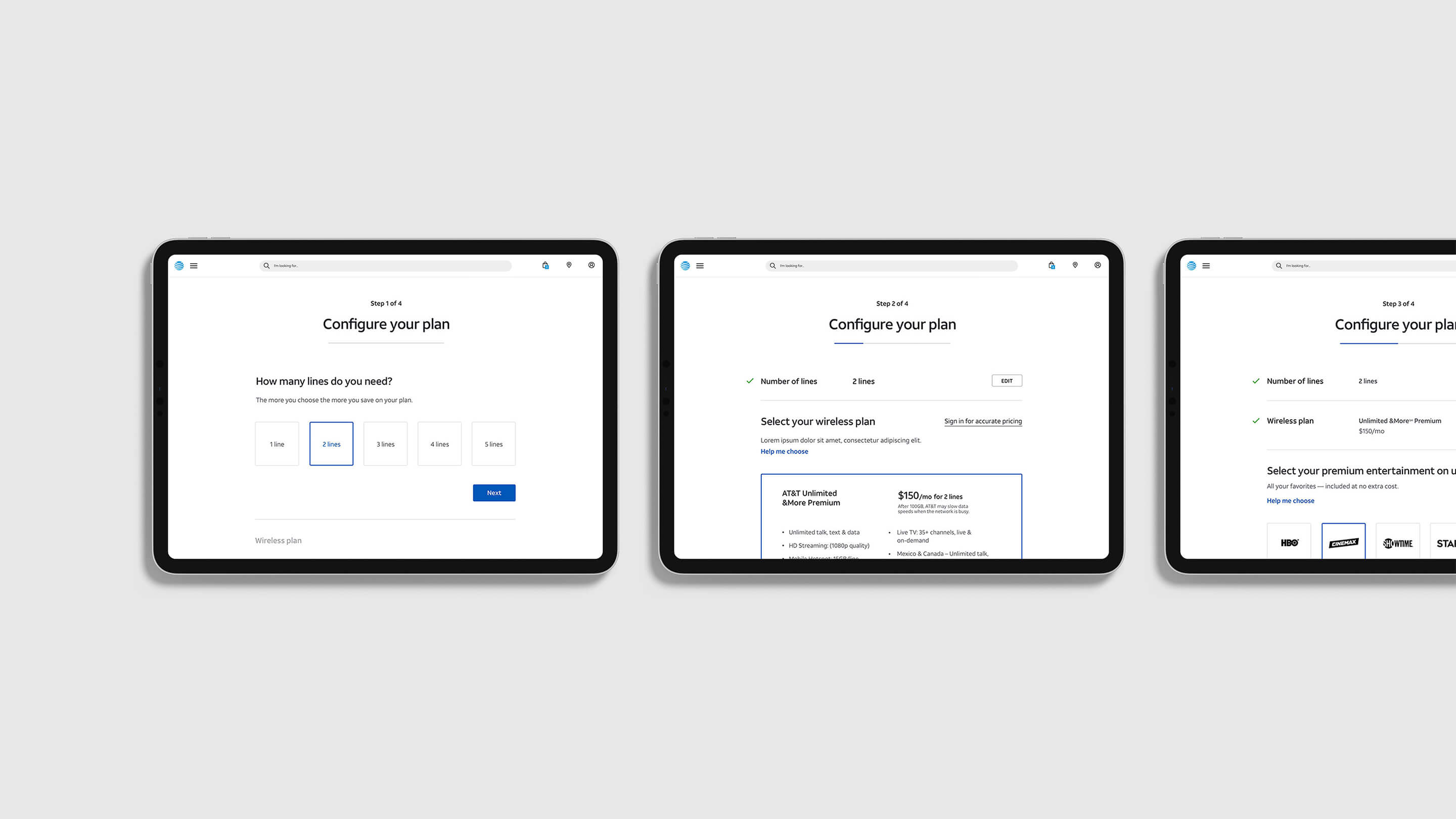
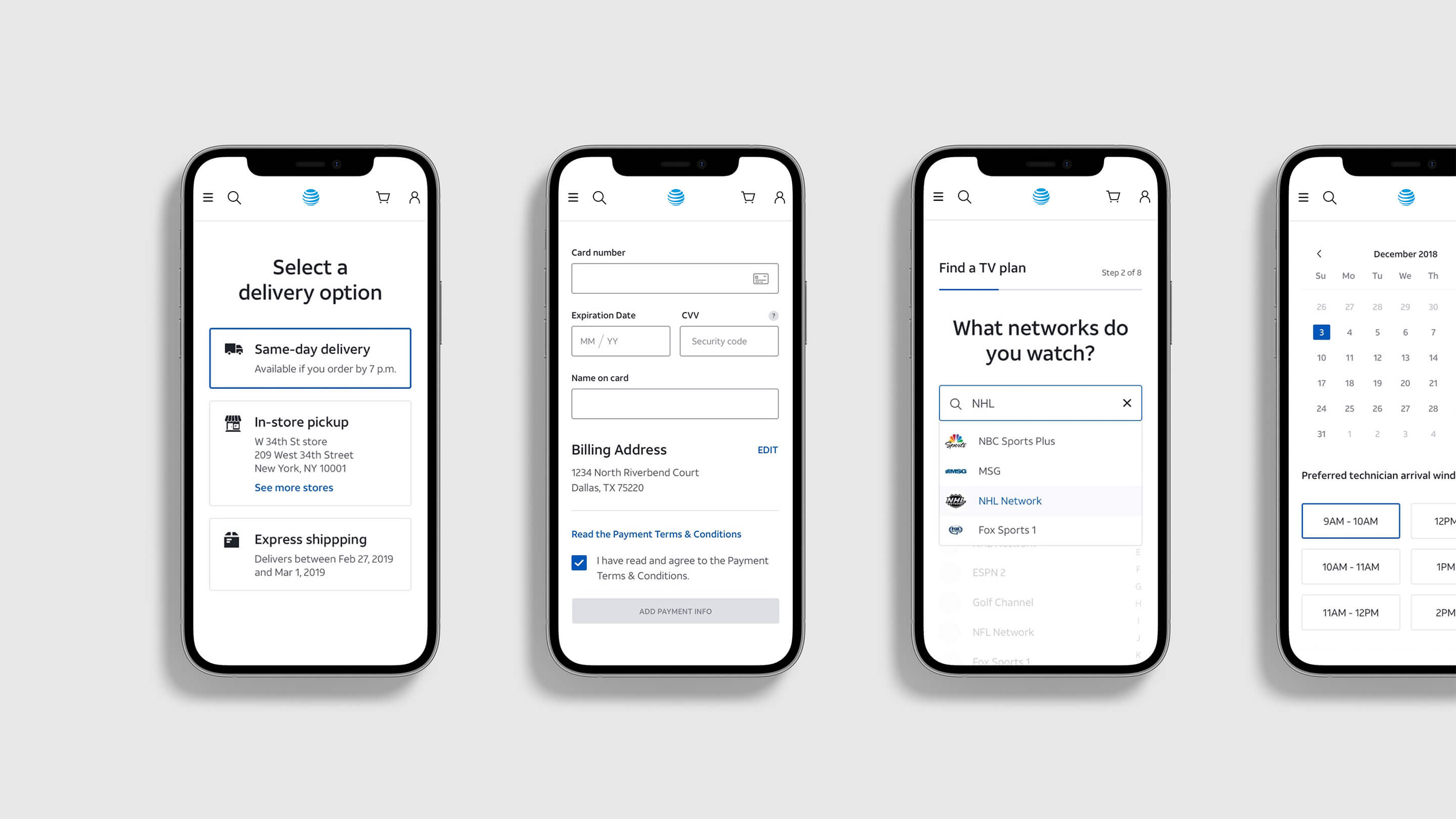
The first five key pages — homepage, product, configure, locator, and sign-in — carried that language at AT&T’s scale. The homepage was mine: color, type, and photography working as one surface that could sell products with the same energy as the refresh.
Design System
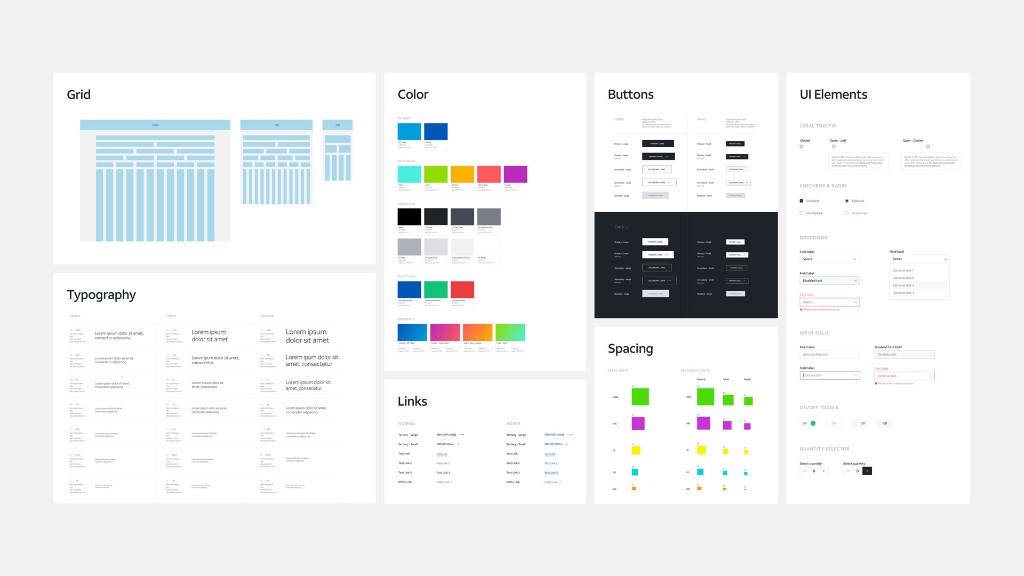
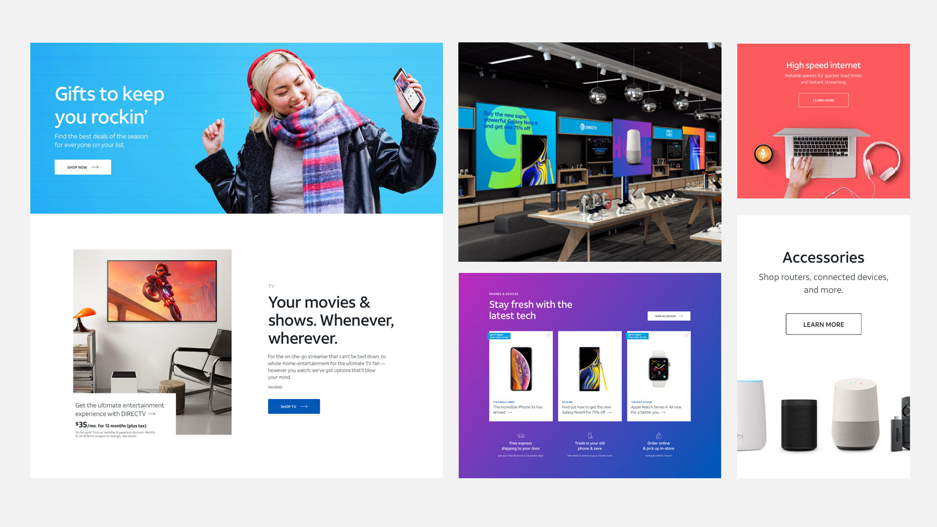
I directed a small team to establish and build the design system. Together we set the art direction of the elements, components, and patterns.
The documented system of type, space, icons, and components was how the refresh would last past the first launch. We built it so those pieces felt like the brand we were pointing toward. After the initial system was in place, we opened a contribution model — a meeting cadence and reviews — so other core teams could add to it, while we kept everything integrated and true to the system and its principles.